Logo of the Day
Logo of the Day
- Started
- Last post
- 821 Responses
- scarabin4
- 0.000% characterutopian
- taking the pets out of petco™futurefood
- whooosted
- lol. so much passion over the logodbloc
- the dog's ear is weird on the cat. start to look like fat horns.bezoar
- Imagine the blowback from being the designer who was responsible for that logo. You think you got problems?cherub
- Samson has a point.PhanLo
- https://www.youtube.…dbloc
- I think Samson is fucked up beyond repair.helloeatbreathedrive
- Always blue.jtb26
- Samson owns 57 catsKrassy
- i_monk-1
Vauxhall goes flat:
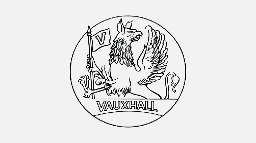
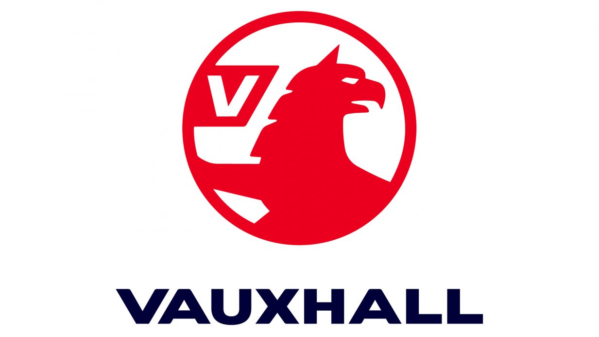
- Three steps earlier was a better flat logo, imo. Cropping out the wings is a mistake.i_monk
- Awful. not that it makes much difference - it's been a pointless sub-brand to GM and Opel for as long as I've been alive. Thoroughly unsexy.Nairn
- The griffin looks like he's turning his head in disgust at the flagBaskerviIle
- Agree 100% monk_niko
- Agree 101% monkdee-dubs
- Needs some detail in the body, too much red. Not that I care, when they’ve just copied Audi and Vauxhall’s are shit.calculator
- Griffin is like, "wut?"sarahfailin
- @Nairn. Pointless?
They sell more cars in the UK every year than Audi, Toyota, Renault, Peugeot, Volvo, Jaguar, Fiat, Nissan... I could go on...Hayzilla - So? As a BRAND it's basically just regurgitating Opel tech. I'm sure Vauxhall do sell well and make the DE owners lots - they're bland. People like bland.Nairn
- Oh, my bad - Opel's actually a French brand now, just like all the other car companies. Thank Goodness for French Gov't Protectionism.Nairn
- People love bland, but they want to think it's upmarket, quality stuff.i_monk
- The 3rd and 4th were the bestNBQ00
- And 5th too.NBQ00
- https://www.youtube.…garbage
- I just wish there were SOME indication of the wing, however minorscarabin
- Never understand opel > vauxhallisaca
- What is vauxhall?milfhunter
- The 2020 Mokka is pretty nice.utopian
- Vauxhall IS Opel you fool.
They rebadge them!Hayzilla - What the hell do you think a brand is, you fool?Nairn
- Cropping out the wings is always a mistakei_was
- fuck monk, I can't believe i missed your pun
https://i.gifer.com/…_niko
- feel0
more on the fox brand identity:
- I don't get it. Are they using both? or is this the new primary logo?dbloc
- Is the new one the new parent company, F A C E B O O K vs facebook?i_monk
- no idea but it still reads VOX_niko
- VOXKrassy
- vox news
Fair and Balanced®utopian - im confused.milfhunter
- More work went into creating this case-video than the rebrand itself.NBQ00
- am i the only one that reads fox? loljaylarson
- No idea what is going on here.Hayzilla
- This is too long and convoluted for any online attention span, and even if it wasn't created for that medium, it's still too much.evilpeacock
- (aha - I see this is a video "case study" more than anything else)evilpeacock
- no idea too, but it's fucking coolfeel
- It's an American brand; bold, empty and soulless.ideaist
- troll-back? hmmlvl_13
- This can't be real. Also the video ends with the old "current" logo.nb
- i_monk3

- Nice idGnash
- nice! ++renderedred
- Love the nod to Herb’s Families IDGnash
- i don't get itutopian
- ^ the dots over the eyes represent the bass, soprano and tenor voicesGnash
- Tenuous, is it not?scruffics
- https://the-brandide…ideaist
- ^ For context.ideaist
- true that it's very subtle, or tenuous, but one doesn't need a hammer for a choirGnash
- I gave it a day or two. It’s a very fitting and well designed mark and system ... for this group.monospaced
- Nice.
Tittles going wildNairn - .
.
faır dınkum.PeterPancake - indent intended, interdicted :(PeterPancake
- haha, nairnGnash
- Still don't get it.
Looks like SEA did it 20 years ago and they still knocking out the same shite #progressnylon - It’s nice, but I reckon probably like one of The Partners’ old ‘sparkler’ projects.MrT
- stoopidrobthelad
- _niko1
What say ye, Qunts?

- I don't see the connection to kickball.i_monk
- 4 LALIGA?oey_oey
- Y LALIGA?oey_oey
- Satander?oey_oey
- Fine, it's no Premier League tho. Plus that LL icon - players skidding on knees after scoring - is that more a Spanish league thing than in the others?MrT
- distancing themselves from the rainbow motiffaxion
- the font is nice but the I don't like the symbol on the left. What's supposed to be? LL? Y? U?NBQ00
- The U from Unreal engine but it supposed to be a double LL?milfhunter
- The LL represents a player sliding on knees after scoring.MrT
- the new one is a better markmonospaced
- https://ih0.redbubbl…Krassy
- The old one looks a lot like Picassa.CyBrainX
- 4 LALI6AKrassy
- I LLike itstoplying
- www.laliga.com - What a mess of information!!!ideaist
- Y la liga?Miesfan
- maquito2
Oh ffs! Really?!

- Suggestive...i_monk
- Surely they've been hacked?
₩∪⟂Nairn - ok, so which bullshit movie dystopia timeline have we slipped into this time?Nairn
- https://twitter.com/…
https://twitter.com/…imbecile - Sadly... some agency got a lot of money for this redesign.hydro74
- So it beginsskinny_puppy
- its about that timeautoflavour
- Metal Goth band?OBBTKN
- is this one of them magic eye things that if you squint hard enough you see a swastika?dee-dubs
- lolmilfhunter
- wokeneverscared
- They got infiltrated by Russian Propaganda Artists.uan
- Actually being it the Opinion Section...on second thought, I think it's clever af.uan
- it's on all their accountsimbecile
- not only Opinion got red...not so clever after all
https://i.imgur.com/…uan
- sted0

- D ee PNBQ00
- It bothers me that the dots are not skewedrobthelad
- and that I want pizza now. Otherwise I like this little mark.robthelad
- yeah that looks a bit weirdsted
- Where’s the golden section grid?Gnash
- Lol @ "Letter d". That's some tenuous shit right there.scruffics
- arrow pointing downdbloc
- @scruffics, I was thinking the same. Tilted chevron, more like.Continuity
- Tilted Dsted
- that's a laptop or Lego piecesKrassy
- terriblemilfhunter
- But they still sell fatty manhole covers made by dingbats.MrT
- Just a concept, move along
https://www.msn.com/…grafician - Is this guy on twitter "re-designing" famous logos on request for clout, pretty boring stuff
https://twitter.com/…grafician - gfo ppl qbn police is here.
@grafician if you have nothing to contribute, you are just instructing people without any foundation at 3am, go to sleep.sted - sorry, did I embarass you in from of your friends by actually contributing the source of this post? Awwwwwgrafician
- aye so the reason why skip on the source for these post are exactly these bitchy judgemental notes.sted
- Passscarabin
- Unless the dots were also in perspectivescarabin
- Also, dominos‘ legal department said they haven’t had the word „pizza“ in their brand name for like 9 yearstoemaas
- drgs2
Microsoft's 1980 Metal logo


- 1987 is my fav. A few tweaks but have stuck with it.Hayzilla
- 1980 is a straight up heavy metal band \m/Krassy
- 87 was the best.utopian
- '82 version had the fucking Death Star in it!grafician
- 1980 should be Microsofticadbloc
- That's not a Death Star....that a TIE fighter!utopian
- It's funny that they only went 2 years with the "metal" 1980 logo.NBQ00
- 2012 is fucking awfulinteliboy
- so they've never had a good logomonospaced
- 1987. Serviceable but with something missing. Perfect.MrT
- '87 FTWrobthelad
- when you have no vision or values, but still succeedaliastime
- dbloc1
This logo really triggers my OCD. Why the hell is it slightly rotated? I assume there's a reason.

- Why is it ugly in the first place?nbq
- They don't want you to mistake it for the wifi iconMaaku
- crooked wifidbloc
- I also hate that logo. It's all sorts of wrong.Melanie
- Hand drawn wifi signals surrounded by vomit. This makes clip art look great.utopian
- There's no real reason like most things with Spotify. It was created purely as a streaming platform, they were going for movies but Netflix got in first.face_melter
- The arc of those lines always annoyed me, they look off, like the curve skews right slightly. I just want to grab the adjustment handles and fix it.BaskerviIle
- They tried music instead. Before they signed deals, almost all the music in the catalogue was taken from Pirate Bay.face_melter
- Always though this and Soundcloud could be dramatically improved.
Probably the ol' "we love our original logo 'cause our son/daughter did it!" mentality.ideaist - It's based on the original crappy logo. The O was rotated.
https://1000logos.ne…dbloc - Those default illustrator stroke blobby ends too.MrT
- I never noticed and now it can not be unseen.fooler
- Worst logo for a startup - ever. It makes no sense, no point, no nothing. Spotify has a very good brand team, but they kept this stupid logo for ages...grafician
- It's a "placeholder" logo, like when you do something in 3 minutes, then use for all eternity because ppl get used to it...grafician
- dammit I get triggered everytime I see this logo, even those online logo generators could do a better job...ugggggghgrafician
- I hate this fucking logo, the curves dont' even feel correctmonospaced
- i_monk-6

Mint Payments, unrelated to Mint the budgeting app.
- I don't get it, am I missing something?utopian
- NVintsection_014
- IVintfuturefood
- NintKrassy
- CuntNBQ00
- @NBQ00 lolKrassy
- this really bothers memonospaced
- @monospaced +1Krassy
- I think it works really well at smaller sizes.i_monk
- Yeah seen this today on design twitter, yup really bothering - a "forced" ligature...grafician
- Not feeling itpango
- it stayssandpipe
- not for me. forced i agree.renderedred
- Will never fax!_niko
- yep, nah. maybe could have worked in the right type. Should have just capped the "i" with a mint leaf and called it a day.ben_
- IVintcolab
- IV initrobotron3k
- Net yet VintageBustySaintClaire
- https://www.youtube.…PonyBoy
- It goes.garbage
- memorable. in a bad wayBeeswax
- Nairn-1
- This makes a bit more sense..
https://cached.image…Nairn - Wonder if all companies will eventually have terrible logos like this. Value brand branding.PhanLo
- Not one single flourish or unique element. Fuck me. Groan.Hayzilla
- if it was some miserable minimalistic coffee shack clad in OSB and raw concrete in Bethnal Green, it'd make sense.Nairn
- Not much brainstormingmaquito
- @hayzilla, perfect for the company thenhans_glib
- It's BT in a (coax, fiber, etc) cable. It's not mind blowing but it works, and could be cool depending on the overall system.MondoMorphic
- So much equity in that old globe symbol...grafician
- https://www.bttoront…_niko
- standard ranch cattle branding
http://www.cowboysho…BustySaintClaire - well they only paid $5. Whadaya expect?dbloc
- @niko loldbloc
- It's the biggest broadband provider in the UK. Started in 1846 and has revenue of £24b. This is sad.Hayzilla
- All these logos look like icons an app creates when people don't have a photo icon available.PhanLo
- Sticking one of these on my car bumper when I drive round Europe.see_thru
- Truely inspiring and imaginative, said not one person.utopian
- I like itdrgs
- FFS...the weight of the circle is not even the same as the font. Lazy Brexit designers!utopian
- ^that's the first thing i noticed, in the color version it's less noticeable.renderedred
- oh, the color version is actually different. link from first comment.renderedred
- You're right - it's totally different! here's an apparent leak.. https://www.isprevie…Nairn
- This makes a bit more sense..
- uan1
- They got it right in 1975.comicsans
- Yawndbloc
- That egyptienne font really gives me a limp zucchini. What a senseless combination.stewart
- lego space called, they want their logo backtrooperbill
- It already feels dated.utopian
- love the vid, logo doesnt feel magical trusted or innovativeHayoth
- that said, the original logo was an ass sandwich with a side of shitsaladautoflavour
- logo looks outdated.milfhunter
- A bit meh really. When your story starts with the original SW trilogy and arrives at The Dial of Destiny, your brand needs a boost alright.MrT
- clipartimbecile
- IBMmonospaced
- fooler1
- I hated the last redesign. I can't believe it was 15 years ago. I remember tearing it apart here back then.fooler
- The new one for me says "unapologetic enjoyment" so clearly.shapesalad
- I can't unsee a fat red shirt and white gut hanging over blue pants on the old one.
I've always like Coke better anyways.fooler - Welcome backgrafician
- So immediately
Forgettablemonospaced - This is definitely an improvement, despite it looking like the logo of an Italian automobile manufacturer.MondoMorphic
- https://www.undercon…milfhunter
- anything is an improvement after the last atrocityKrassy
- The first batch of Coca Cola was brewed today in Atlanta in 1850-somethingstoplying
- LET'S FUCKING GOOOOcrazyprick
- Sooo much better!scarabin
- waaaaait a minute... how come I live in a country where they still say pepsi maxArchitectofFate
- grafician4
- I like it, nice motion treatment too. Better than the old one from those SomeOne chancers.MrT
- Indeed, one of the better ones so far this yeargrafician
- Me likee. Good that UK does the design contract whilst having absolutely fuck all to do with the actual business. Yaay.Nairn
- So... many... videos...
'tis lovely, though!
#Approvedideaist - The posters are using the same typeface as the logo which used to be a branding faux pas.canoe
- meh.utopian
- that type is blah. the whole thing looks like a freight forwardign company to me. but wtf do i know?hans_glib
- I know what you mean about the type hans. Maybe it'll grow on me, otherwise i do love the icon and it's movement.Ianbolton
- lnu1


- Looks like toothpasteHench
- https://www.thedrive…wckd
- For a second I thought it was a Pentagram rebrandNBQ00
- I imagine they would have lost a lot of brand equity if they went for this. And started a cycle of updating the logo every few years.Chimp
- This is just about the only time for me that he misfired, but it's still pretty cool.MrT
- There's a weird human centipede/Mr Garrison's invention going on in the middle of that logo. Kinky.Wolfboy
- Foidsrhadden
- Durexmilfhunter
- Why the ball? Chip that off and squeeze it together.garbage
- Honestly he came to a one-line link collision from R to D, but he was committed and said "fuck it, I'll put a bump".garbage
- Wheelchair dude sucking the dbabydick_
- Please tell me this is a jokesection_014
- i_monk0

- paintxobnbq
- paibnoxt?
paintxob?
pbo ax int?capn_ron - horribledbloc
- should have continued the eyeflowdbloc
- paint box?! terrible!oey
- I like.wagshaft
- You guys, think outside the paintbox you guys.i_monk
- i got it. challenging, still interesting.renderedred
- Box should be a different font.omahadesigns
- Should be a different colour too.detritus
- And a triangle.detritus
- It's two fricken triangles.Amicus
- Nip Bat Ox?Krassy
- ha, i work near this placedoesnotexist
- like.bklyndroobeki
- no goodmarychain
- Gnash5
- somebody added this to a contest on 99designs?sted
- it must be in jest.Gnash
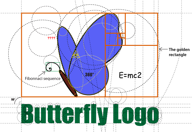
- lol, golden rectangle ... and is that Impact?monospaced
- lolKrassy
- Lolnotype
- brillantatomholc
- yep Impact :Dsted
- I bet that completely pointless E=mc2 is Comic Sans.CyBrainX
- ooh we have here a lot more: helvetica rounded, arial, comic sans, verdana, impact. I would love to know who made this :)sted
- Pentagram design?utopian
- chukkaphob2
- I'm #Firefox4Lyfe but i literally don't give a shit.detritus
- "literally?"
do you literally know the meaning of the word "literally?"chukkaphob - quite nice. I like how vibrant the new colors are. the purple though on it's back... i don't think its needed.kona
- I'm with kona, I like it without the purple.Maaku
- Foxfire.MrT
- Huh, looks so similar I would never have noticed.formed
- https://pe-images.s3…dbloc
- Why did they add a flat earth variant?SimonFFM
- lol
https://uploads.disq…dbloc - Vaporwave ℠sureshot
- chukka, this'll blow your mind..
https://en.oxforddic… - 1.1 informal, Used for emphasis while not being literally true.detritus - y tho? Old logo is fine. New one is fine too. Except that purple on the edge. Looks worse, the smaller it gets.section_014
- Mozilla waste far too much time rebranding themselves, pointlessly and often quite badly. It's their Thing.detritus
- @detrius this will literally make you laugh: https://www.youtube.…chukkaphob
- But, I am actually literally not giving a shit?detritus
- They added that to the dictionary, well fuck me. You can't use literally in the non literal sense, that's the EXACT opposite of what the word meansset
- fucking americansset
- next they'll suggest there/they're/their are interchangeable. We're fucked.set
- ^ yes, we're literally fucked.chukkaphob
- hans_glib4

- no idea if it's official or even a logo, i just liked ithans_glib
- if only the t wasn't touching the o. sorry, it's great but that bugs me.renderedred
- yeah, spacing between letters is all over the place.dbloc
- Also, the Y is the only crooked letterdbloc
- y looks finemonospaced
- Yikes!utopian
- i like itStoicLevels
- It's all a harmonious flow of almost fine. I like it.CyBrainX
- https://i.pinimg.com…OBBTKN
- It looks like a 9th grader created this logo.utopian