Logo of the Day
Logo of the Day
Out of context: Reply #575
- Started
- Last post
- 934 Responses
- i_monk-1
Vauxhall goes flat:
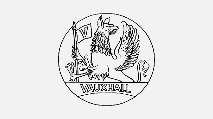
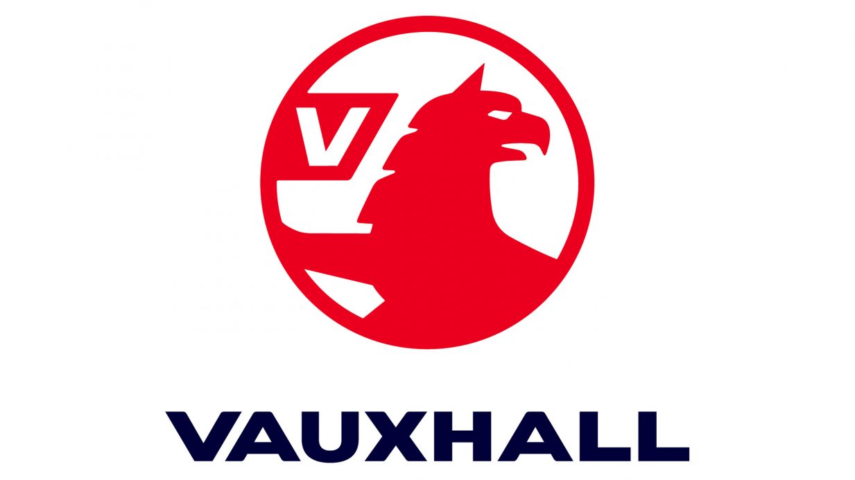
- Three steps earlier was a better flat logo, imo. Cropping out the wings is a mistake.i_monk
- Awful. not that it makes much difference - it's been a pointless sub-brand to GM and Opel for as long as I've been alive. Thoroughly unsexy.Nairn
- The griffin looks like he's turning his head in disgust at the flagBaskerviIle
- Agree 100% monk_niko
- Agree 101% monkdee-dubs
- Needs some detail in the body, too much red. Not that I care, when they’ve just copied Audi and Vauxhall’s are shit.calculator
- Griffin is like, "wut?"sarahfailin
- @Nairn. Pointless?
They sell more cars in the UK every year than Audi, Toyota, Renault, Peugeot, Volvo, Jaguar, Fiat, Nissan... I could go on...Hayzilla - So? As a BRAND it's basically just regurgitating Opel tech. I'm sure Vauxhall do sell well and make the DE owners lots - they're bland. People like bland.Nairn
- Oh, my bad - Opel's actually a French brand now, just like all the other car companies. Thank Goodness for French Gov't Protectionism.Nairn
- People love bland, but they want to think it's upmarket, quality stuff.i_monk
- The 3rd and 4th were the bestNBQ00
- And 5th too.NBQ00
- https://www.youtube.…garbage
- I just wish there were SOME indication of the wing, however minorscarabin
- Never understand opel > vauxhallisaca
- What is vauxhall?milfhunter
- The 2020 Mokka is pretty nice.utopian
- Vauxhall IS Opel you fool.
They rebadge them!Hayzilla - What the hell do you think a brand is, you fool?Nairn
- Cropping out the wings is always a mistake********
- fuck monk, I can't believe i missed your pun
https://i.gifer.com/…_niko