Logo of the Day
Logo of the Day
- Started
- Last post
- 821 Responses
- sted2

- https://i.imgur.com/…sted
- BER to GOdbloc
- i fux wit dizAQUTE
- almost nazisarahfailin
- that is a beershurikensted
- Isle of ManBrabo_Brabo
- totally the owner's ideapinkfloyd
- "ceo button" effectpinkfloyd
- The Mercedes Benz of beer.utopian
- BE ≡ ≡ ≡ ≡ ≡ ≡ ≡ ≡ ≡ ≡ ≡ ≡ ≡ ≡Rmilfhunter
- _niko2
all this weirdness aside, this is a nice logo
- http://orig04.devian…monospaced
- where from?Gnash
- that is nice.dbloc
- not sure article by logosguy above_niko
- ah, it's these guys:
http://www.thedailyb…Gnash - their subreddit https://www.reddit.c…scarabin
- That's Trump's new logo.utopian
- lolfadein11
- feet are a bit cock'n'balls.detritus
- nooey
- inverted yesoey
- monospaced4

- i see a music note, then a fox.Gnash
- same hereKrassy
- Interesting, didn't notice that. Been watching a lot of golf with the master this past week so thought it was clever. Second to the Trojan onejuanluisgarcia
- I see the swoosh, then the food processor. Clever.brut33
- A cat tilting its head with half a martini glass on his face.ORAZAL
- Nice. They need to release the hounds on whoever did the website though.MrT
- Almost posted this yesterday, but the Fox Hills course site I found wasn't using it so I figured it was spec work.i_monk
- wagshaft1
- I actually really like their current logo. Has an ancient coin feel to it.iCanHazQBN
- Allahu Akbarutopian
- iCanHaz, totally agreed.
Old one has more terror in it alsomaquito - It's like it was written in a puddle of blood with someone's finger. Plus looks very primitive. I think it totally works to represent ISIS.iCanHazQBN
- aui
jawj
1010scarabin - should have settled on dick buttzenmasterfoo
- aUI
JgwJ
YOLOBennn - needs more drop shadows and bevel and emboss. and a flare or two. with metal effect.Bennn
- have to agree. their logo is pretty great.Gnash
- where in the logo are the fucking letters ISIS?dbloc
- Needs to be bigger.spunji
- all
jelly
loloface_melter
- i_monk2
New logo for Google Ventures

- not badmonospaced
- Google Vultures I can get behind. Cybernetic, human-devouring, vultures that also tell you flight departure times.face_melter
- aka G slash_niko
- Can see inspiration from V&A logo, but poorly executed.desmo
- +1 face_melterdetritus
- i likeKrassy
- Me likepango
- The logo is basically saying: "we take our cut"riskunlogic
- Awful. Student -esqueset
- i_monk4
- They nailed the search engine; that's for damn sure.ideaist
- For a while there yeah, but it's been kinda shit for a few years now. Quora has SEO'd garbage to the top of every search, Pinterest has ruined image search, andi_monk
- Google itself tries guessing what you meant when you search and fills the results with alternate suggestions unprompted.i_monk
- And you want to search for a product? Here's Amazon first, instead of the product's own page, useful reviews, etc.i_monk
- They nailed (monetizing) the search engine; THAT’s for damn sure.
; )ideaist - It’s now a monetizing enginescarabin
- they're good at monopolyMrT
- Prioritizing Reddit/Quora is relaly going to ruin searches. I don't put any validity in anything posted in either place.formed
- Gnash1

the kerning is off on the new mark
- http://rebrand.c21.c…Gnash
- yeah, pretty loose in the NTUmonospaced
- ^ T H I SKrassy
- Yepset
- They've kerned the T from the ends of the crossbar rather than balancing it visually. Basicset
- CEN T URY 21capn_ron
- this is nice.
http://rebrand.c21.c…dbloc - ^ ya, some of the application is quite niceGnash
- Aka how to make a brand completely generic. Congrats...youre a boring uniform of generic modernization.since1979
- Cunt21, interesting..futurefood
- lol 1979Maaku
- sarahfailin-3
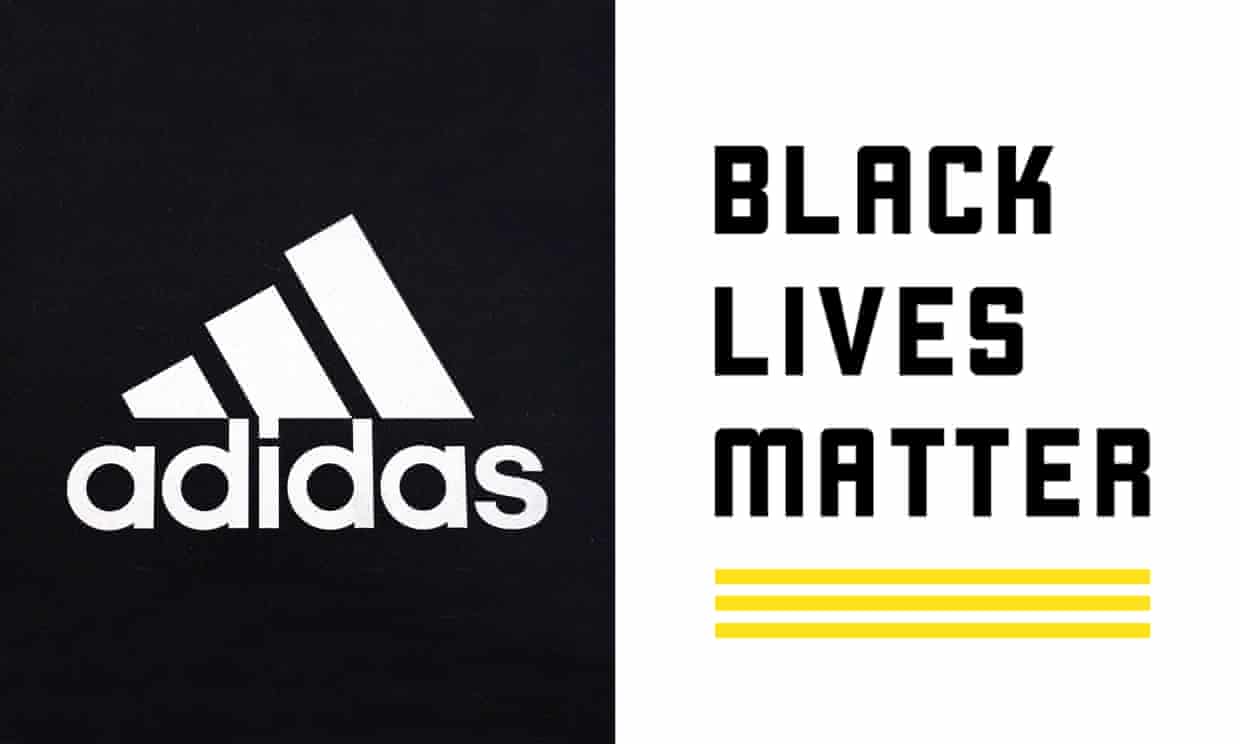
Adidas (apparently run only by white people) finally drops lawsuit against Black Lives Matter for using a logo that has *gasp* three stripes. Only adidas can use 3 stripes y'all, watch out.- Stupid lawsuit. I'm guessing the 3 stripes are 1 for each word.dbloc
- BLM is just giving adidas free publicity. Why would they use such an overtly adidas design?_niko
- This is trademark law. Defend it or lose it, even if nobody would reasonably make a connection.i_monk
- I would imagine it's more about their clothes. they have a pointGnash
- BLM is a business, tooGnash
- how are these the same? they are very not the same.sarahfailin
- Yeah, BLMGNF applied for a US trademark for a yellow three-stripe design that could be used on branded merch like cothes, bags etc.crazyprick
- They are also getting back with Kanye 'cuz they can't sell shoes without him
Chumpsgrafician - three stripes across a tennis shirt or hat would be interpreted as adidas.hotroddy
- *couldhotroddy
- grafician: source?crazyprick
- Just Do Itutopian
- 3 white stripes on black fabric are def Adidasdrgs
- "Adidas lawsuit is an example of systemic oppression and appropriation of a cultural symbol used in the blaxploitation of the urban community" - BLMhotroddy
- BLM is one big scam anyway.milfhunter
- you old white people understand nothing.
the stripes are *yellow* -- they can't copyright 3 stripes in any fashion.sarahfailin - Adidas use those 3 stripes everywhere. It's clearly their brand, no different than the Swoosh.formed
- zarkonite1
Ad Age logo redesigns:
1930:

1950:

1970:

1980:

1990:

2017:

I'm down with 1930 and 1990 personally.
- 1990utopian
- to be honest they're all pretty shittyPonyBoy
- nice use of original g - I like it (latest) and 90.fadein11
- 2020: Adgeset
- 2030: Vadgedbloc
- 1990milfhunter
- 1990. 2017 is ok but the 'd' looks out of place slightlySunSunSun_
- 2017 looks more 1970canoe
- full circlesarahfailin
- jagara1
Not great, but so much better than the old one:


- KNKrassy
- it looks great on their vehicles_niko
- it's way too big on the vehicles.
"make the logo bigger" was at play . LOLKrassy - It's been quite a big rise for Kia over the years. Some of their latest models are tidy as hell. Vast improvement on brandingIanbolton
- KИwhatthefunk
- I like it. Certainly one of the better auto logos out there. Look at GM for fcks sake!formed
- KoreaИdbloc
- killed in actionzardoz
- worst logo on a cardoesnotexist
- ^ second worst behind CadillacKrassy
- https://cdn.motor1.c…
vs_niko - this https://www.autotrad…_niko
- _niko-3
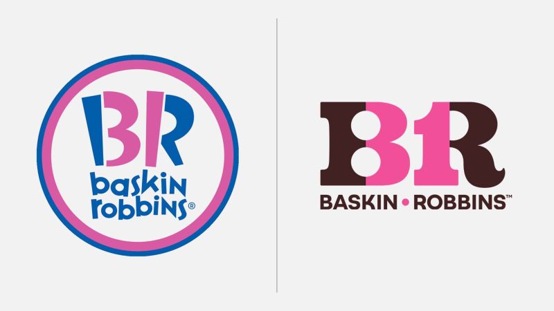
- Funny, I remember posting the new one on the left a few years agofooler
- new one's not an improvement but I do prefer the chocolate to the blue_niko
- Not a fan. It's lost personality and isn't very well resolved. Always wished it was Robbin Baskins.MrT
- The old one did a better job of disguising the 31 also felt more appropriate. New one feels 70s and the 3 & 1 are too conspicuous and also nasty letter formsBaskerviIle
- Looks too forced and not as fun as the old one.dbloc
- The 3 bugs me but i like the color schemescarabin
- 8RKrassy
- 8KKrassy
- I don't like the circle but the type is fun. New one is too corporate.doggydoggdog
- old one was OK and appealed to the right (kids) demographic just fineKrassy
- the old one was all right! Why does company changes their logo all the timeBennn
- I like the new one over the old one.MondoMorphic
- The new one feels more like their old brand and less like shit which is what the last logo embodied.monospaced
- I feel late to the game here, but I only just now noticed the 31 in the first logo..autoflavour
- HijoDMaite0
They even bit off the Dodgers logo. smh..
Everyone pissed here that we lost our team. Whatever, I kind of like the logo and will still be a fan until we get a new team.


- they'll leave LA again and go back home just like the Raiders_niko
- well LA was their original home so..HijoDMaite
- how much was spent on that shit logo and who did it?dbloc
- that's just FUCKED that they left SD. I mean so they have the Rams and Chargers? I don't get it.vero_vandal
- hmmm.. i dunno dbloc where have i seen that lightning bolt before... :)HijoDMaite
- LA CHODGERS?HijoDMaite
- LA Dodgers +
Tampa Bay Lightning =desmo - https://pbs.twimg.co…chukkaphob
- the old chargers logo looks like a wigmonospaced
- http://i.imgur.com/F…HijoDMaite
- lol @ hijodbloc
- Cripsdbloc
- http://www.msn.com/e…dbloc
- Good, fuck the owner. We aren't paying for that stadium. The NFL offered him 300 million help his costs. Relocation fee? 650 million. fuck that guysofakingback
- BOO. I love the Chargers identsince1979
- Spanos is an asshole. I'm on the fence and this logo and whether I still follow them. The darker blue is a welcome change.voiceof
- i_monk0
Saw this over the weekend at a few wineries. I like it.

- besides the bottles, why relevant to Ontario? Many flowers there?
digdre - bland and uninspiring.Amicus
- The letter O would be a place to start.i_monk
- More gooder than the Microsoft logo.utopian
- also forms a sun. Out in the country, sun kissed grapes etc_niko
- I haven't seen too many purple suns.Amicus
- The negative space forms the sun. Is this amateur hour at qbn?i_monk
- bitches like to bitch, or simply bitches bitch.albums
- what's seen can't be unseen. nice negative sun. Type is bland and uninspiring though.Amicus
- its an O? hmmmwhhipp
- ™ that bitch.MrT
- Type is bland and uninspiring in EVERY brand, it seems lately.ETM
- an O made of bottles that turns into a sun and I still think it's weak? fuck am I jaded.monNom
- Just as wretched as the wines they represent.Continuity
- besides the bottles, why relevant to Ontario? Many flowers there?
- utopian2
Finally!

- was the top one ever really used?? or is it all just a joke?Krassy
- Our job is done here. A better tomorrow has begun.monospaced
- Ribbed for your terror.garbage
- lol @ garbage.Wordsworth
- yes, it was an actual logoutopian
- legend is that they wanted it out but it got stucksted
- It took me a while to figure out what they were trying to show here. The penile intrusion is a strong image to overcome. It is most powerful.CyBrainX
- Salarrue4
- Yeah mate we know, it' on the front page
https://qbn.com/repl…grafician - Also not a rip, just a coincidence, it's very hard to come up with fresh simple geometric logos these days, as most of them are already donegrafician
- TYutopian
- Mastercard ripped off the Olympics!nb
- @grafician stop with this self-appointed judging. you're nobody here, well less than nobody.sted
- Sted stop with this self-appointed judging. you're nobody here, well less than nobody.grafician
- there is a huge difference between you and me: i'm not a lair.sted
- uhm then who are you again sted?grafician
- just to recall the recent ones which can be interesting in this case: i'm the one who made yurimon leave, and kicked out jazx from here.sted
- yeah I see TYdbloc
- so sted are you QBN's bouncer then?
uuuuuhgrafician - seriously now, sted man are you okay? act your age or something
stop with all this shitty bickering alreadygrafician - bickering is a word you just learned from pr2-s post in the blog thread, that's how simple you are.sted
- and nah i'm not a bouncer, and i don’t write things down for no reason.sted
- TY vs IAutopian
- Yeah mate we know, it' on the front page
- BaskerviIle3
Had a quick go at redrawing it geometrically...it was bugging me

- the wifi lines/waves still looks hand drawnutopian
- the geometry is much betterutopian
- it's weird how your eyes mess with the geometry. I blame the rounded terminalsBaskerviIle
- Good work.
But now it's fixed, it's entirely generic.Nairn - Still looks like someone paid 3$ for it on Fiverrrgrafician
- *shrug.
Question for you all - you recognise the logo, right?
If so, it's done its job.Nairn - I mean ffs, what the hell is a 'spotify' anyway?! ;)Nairn
- Let's be honest though. Any logo can become recognizable with enough marketing bucks behind it. That's not a fair assessment.dbloc
- Let's be honest - most punters don't give a shit. Remember the old GoDaddy logo? How long did they use that for? It's a fair, if a bit bleak, assessment.Nairn
- I'm still shuddering from the implications of that supposed Art.Lebedev AI experiment.
Any shit goes if you want to make it.Nairn - I worked at a big brand consultancy back in the mid 2000s. Daniel Ek came to give a lunchtime talk about the newly started Spotify, we all got free accounts.BaskerviIle
- We paired him up with Citroen, one of our big clients, and they made a deal to give free accounts for streaming music in their cars.BaskerviIle
- you poor bastard - all that time and you're having to stare at that 3°-whatever offset, hahaha. very good!Nairn
- The old GoDaddy logo was done by the fuckin owner from I recall, that's why it stayed so long onlinegrafician
- @Nairn yes, it did the job alright, to piss off designers! They could've made a fortune out of me, but chosen Apple instead to park my subscriptions moneygrafician
- ..be..because of the logo?
If so, I suspect you might be an outlier.Nairn - nice try, but the convergence doesn't aim at the center, and until it does, it will always feel wrongmonospaced