Logo of the Day
Logo of the Day
- Started
- Last post
- 820 Responses
- shapesalad53
Pentagram's new QBN Logo:

- Is that Impact?NBQ00
- at least it's not redundantformed
- Impact and Arial ~ the finest font's known to man.shapesalad
- qbn gods should let us "design" the upper left QBN every month or so. this would be a winner for sure :)renderedred
- This is magnificent.Continuity
- haha. nice oneGnash
- approvedsted
- hahah great!yuekit
- perfect! bravo! hahahKrassy
- Are those dogs the first entry to Pic of the Day?CyBrainX
- First surviving entryyuekit
- I fuckin love you guys. ty shapesalad for making my dayArchitectofFate
- this is amazingBennn
- QB bunch of dogs disguised for halloween N QBN FOR A BETTER TOMORROWBennn
- hahaha! wow!oey
- lol, shape... I spit coffee on this one :)PonyBoy
- What was the first pic in the pic of the day?fooler
- A.M.A.Z.I.N.Gtrooperbill
- yes from pic of the day, before I signed up to qbn, I was forever seeing that image.shapesalad
- Top shelf.dablammit
- HAHA!bezoar
- it stays.utopian
- fucking yespedromendez
- how much?umbee
- This should be a T-shirt.monospaced
- 52likes, can it be beaten?shapesalad
- drgs22

- whoa! nice!Krassy
- i am not sure about the type choice for tokyo but that mark is absolutely wonderfulcolin_s
- Nice but once you see the 22, that's all you see.dbloc
- Nice but once you see the Olympic rings, that's all you see.
Oh, sorry, were we being serious?zarb0z - 20200, they're booking this shit way in advance now.zarkonite
- why not this type choice for Tokyo? Not a massive fan of this design but not because of that!MrT
- Dinmaquito
- Interesting concept, but looks dated...
Maybe because of the colors.
And DIN for Tokyo? idkgrafician - TOKYO too small. Otherwise, boring, too obvious.SoulFly
- My inner art director cries for an “oriental handwritten, even better if those svg fonts” for “TOKIO”, and make it 200% bigger. Can you have it like in 5 min?”maquito
- Now, seriously: I REALLY like the contact between the yellow circle and the black circle created by the O shape of the black “2”. THAT precise spot makes it.maquito
- And also seriously, why isn’t that happening between the first two? Ahhhmaquito
- fugly!!pablo28
- I like it. Like the small type too. Anyone who's been to Tokyo (or Japan) will know they love their little utilitarian details on the most random ephemera.de4k
- @de4k with you there. Some may not be a fan but it's a very Japanese approach... so fitting without hitting up the clichésShaneHolley
- i really like it. thinking of how watered down these marks usually get, this is impressive.sothere
- it's a definite like from merenderedred
- ooooo<<Tokyoshapesalad
- nice idea, sadly it doesn't work and should have been cannedhans_glib
- nice idea ... works perfectly and great final selectionmonospaced
- I like the simplicity of it, but it does seem to sedate for what I think of with Japanese design. Can't wait to see how it works with the other design elementsMelanie
- Like this better than the two official ones._niko
- It's gorgeousrobthelad
- utopian17

- *shoots gun in airHayzilla
- *spitsmaquito
- *gives this shit the fingerContinuity
- *shits pantskingsteven
- *guns the engine on my coal-powered life-size Hot Wheels truck and fistfucks a grizzly bear.face_melter
- *shits kingsteven’s pantsscarabin
- *spits
loads an upper deckermoldero - I can't believe you've done this.garbage
- *Bares toothless grin
Quue-ee Bee-e ee-enNdrgs - Qnon B*tches Networkoey_oey
- pew pew pewneverscared
- "Freedumb for All or
Freedumb for None"utopian - :clap:dorfsman
- Shoooo weeee!scarabin
- I want this on a hatsarahfailin
- *unzips flydmay
- *calls the shitpolice on kingstevensted
- I am the shit policekingsteven
- I am Sheriff Shit Slacks.CyBrainX
- *farts the national anthemAkagiyama
- Q Broadcasting Networkoey_oey
- *** air horn blasts ***monospaced
- *rolls coaljaylarson
- These notes are toxic.
: )ideaist
- utopian18
- Yes! Other proposed names were Whales, Sea Lions, and Firebirds(?).garbage
- That's a really nice site, showing off the crafting of the logo etc. Love the tentacle and eye.BaskerviIle
- Would of been better green imo, go full kraken.thumb_screws
- Perhaps a dark teal color instead of the pastel aqua.utopian
- Main logo is pretty good but that secondary one is perfect_niko
- Yet more cultural appropriationGnash
- @gnash lol what? The Puget Sound is home to the largest octopus species in the world. It's spot on.garbage
- so americanmilfhunter
- Wordmark’s not great tho, is it?scruffics
- Why did Trump allow this?deadsperm
- Will their arena be called the Kraken House?BaskerviIle
- I don't think Kraken Rum has enough clout to buy the arena.deadsperm
- Seattle CRACKERS would have been more appropriate in these sensitive times.hotroddy
- Lets-Go Crak-ass!hotroddy
- @garbage - Kraken is from another culture’s mythology/religion. Why ok to take from one culture, not another?Gnash
- Because the culture it's taking from is superior not inferior.deadsperm
- As long as there are guidelines !Gnash
- There is feeling of mediocrity written all over this identity. The mark was created by Adidas's in-house team team.utopian
- It's not as much a cultural icon as a matter of language evolution. Kraken is an old norse word from many cultures, not really a cultural centerpiece for anyon.monospaced
- Did they get the Greek community's approval?i_monk
- Kraken were named by Viking sailing into warmer waters and seeing giant squid. The Seattle Squids.BustySaintClaire
- why no just "Seattle Hockey Team"?fooler
- Greeks called it something else. Mono, you have zero idea what you’re talking about. As usualGnash
- You can criticize the name, but you'd be missing the forrest for the trees. Professional sports have so many problems.nocomply
- As far as the branding work, I personally think it's great! The anchor in particular is pretty brilliant.nocomply
- I meant *forest. Not, you know, Forrest Gump.nocomply
- I like the colors too. I thought green would have been a more fitting highlight color than red. But maybe that's because the Canucks have green and blue too?nocomply
- Do you really think the logo/mark is great?utopian
- @gnash Not that you had a point to begin with, but you obviously don't know the Scandinavian roots of the city.garbage
- https://www.naha.sto…garbage
- Not that you'll read it, of course. I know you were just doing your usual make-believe at being smart bit.garbage
- I like the look of everything, I just think the name itself is kind of dumb for a hockey team - or any sporting team.stoplying
- Lol at the cultural appropriation comment. *facepalmETM
- LOL at the "Lol at the cultural appropriation comment. *facepalm"
facepalm._niko - Seattle Karen'sBonSeff
- Of course I didn’t have a point to begin with. That was the whole fucking point - to begin with. Thanks for helping make it for me, geniusGnash
- The wordmark is pretty shit imo. Looks like someone just took a shutterstock badge vector pack and changed the textcultmethod
- Yeah. The Greeks called it something else. I didn’t bring them up and their culture isn’t appropriated. Derp.monospaced
- Why insult me? I happen to know quite a lot about MY culture I’m speaking about. And it’s etymology. How am I wrong or not know what I’m talking about???monospaced
- Because facts. Why so sensitive about insults? You have no problems flinging them about to othersGnash
- The only person being sensitive is you when you're called out for being a moron.garbage
- I'm stoked because there are already the following nicknames: Fans will be Krakheads, and they play in the Krakhouse.garbage
- Kind of the way Hawks fans don't refer to Century Link as Century Link, but the Clink.garbage
- And how Trailblazers fans still call it the Rose Garden.garbage
- What facts am I an idiot for not knowing? I'm only sensitive to insults when they're undeserving. I don't insult you.monospaced
- The word "kraken" isn't tied to Greek culture. You're thinking of Clash of the Titans perhaps? That movie gives the impression it's an ancient greek thing.monospaced
- It's just a Norwegian word, and it's not a culturally sensitive symbol.monospaced
- @mono I was talking to Gnash.garbage
- I never said that the worD Kraken was tied to Greek mythology.Gnash
- No, you just made some bullshit attempt to complain about cultural appropriation, and I corrected you. I never even talked about Greek mythos, you dimbulb.garbage
- "Kraken is from another culture’s mythology/religion." Which one?monospaced
- Since we had covered that it's just a Norwegian word and not cultural, mythic or religious, I assumed you were referencing Greek. My bad.monospaced
- It's all gravy baby.garbage
- Gnash7

- https://www.itsnicet…Gnash
- I like itFax_Benson
- WTF. This is just the worst.MondoMorphic
- That's hilariousset
- more flash then substance, imodesmo
- Saved by the BellDRIFTMONKEY
- I like it. Could make some good animated versions too. Referencing Kandinsky?PhanLo
- that little detached square on the left is the crimean peninsula http://ontheworldmap…sarahfailin
- it's nice thatMilan
- the application is fun.Gnash
- def Saved by the BellRamanisky2
- nice logo, preppy!PonyBoy
- looks like a toddler dropped all his toysdbloc
- https://assets.itsni…dbloc
- @dbloc did you just assume the toddler's gender?chukkaphob
- looks like an 80s music video nightmareGuyFawkes
- a birds eye view of kitchen utensilspinkfloyd
- I like it. Brutalist style. Technically it is a bad logo thoughCalderone2000
- Did RUSSIA need a logo?microkorg
- el lissitsky is turning in his gravehans_glib
- cuntstructivistkingsteven
- i think the term is suprematismdrgs
- Wtfnotype
- https://www.undercon…set
- applications are superb. Just v.odd alone.fadein11
- brave and suiting. why so much negativity here?SimonFFM
- I absolutely love it, and love its application design. If you hate the colors, its application usages is far greater than just the application.ElephantMark
- ^ yupGnash
- Yeah the clipped imagery in the shapes works super nice. I like the extreme kerning too.robthelad
- To the above, whom said its technically bad as a logo. Not really a brand mark is about memorability the shape becomes memorable, and in a similar way as Nike'sElephantMark
- suprematism, man. kandinsky, el lissitzky, et al.doesnotexist
- I think (hope) everyone knows what it refers to.fadein11
- Very Russian. Says "Soviet era" all over it, Y'all mad because you didn't think about it :)Maaku
- Very fittingpango
- Fitting yet terrible.garbage
- (i think most do, fadein)Gnash
- I like it.cannonball1978
- most yes but not all it seemsfadein11
- love itsinjun
- i_monk21

- cooldbloc
- Nice use of space.Sellies
- i love it at first, then something seems off, then i really like it, then it bugs me... but it's certainly eye-catchingcolin_s
- You'll get sued by &Walsh, broNBQ00
- designers love making use of an ampersand thats for sureinteliboy
- would of the dayAQUTE
- I dig it.Continuity
- i like itrenderedred
- NJX E KPXoey_oey
- elegant designRamanisky2
- wirx for mestoplying
- Nice, amazing this actually works!Chimp
- It’s made of chocolatemaquito
- set0
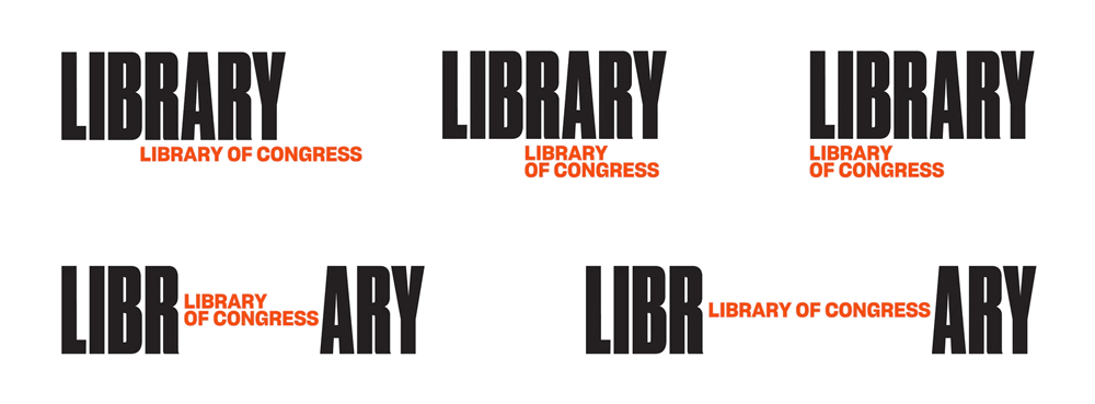
Library Library of Congress. I wonder how much this cost then?


- (by Pentagram)set
- yeah, that's just unpleasant.Fax_Benson
- not to say lazyhans_glib
- ive seen this design trend to muchmilfhunter
- library library of congress - so good they named it twice?trooperbill
- you guys love to shit on pentagram. but this is rather average...inteliboy
- and yet again I scratch my head and wonder how they became such design Gods.formed
- https://uploads.disq…mort_
- selling concepts, applications and longevityumbee
- They pander to the ego of the MD/CEO..."Have you seen our new identity? Pentagram did it".Morning_star
- The original one is classic. Why even fuck with it? Plus the Pentagram ones look like some amature randomly found some free fonts and stock photos.fooler
- Looks pretty boringTaschen
- I knew this was Pentagram just by looking at it.monospaced
- you have magic eyes?Taschen
- i'm starting to assume every boring logotype for a big brand is pentagramTaschen
- http://i64.tinypic.c…monospaced
- links not workingTaschen
- works finemonospaced
- This is ulgy.
Awful font choice.
Fail.
Nope.Bennn - there's nothing on there monoset
- this is such garbagecolin_s
- Like the idea - the application sucks donkey balls. This is the absolute worst example of motion design. Lazy type. Lazy everything. It'l be changed in 2 yrs..RumperChunk
- Are they just churning out the same design? https://www.pentagra…Hayzilla
- so weird ... when I click I get the tiny url image I made :)monospaced
- Who uses tinypic anyway.
imgur.com !set - There was a very similar execution recently for British museum or something like that?Hayzilla
- even if you go for a type based identity, at least don't use a boring generic font.renderedred
- imgur wasn't working for me, I think the firm firewall is blocking uploads to itmonospaced
- We have a thread just for this
http://www.qbn.com/t…i_monk - https://pli.io/kuq8n…monospaced
- There are so many reasons why that original one was great and smart, and why this new one sucks.nocomply
- at the very least it will teach the philistines the there is an "R" in the wordGnash
- LI VIOLON BRARY LIBRARY OF CONGRESSBennn
- LIBRA Dorothea Lange RY LIBRARY OF CONGRESSBennn
- LIBR FLOWERS RARY LIBRARY OF CONGRESSBennn
- LIBR LIBRARY OF CONGRESS ARYBennn
- Thanks Bennnnmonospaced
- I'm starting hate it less the more I look at it.Taschen
- the |'s in the B R A R are annoying and forming a face.shapesalad
- I like it, it wont last more than ten years probably but its nice for now.wordssssss
- This is shite. Pentagram UK were deserved legends in the early days. Once they expanded in the early '90s the design diarrhoea kicked in. IMHO.MrT
- it's drearingly uninspired and contemporarydocpoz
- the one with the violin, kerning is horribleTaschen
- Its very bad. College students would do better.Bennn
- /\ College students are doing better.ben_
- Wait... are those flowers?DRIFTMONKEY
- I wonder how they sold this through. They must be masters of spin. Could have had a decent rationale behind it.inteliboy
- Fucking hell, this really is revolting.Continuity
- BOND. JAMES BOND.Krassy
- Design by cocaine. Or yoga.PhanLo
- ans must have cost like 300-400,000$ or moreBennn
- Oh, yeah, they've got the sales down!! The big difference in big buck brand development is selling it.formed
- this is an act of treasonimbecile
- LO L̶̪̿͒̀͐̏O̶̦̱̬̱̔͛̿̉͊̉... ̸̧̧̡̨̻̱̼̮͎͖̥̞̀͝I̵͎̞̳... VE IT!chukkaphob
- ^ whoa!Krassy
- milfhunter5
- unimaginative derivative tired clichéhans_glib
- some parts i like for example the helmet prints. But i think the logo will not work on digital platforms where you should think about responsiveness etc.milfhunter
- I used to work for the agency who did the previous F1 logo. This new logo on first sight looked like an "A" or "FI", and I also agree with both comments above.matski
- it's shit
(view expressed as a 30yr+ F1 & Ferrari fan)Bluejam - I don't even know what I'm looking at, but whatever it is, it does seem dated.MondoMorphic
- I don't hate it. And I don't watch F1.stoplying
- Loving it. Totally reminds me of probably all racing games made for consoles. Custom typefaces are also a nice touch although I don't get the E in F1 Turbo.rabattski
- I like it. I'm aware any new logo by anyone for anyone will get 90% negative criticism at first.CyBrainX
- It's good. And works well in applications. Lets see it next year in use, because fancy mockups are always a bit misleading.tank02
- Brett Brashutopian
- God, you are a bunch of hateful, petty and envious people. I think it looks great, esp. in action. Crying about responsiveness, jeezuz what is wrong with you?mekk
- You wedding card designers think you have to give your stupid opinion on everything, don't ya?mekk
- It's not so much that I hate it, it's that I really, really liked the previous one and didn't feel like it needed updating. But I do kinda hate it tho hahaSteveJobs
- Btw, I follow F1 and watch every qualifying and race session including build-up and post-quali/race commentary, so not just a casual complainer.SteveJobs
- sry 4 my rant, luv you all but we all need to be a little less of a designer cunt when reviewing our colleague's work.mekk
- found this on the net ...
"The logo with a proper racing line."
https://i.redd.it/rr…Bluejam - I dig it. Although as someone who races bikes I hate what F1 does to the tracks. (The hard braking in corners makes ripples in the track surface)GM278
- I like it.cannonball1978
- Looks like it's been designed by the same people that have made the sport unwatchable since 1997.see_thru
- Funny...if you think that the logo looks like shit...which it does, we are envious.utopian
- I like it. They have definitely been looking at the past work of the designers republic though.Bullitt
- I don't give a shit about racing. But great improvement on the old one for sure.Miguex
- I thought of D Trumpdrgs
- I think we all think about trumpster, not related to this logo though hahaMiguex
- Are the new kids they're trying to attract still into Wipeout? It feels about 15yrs off. And that display face does *not* work well for the broadcast graphics.Nathan_Adams
- better than the last one. still shit. I didn't do anything better either.oey
- like it. reminds of wipeout.inteliboy
- It's bad ass. I'm all for it. Looks sick in use too.sofakingback
- @mekk welcome to qbn. go fuck yourself if you don't like to discuss designmilfhunter
- I like it.i_monk
- Can't decide if I hate it or dig it, but I do know that I'll never contact w+k for a design job.ArchitectofFate
- Says one that calls himself "milfhunter", member since 2015mekk
- @mekk What the fuck did you just fucking say about me, you little bitch? I’ll have you know I graduated top of my class in the Navy Seals...milfhunter
- @mekk ive been lurking this place since 2009. and that doesn't make a designer with a opinion more special.milfhunter
- I graduated top of my class in the Design Sealz. Probably not the same thing... but brothers! amirite??? guise????sofakingback
- I graduated in the same class as Seal.Hayzilla
- I like it. Although would prefer something to make it more identifiable as a 1 not an I.Hayzilla
- I like it..set
- As a designer I can't help but give my opinion that the weight of the gaps inbetween should be slightly heavier... But I like itset
- This is trash, and F1 is so boring now that I can't even watch it. MotoGP or touring cars.section_014
- Watching people drive in a circle is boring no matter the brand.i_monk
- grafician11

- new one is the classic burger king isnt?sted
- Reversion; finally! LOVE IT!!! 70's porno style.ideaist
- The burger bun color is just weird.utopian
- yup, you might be right: https://www.ibtimes.…grafician
- front page? that was quick lolgrafician
- but yeah, this looks really yummy https://www.undercon…grafician
- All logos should revert to their most pornographic style.garbage
- Lol @ elitist grafician not knowing the new logo is their classic logo.imbecile
- @imbecile being an elitist as you say would imply not having anything to do with trash like fast food including burger king, mcdonals etc.grafician
- It’s so cute when you learn about things in America all American know already and then post it here to romaniansplain to us.monospaced
- The new logo was what we all grew up with decades ago.monospaced
- Would you like to know more...
https://www.jkrgloba…duckseason - If only Burger King would actually flame broil the hamburger. You know that only one side of the burger if flamed broiled...with fake broil lines.utopian
- @mono so cute to think I give a damn about burger king, I just posted because it was on design twitter lolgrafician
- and ofc as usual you guys are way behind everything happening in the world, that's why I keep updating this shitgrafician
- @grafician what if we all saw it before you noticed on that design twitter, decided not to post because it wasn't worthy and/or wanted to wait for the rest?sted
- @sted yeah this is me with most content on QBN all the time, don't kid yourselfgrafician
- MehAQUTE
- Lovely. Gorgeous curves. It’s chubby, like you and I. +1maquito
- Not Pentagram?! Whoa!maquito
- My first job was at Burger King. After my 1st day at work, my dad drove me from BK to the theater on the day the Empire Strikes Back came out.CyBrainX
- @graf we all have the internetz man. relax!renderedred
- now i need a whoppersandpipe
- https://twitter.com/…HAMT
- lol, you didn't know anything about the BK logo until you posted this though :)monospaced
- two buns and a lot of ketchupdpi
- @HAMT LOLsted
- @CyBrainX what a memory!Krassy
- @mono lol what? you mean this mix of Dunkin Donuts typeface and McDonalds colors? Uuuuh boygrafician
- I thought the reduced version that just reads "BK" was super clever.bulletfactory
- Projectile13

- It's not even 'aesthetics' it's overly-rigid brand cohesion.Nairn
- ^thisSimonFFM
- People sure have a lot of time and energy to complain about “free”. “Oh no! Gmail is worthless now that there is a new icon!”imbecile
- I was one of the people who whinged about the gmail icon change a couple of weeks back - purely because I thought it, and its loading anim, were pretty good.Nairn
- Its visually very bad, having all of them on one page on your phone isnt instinctive when you need to spot a specific app.Bennn
- I installed Nova launcher just to change themBennn
- exactly the comment i've made in the previous postmilfhunter
- It's too bad they are stuck with this horrible clownlike color scheme.yuekit
- It’s too bad people feel compelled to complain about global branding. Snapchat logo change caused the same fuss.imbecile
- ^ snapchat's a single logo. This is a whole suite that look identical at a glanceProjectile
- are you justifying your indignation? camera and calendar are somewhat similar, other than that, wholly different and not worth whining aboutimbecile
- They're not great, and they're not inspired, but if you fall into that last group you should take a cognition test to make sure everything is okay with you.ben_
- Is whinging about whingers any more useful?Nairn
- I find it much harder to quickly select the right tabs for Mail, Drive and Calendar now. Frustrating because we use it for work.monospaced
- not sure about whinging but I am sure this is still a design forum where designers discuss design-related things to dev as designers, agree it's 'overly-rigid'prophetone
- ^ exactly what Mono said. They should have worked more on color coding their app suite instead of using the same full palette for all icons.brandonp
- if you have to do a double or triple take to distinguish between these products, and still feels uncertain during the click then probably a little overbaked?prophetone
- I'm not whinging about you guys. I just find the graphic a bit hyperbolic. On my phone they seem easy enough to "get" what with the app name below and all ;)ben_
- Google Blows Ass!utopian
- that's true.ben_
- https://twitter.com/…prophetone
- THIS IS A DESIGN FORUM. WHINGE AWAY.inteliboy
- @ben_ if only we ONLY used phones. But in most cases, these icons live as 3mm icons in tabs that people need to access and reference regularly with a tiny arrowmonospaced
- also, easy enough is not good at all, considering it was EASIER before, and could have been further made easier. They went backward, dudermonospaced
- They remind me of plaiddbloc
- I like it better than adobe’s “initials” iconsscarabin
- milfhunter1
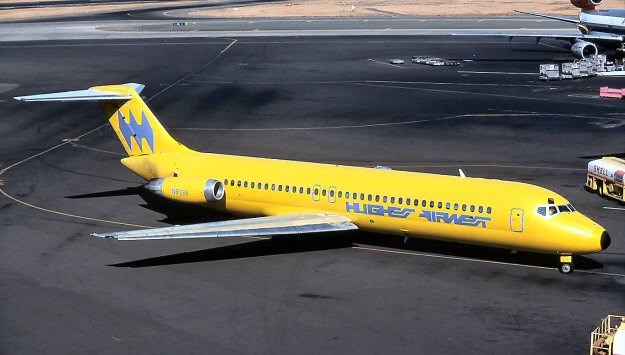
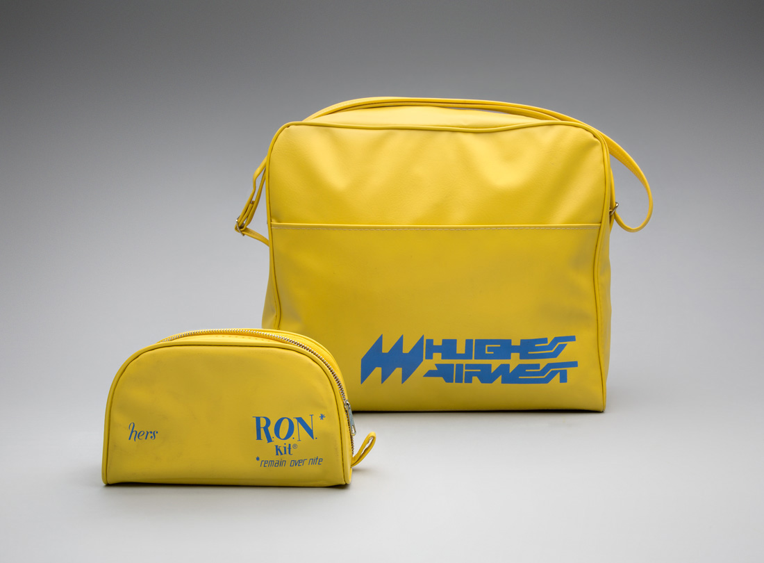
Hughes Airwest by Mario Zamparelli
- wow, that's....shitscruffics
- You are shitmilfhunter
- what scruffics saidoey_oey
- what milfhunter saidoey_oey
- what oey_oey saidIanbolton
- what Ianbolton saidutopian
- I can’t unsee the Batman logo on the tail wing.Green_Pork
- I kind of dig it. It’s like when AI is trying to make letters but they come out all gibberish. A brand before its time.monNom
- what they saiddee-dubs
- The Hughest, the biggliest, the airwest.
— RonNairn - what utopian saidKrassy
- Slight Wipeout vibe(s).ideaist
- I think this was great back in the day and it looks kind of cool now. Or everyone's just biting the style from that era now._niko
- Feels over designed — a bit of cleanup and it would work better. But good luck with that word mark at small sizes/pixels.evilpeacock
- there were no smaller sizes/pixels in the late 60's they didn't even have to worry about yo fax! lol_niko
- there is not a way in which this is NOT shitscruffics
- what Krassy saidsted
- WIPEOUTcrazyprick
- If batman did a hostile takeover of QFC.garbage
- Late 60's small sizes = heavy dot gain killing fine details.evilpeacock
- What yurimon saidmaquito
- Na, i likes it, 4 realzmaquito
- If you said to me that it was made in 2001, I would have believed itdrgs
- What I don't get here is the bat symbol on the back of the plane is not the same logo as on the larger yellow bag and the smaller yellow bag is the same colorsCyBrainX
- ...but completely different type and logo.CyBrainX
- That is ass that makes the shit, nice swedish colors thoughAQUTE
- that looks bananapango
- Highest Air Wet?sab
- AirwolfCalderone2000
- This is neither WipeOut or particularly good.MrT
- Bluejam10


For Iceland.
New visual identity for the Icelandic national football team.- a bit complex for a logo but i likes ithans_glib
- think i prefer the 4 separate idents.
did smile at the designer going nuts in applying the logo to anything and everything ..Bluejam - nIceMrT
- dope !neverscared
- Icelandic Voltron.thumb_screws
- Nice!fisheye
- me likeysrhadden
- Looks like logos for decepticons and autobotsdee-dubs
- BEAST WARStank02
- I dont like it. I think it looks incoherent, overly stylizedcannonball1978
- I love the complex symbol as well as the mockups created for the brand campaign...but I'm not fan of the typeface used.utopian
- NS logo vibesmilfhunter
- would make a lovely stamp on a sand ashtrayKrassy
- nicested
- I would take either of the left two in the bottom image but that clump of chaos is a meaningless pile of lines.CyBrainX
- bit of a nightmarewebazoot
- Krassy0
New Skrillex logo by Aphex Twin logo designer Paul Nicholson


- https://i.imgur.com/…utopian
- What am I missing with the "ILL"?bezoar
- I remember my first attempts at graffitiAQUTE
- "Ill" as in "cool" or something?
Nah...grafician - Hmm.jagara
- Nah.jagara
- this is badmilfhunter
- ILL SKREXoey_oey
- Shitebabydick
- Should have just used Skrillex's haircut for the logoyuekit
- Imagine being the guy who’s only known for the Aphex logo. The pressure must be unbelievable! This is wankIanbolton
- Hello 2003NBQ00
- Or 1997NBQ00
- def 2003.garbage
- Interesting grid. His unique style balanced with legibility. It’s actually good experimental typography and fitting for the client. Haters gonna hate.monospaced
- without visual reference to any 'grid' I'd of had zero clue the 'designer' wasted their time in an epileptic fit w/the fucking guidelines—this is kinda awful <3PonyBoy
- Just cause you throw lines on it doesn’t make it a grid. Feels like Bitcoin charts validating with the trend lines or whateverwordssssss
- This what happens you end-up with when don't go to design school.utopian
- ^ almost a haikumonNom
- Eh. As long as he got paid, looks like a mid-tier Büro Destruct rip to me.face_melter
- still better than the usual crap that is floating around though..neverscared
- I don't like the post hoc bullshit made up grid rationalisation and the counter in the R but otherwise I think it works well.
*shrug*Nairn - well it's quite close to the original logo. just made more odd. is Skrillex still a thing?shapesalad
- Oh dear lord, I just googled the old logo.
Guise, whatever your thoughts - this is a fuckign masterpiece by comparison.Nairn - Awfulscarabin
- It's like a graffiti mural 1.0 sketchstoplying
- Well... he sure made thataliastime
- The "fake grid" is not even accurate or complete. Haters Gonna Hate, LOLutopian
- This what happens you end-up with when don't go to design school.sarahfailin
- https://searchlogove…sarahfailin
- milfhunter6
- I don't get it. It's flags in a circle right? But why?robthelad
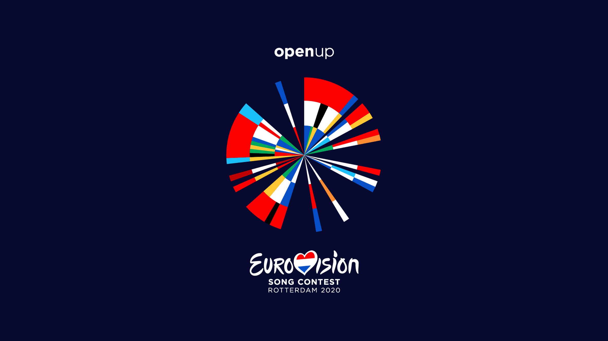
- @robthelad
https://static.dezee…milfhunter - The flag circle? Not really a logo. But I like it. Countries that have won more get a biggest slice?thumb_screws
- i like it!renderedred
- it reminds me of the old logo: https://i.pinimg.com…renderedred
- I like it !spl33nidoru
- Very nice dude. As a Brit I resent the Eurovision obvs but this is nice work none the less.Hayzilla
- What part of it did you do and how many more people worked on it?NBQ00
- Why, as a Brit, do you obviously resent the contest, Hayzilla? Asking as someone who has never watched it... .Nairn
- The old logo looks like contemporary design.sinjun
- @renderedred nice! yeah we took that as inspiration for the background. not included in the current design https://static.dezee…milfhunter
- NBQ00 did the the concept and visual part more or less with 1 other designer but a bunch of other people worked on it as well. Was a team effortmilfhunter
- why is Slovakia missing?kap0r
- Estonian flag colours are in the wrong order, but I haven’t check other ones to see if it’s intentional. Lovely otherwise.scruffics
- Very nice. I like the collaterals too.
The only part I hate though, is the Eurovision logo that ruins it. Why a Pepsi logo inside the heart?nbq - Cool direction but I can’t help feel it could be simplified drastically.monospaced
- Even just removing the numerous duplicates would help in that. You might end up with a mark that was but a fraction of the slices in the pie.monospaced
- And when you append the Eurovision logo right in the center of this logo it gets quite busy. Couldn’t you just typeset Eurovision?monospaced
- is openup a third logo in this collage?monospaced
- BTW Milf. Looking at your agencies site. I get the home text overlaying on every page! Mac/Chrome.
https://i.imgur.com/…Hayzilla - Is there a BW version of the logo?desmo
- @Nairn I'm a Brit who also thinks Eurovision is a load of tripe. Not sure of a broader reason. That aside, I like the logo and give it 12 points.MrT
- @hazyzilla, i know. that text effect is horrible..milfhunter
- @MrT haha thanks!milfhunter
- haha, +1 MrT :)Nairn
- Great work. The executions and presentation on the link are even better.CyBrainX
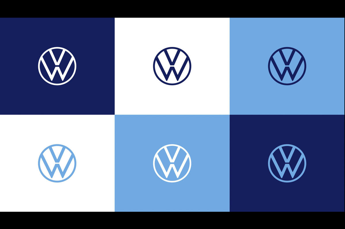
- OBBTKN3
- https://twitter.com/…OBBTKN
- ugh - thin and weedyhans_glib
- ^i_monk
- After the press releases don't work, try a new logo, I guess.ben_
- Hans, is "weedy" a common way in which one might describe a logo? I'm not in branding but totally get what you're describing.MondoMorphic
- it's nice in application actually, but on its own - thin and weedy is an apt description.ben_
- THIS VW would never fake emissions tests and test emissions effects on humans and animals.
Crazy how VW sales are actually up again; the public has no memory.ideaist - Weak like the Germany.utopian
- eekcolin_s
- Why fix what wasn't broken? There is always someone trying to be the smartest guy in the room.utopian
- 1 billion Deutschmarks please_niko
- Looks like a sketch.nbq
- ⌘+C, OBJECT>PATH>OFFSET PATH> .0625". DONE!fooler
- is this a joke?necromation
- This has circled back to the '52-59 Beetle hood emblem, an era when logos where thin and elegantprophetone
- Well they also had chubby variations at that point as well I guessprophetone
- pushing the envelope here... hehehe, just kidding .. fuck this shit. is boring.neverscared
- das scheissefuturefood
- Not as bad as the car ID.3 car they put it on. Why do big automakers continue to make electric or hybrid cars so ugly? Take a page from Tesla.aslip
- Too many different line weight. And no action.adrok
- GREATsandpipe
- @mondomorphic : in a branding meeting you'd say "lacking confidence, apologetic, poorly executed, in other words complete shitehans_glib
- It’s finemonospaced
- Krassy4
- Ca?Krassy
- Ga?utopian
- https://imgur.com/a/…MrT
- meta tying itself in knots trying to remain relevanthans_glib
- Not available for EU folks?crazyprick
- Balloon Knotrobthelad
- 6a or a6?nbq
- my Uber driver's "fastest route"Krassy
- heck of a buttholeGucci
- Cagmaquito
- CA = Cat's assholenylon
- https://i.dailymail.…Krassy
- CacaOBBTKN
- Kinda dig it, can actually see people I follow vs that tic tok wanna be random shit. fucking hate instagramhydro74
- The overhang is outta whack w/lower-right—looks like it would roll over. So I gave it a try... https://www.threads.…ptrdo
- If you delete your Threads account it also deletes your Instagram account for some reason.Nutter
- .net lolslappy
- i likemilfhunter
- i_monk3

- i like this a lot. good post i_monkcapn_ron
- Looks like a Q and a V to meMondoMorphic
- definitely reads Qmonospaced
- ON
QN
OV
QVKrassy - reads QN to medbloc
- Yeah, it reads anything but O&J.chukkaphob
- Logo FAIL of the day! LOLchukkaphob
- I don't get why the & is the most prominent feature?slappy
- because the designer thought they were doing something cool & creative. LOLchukkaphob
- I dig itmoldero
- ONJRamanisky2
- I dig it. Took me a second look after reading Oliver and June to get its O&Jpango
- it doesnt workBennn
- Why is the ampersand the most prominent feature?
Cuz OJ doesn't sound good.pango - diggin itdocpoz
- nope doesn't work at all.fadein11
- It stays.i_monk
- Forced amateur attempt at something clever.chukkaphob
- I liked Terry & June.
Is this a lesbican remake?MrT - I almost like it. I want to like it, but it confuses me. Seems like one more day and they'd nail it.formed
- QNoey
- is it swiss tho?pango
- No worky, pal. No workyset
- I read ON or O&NProjectile
- Q&J for meHAYZ1LLLA
- Utter guffing nonsensical bullshit fuckeryset
- i_monk2
- I hate it.nbq
- ATTN: Millennials.
: )ideaist - Hello, it’s the 2012 London Olympics, yeah you guessed it, we want our logo back.Chimp
- Horrendousutopian
- https://media.tenor.…IRNlun6
- Some deep critiques there, guys.i_monk
- Ghey.robotron3k
- I think the logo by itself is not SOO bad... but this aplication with the images inside.. nah..Fabricio
- Feels like the 2012 Olympics with the image fills. Solid color is best for the pop art vibe which is probably what MassArt was going for. The fills are crap.ayport
- It really can’t be anything but, MamaGnash
- https://www.youtube.…renderedred
- Immediately dated. Not even modern for a fucking second.monospaced
- Why did you even post this?!grafician
- Mass Art Art Museumdbloc
- I like itCalderone2000
- Ugh. A day later I’m starting to like it.monospaced
- It’s cool. I don’t feel identified, but it’s a cool logo.maquito
- I get the geometry used... but it falls apart so quickly as the moment I slightly step back from it (go smaller) all I see is magic marker handwritten lettersPonyBoy
- No ma'ammonNom
- love it.sinjun
- mort_11

- Aphex TightsChimp
- Aphex Limb
Aphex ShinBaskerviIle - Windowstickermort_
- Caustic Window DisplayFax_Benson
- LekqsKrassy
- lol mortfadein11
- Amazingscarabin
- https://static.tumbl…Krassy
- Alternatively, half life logodrgs
- _mort winsscarabin
- Amazing!instrmntl
- i_monk10
Infonotary by PETROV
- I like logos that immediately make me think "Well, there's no better way to do that, is there?"Nairn
- perfectKrassy
- blah blah i don't like the rounded N inside that poor I. While it works, it seems unfinishedimbecile
- ewzarkonite
- Nespresso?see_thru
- I like it.maquito
- I like it too (I don't like the Nespresso one, but see the similarity). I am not sure why there is an 'N' there too...?formed
- This reads primarily as an N, to me. I didn't even see an I for a whole day, and only after I read the comments.monospaced
- The company reads "InfoNotary". It took me like 6 secs tbh. I think it's one of those simple, pure, hygienic monograms I'd use as an example if still teaching.maquito
- https://inglewoodyyc…
https://theindoorla.…
http://cfile1.uf.tis…sted - ‘hygienic’ is the perfect descriptionerMrT
- sterile would be more apt.imbecile
- Looks clever, but for no reason.robthelad