Pentagram Sucks...
- Started
- Last post
- 189 Responses
- hans_glib1
a houzz
- detritus-3
Zz
.
Why would anyone - who is not in the business of selling sleep - employ a double zz in their branding?
That's CRAZZY, motherfuckers.
- Domainset
- the only point of interest here is how such a 2nd tier .com can afford Pentagram. Investors money well spent when one of us could have banged it out?fadein11
- I do know what they do by the way, I have to integrate their fakkin' reviews into numerous architect client websites.fadein11
- they're valued at around $4 billion.Gnash
- yes, it's abundantly clear the domain was the limiting factor here, that's obvious. What's not obvious is the lack of any further thought on the subject.detritus
- Asks obvious question. Gets obvious answer. Says obvious answer is obvious. lolset
- @gnash, Uber is valued at [insert inflated meaningless price here] but they are still an utterly shit company not worth anything near.
And Jesus, I was joking.fadein11 - Sorry, set - shall i dig out my badge machine and make you a congratulatory badge for your profound insight here? What's your address again?detritus
- LOL.detritus
- "one of us could have banged it out" was the clue to the seriousness of my comment.fadein11
- 72 go fuck yourself avenueset
- hahafadein11
- [engage QBN escalation routine]
no pls don't, let's all just be nice to each other, like jaded bitter dog wee stained snowflakes.fadein11 - Meh. Said with a smile on my faceset
- meh is prob the most appropriate response to my comment(s) and without a smile on your face. I've done it again :(fadein11
- What's your address, fadein? I've got a badge for you too, it's sparkly and has a flop-wristed snowflake on it... .detritus
- Just in case you're sat there weeping, I wasn't being entirely serious, fadein.
Not EVERYONE on QBN loathes you.
Well, almost.detritus - Even I don't loathe fadein. I don't really loathe anyone. Well, apart from mono, but that's unavoidable.set
- lolmonospaced
- Only joking. Obviously.set
- What sort of a micro-penised halfwit would bother downvoting this fantastic post?detritus
- Not this oneset
- haha!detritus
- this thread gave me a micro-penis, I like it.fadein11
- lvl_131
so much hate.
aside from that bullshit grid, the logo is actually a nice update from the original.
- Is it tho?scruffics
- A nice update? You are fucking
with with us right.utopian - it is far better, not to say it won't date as bad as the original.kingsteven
- it was ordinary before, it's ordinary now. so much ordinaryhans_glib
- it's more the illustration of the grid that's poor. '16 degrees' is obvs the result of a junior designer's pride in remembering pythagorus' therom.kingsteven
- ordinary 2008, ordinary 2018.kingsteven
- Never heard of this company so no baggage. I prefer the new one. Those BS grids people do are so stupid though LOL.Hayzilla
- SO. MUCH. HATE.
Don't dare voice a dissenting position... HATERS.detritus - why you hatin' detritus? PLEASE STOP THE HATE.lvl_13
- Well no, it's not a nice update.i_monk
- well, fuck you very much. I actually don't care. I'm just bored.lvl_13
- doesnotexist-1
it's natasha jen's fault
- Gnash-1
V
with the gridification, for context
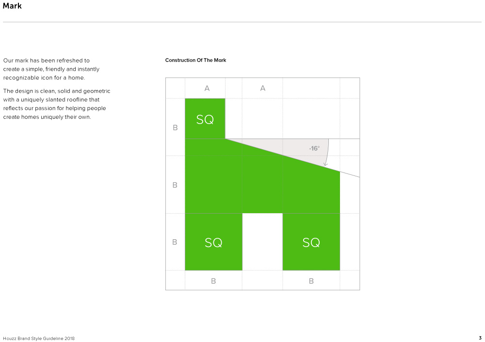
- a factory?Krassy
- So that's what a square is. All this time...MrT
- I just vomited in my mouth.utopian
- Throw the designer in a wood chipperutopian
- that grid makes no senseinteliboy
- The entire logo makes no sense, just a lazy boring poor execution. Probably just a money grab.utopian
- FFS...a 16 degree roof pitch, with a open door frame that is not even in proportion with the rest of the house/toilet seat.utopian
- they only had planning permission for the 16 degrees unfort, they wanted 30 but council said no.fadein11
- Lol @ fademicrokorg
- afterthoughtdbloc
- i_monk0
- the before one is great!Krassy
- FFS...it looks like a Squatty Potty!utopian
- lol utopGuyFawkes
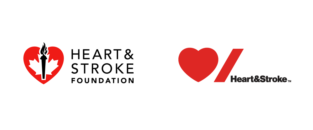
- I bet there were bedates over visually centering the mark over the word, or the UGnash
- although, I do prefer the new oneGnash
- I know they've aligned the door of the house with the space in the U, but it being off centre like that feels wrongset
- ^ totallyGnash
- hah, sorry Gnash, I didn't even see your comment re: alignmentset
- Definitely bedates over thatset
- b's d's will de my unboingGnash
- Gnash has deen hitting the dong pipe harb again.detritus
- living the bream on qdnset
- QDN!set
- that will be $500,000. Thank you, we've been working hard! Soo very hard!helloeatbreathedrive
- For a second, I assumed the After was on the right since it's so much better.CyBrainX
- looks religious with the crossdbloc
- houzz of prayerdbloc
- i_monk0
Have they discontinued their blog, or are all the image links broken at blog.pentagram.com?
- same here mateOBBTKN
- It's called design. Look it up.face_melter
- canoe-1
Is it because the motherload of ass hattery, Armin Vit worked there?
http://underconsideration.com/
- BK-2
Untrue:
- since19791
Pentagram has their style. They pull it off. I don't consider them crap at all.
- desmo-1
Pentagram churns out good design. They just happen to be better salesmen.
In design school, a Bullshit 101 class should be just as important Design fundamentals.
- i_monk-4
New logo by Paula Scher.
- Id like to see the editing process for this. This new logo is just so literal.desmo
- I'm guessing the rarely will need the type/textsince1979
- well it sure beats the Canadian Olympic logo on the left.fadein11
- I'm guessing they will rarely need the type/textsince1979
- A playing card and a penis would equally suffice.face_melter
- E.T. salutes his masters back home.robthelad
- hahahaha robdetritus
- Trying to hard to be clever, designer's masterbationutopian
- ^ Lol can't unsee that nowdesmo
- ET is a goddamn nazi, folkssince1979
- I'll assume the down votes are directed at Scher.i_monk
- wow, this isn't even a first rounder._niko
- Considering this is for a Canadian institution it's a complete failure as it doesn't work in both official languages.zarkonite
- mort_2
Christ on a bike!
- 2005was bestyurimon
- Huh. Didn't know it was them. I love DC comics, far more than Marvel so the logo isn't all that important to me. Still a bunch of hacks though.face_melter
- That "C" looks like its on crack or maybe even heroin.utopian
- 2012 wasn't bad at all, wtf.Maaku
- This is really bad.grotesk_neue
- i love itinteliboy
- mort_-1
Not tampons...

- What would a 'teabox tampon' be anyway?!
http://cdn.hypervoca… ?detritus - tampax padssince1979
- What would a 'teabox tampon' be anyway?!
- imbecile0
"We’d ideally like to code [the logo] so it could react to different conditions," Willer says, explaining that Pentagram could create a gridded visual logic so the logo always looks good. "They don’t want to have that yet because they’re quite scared of the diversity. So we ended up giving them a set."
- That's how they did it on a budget. By making it not actually a responsive logo? Still, I like Pentagram. Cool shit.nb
- utopian2
- I like it.monNom
- what's "on a budget"formed
- diggin thisdocpoz
- i like. ^^ and ya, I wonder what 'on a budget' means at PentagramGnash
- I like it.dbloc
- why not link the end of the A with the start of the R?oey
- Fucking Amateurs!!!oey
- because that would be too conventional.docpoz
- That part bugs me about this (not connecting the end of the A with the beginning of the R).MondoMorphic
- It is the beginning of the R! http://www.handwriti…zarkonite


