Pentagram Sucks...
- Started
- Last post
- 189 Responses
- i_monk1
- What ever happened to the Saul bass version?
http://teamkaroshi.c…Gnash - What exactly did they rebrand? Looks almost identical to the previous version.utopian
- http://annyas.com/sc…Gnash
- it got fatter, so they've returned it back to it's former svelte selfhans_glib
- LOL they threw in a Fibonacci spiral sequence to make it look all "Hey, we did something". Pathetic.garbage
- Wow, that Fibonacci is so freshman year.omahadesigns
- New typeface is very nice, although the whole thing has a vintage flair I don't understand, doesn't seem made to last.sr_rosa
- Having one made by Saul Bass, that already has history and has aged spectacularly well, and not using it, totally blows my mind.sr_rosa
- love the saul bass one, but always tought that was for warner tv_niko
- this got to be a joke righthelloeatbreathedrive
- LOL @fibonacci.renderedred
- also, saul bass version is acerenderedred
- as overused as the fib series overly is, in it's a great way to define a curveGnash
- @gnash Saul Bass version is still in use for Warner Musicmilfhunter
- Yup. Is should be used for everythingGnash
- What ever happened to the Saul bass version?
- i_monk0
Here's another identity for a theatre, by Paula Scher, that *doesn't* suck:
https://bpando.org/2019/09/12/at…

Tungsten to the rescue.
- Saw that show where her 25 year old interns do all the workrobotron3k
- It's definitely better than some of her previous work. But like robo said, it's really hard to tell who really does the work there.utopian
- robotron3k - yuptimeless
- i_monk1
- Isn't Paula like 70? Give her a break.NBQ00
- Also I don't know her exact role at Pentagram atm. Is she still very active? Why not retired?NBQ00
- &Paulautopian
- To be fair...typography was never her strong suit.utopian
- Across our industry in general...there seems to be a strong movement and a trend towards anti-typography. IMO - it looks like shit.utopian
- all in all I like itCalderone2000
- I love that color palette.mg33
- lol@ utopian, okaymonospaced
- NBQ00-3

- utopian-1
Don’t Like Slack’s New Logo?
You’ll Reconsider When You See the Other Options

- Nairn0
I can't really get my head around why slack felt like they needed to change it so much - the first and foremost purpose of the logo aspect of a brand is that it's recognisable and somewhat unique - slack's was and fit with its culture, '#relevant'. I really can't see why the decided to hoy the proverbial baby out with the bathwater. It seems so completely unnecessary.
—
Also, as for the thread itself - P are now behind on payment for two projects and are ignoring my emails, so they suck.
- colin_s0

lol
- damn i just saw that feck LoLhelloeatbreathedrive
- meh - that's a bit of a reach tbhhans_glib
- it's beyond a reachmonospaced
- wtfcanoe
- feel0
- is this for real?
sad, truely sadutopian - they broke it...nbq
- god the examples of what the designers were trying out were studio 1 concept level badcolin_s
- #worksKrassy
- https://pentagram-pr…
eww wtf?sted - no!...really?oey
- it's great!chukkaphob
- I call it Slag.MrT
- The wordmark is on trend (the trend is boring), but I actually like the new logo and graphic direction.i_monk
- I’d like to know what we’re the goals of this project were.Chimp
- they're little ducks..
quackSteveJobs - Innecesary.maquito
- I guess if you have an animated gif all's goodformed
- this one actually isn't bad. The current logo isn't that great, really.dbloc
- https://i.pinimg.com…utopian
- I love/hate it.inteliboy
- its a circle jerk...ArchitectofFate
- dunno, I like itmekk
- Seems fine to me.Hayzilla
- when u hit the mediocre aesthetic.neverscared
- penis swastikamekk
- So wasn't broken... Tax write off i reckonnecromation
- @SteveJobs little ducks sniffing each others assesmaquito
- is this for real?
- RumperChunk3
I'm gonna say it. I like Pentagram. Don't always like what they turn out... but mostly thumbs up. I also like Michael Bieruts essays and books. Humble and intelligent.
- i dunno i was re-reading looking closer 4 yesterday (specifically 'cause of this) and beirut just seems spinelesscolin_s
- That’s cool.. I just like the fact that he is not in your face like a lot of other well known designers..RumperChunk
- fate8
This is my favorite thread on QBN
- mg332
Step 1: Remove brand name.
Step 2: Don't change anything else.
Step 3: Profit.

- https://www.itsnicet…mg33
- That's great!Krassy
- love itchukkaphob
- Step 0: Build a brand so widely known that two colored discs and some red tones are enough to recognize itmekk
- Interbank is my favorite version.NBQ00
- @mekk touchéKrassy
- although it's a logical progression, nothing more than that i wonder how much it cost them ;)renderedred
- wow, just wow.utopian
- this is such bullshit. you could do the same thing with most fortune 500s due to mass media ad buys and general social recognitioncolin_s
- self-congratulatory "mount olympus" bullshit beirut is such a fucking twat he's a bigger disaster than lebanon in 89colin_s
- 250,000$ please, txBennn
- May be he was testing the limit of the system and the limit hasnt been crossed and he made 250000$ for this? He's a rebel actuallyBennn
- worth every penny
the (genius) idea is what costs, nothing elsechukkaphob - Interbank looks like interscope's logo.shellie
- In the next Pentagram iteration the get rid of the TMNutter
- Nike did exactly the same with the tick...so what?see_thru
- ^ and same with so many others
It works!chukkaphob
- i_monk2
- This one's not easy to look at...it's hard on the eyeballsMondoMorphic
- it worksGnash
- it worksKrassy
- "the boss wants to know if you can make the logo about 200% bigger. Other than that, we're are all okay to sign-off"monNom
- it workschukkaphob
- Pentagram rules...sorry.see_thru
- Animation bit is cool.PhanLo
- I don't like the confetti gif but I love the logo. It works.CyBrainX
- Podunkutopian
- youngdesigner0
They are killing it....the fact that they make you question if it's good proves that it's good.
- Not for me. For me it’s the fact that they make all the $$$ that makes me question it.monospaced
- they're not the company they were, that's for sure. or else clients are getting duller and duller.hans_glib
- Dull is the new exciting...youngdesigner
- “the fact that they make you question if it's good proves that it's good.”
What kind of garbage logic is this?cannonball1978 - Kinda like the “they’re just jealous” one for explaining mean kids.monospaced
- shapesalad0
Hmmmm.... not sure about those stripes... a bit "trying to be an upmarket home deco shop" kinda feeling.
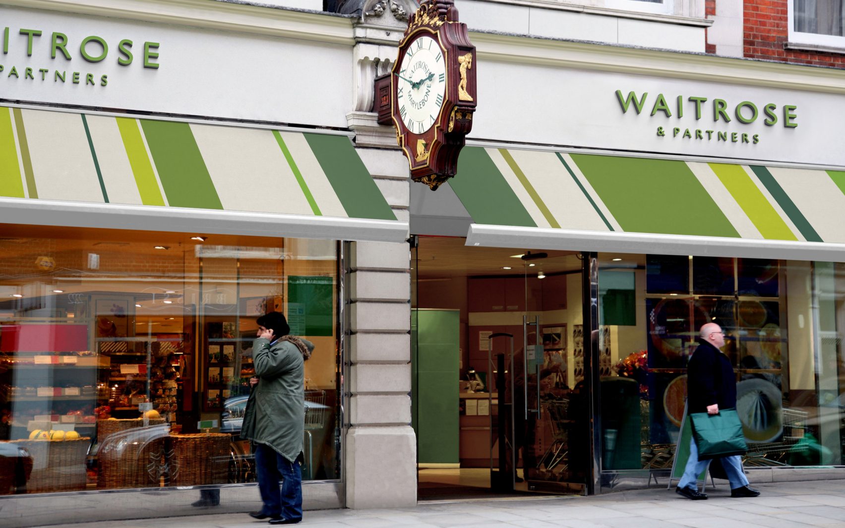
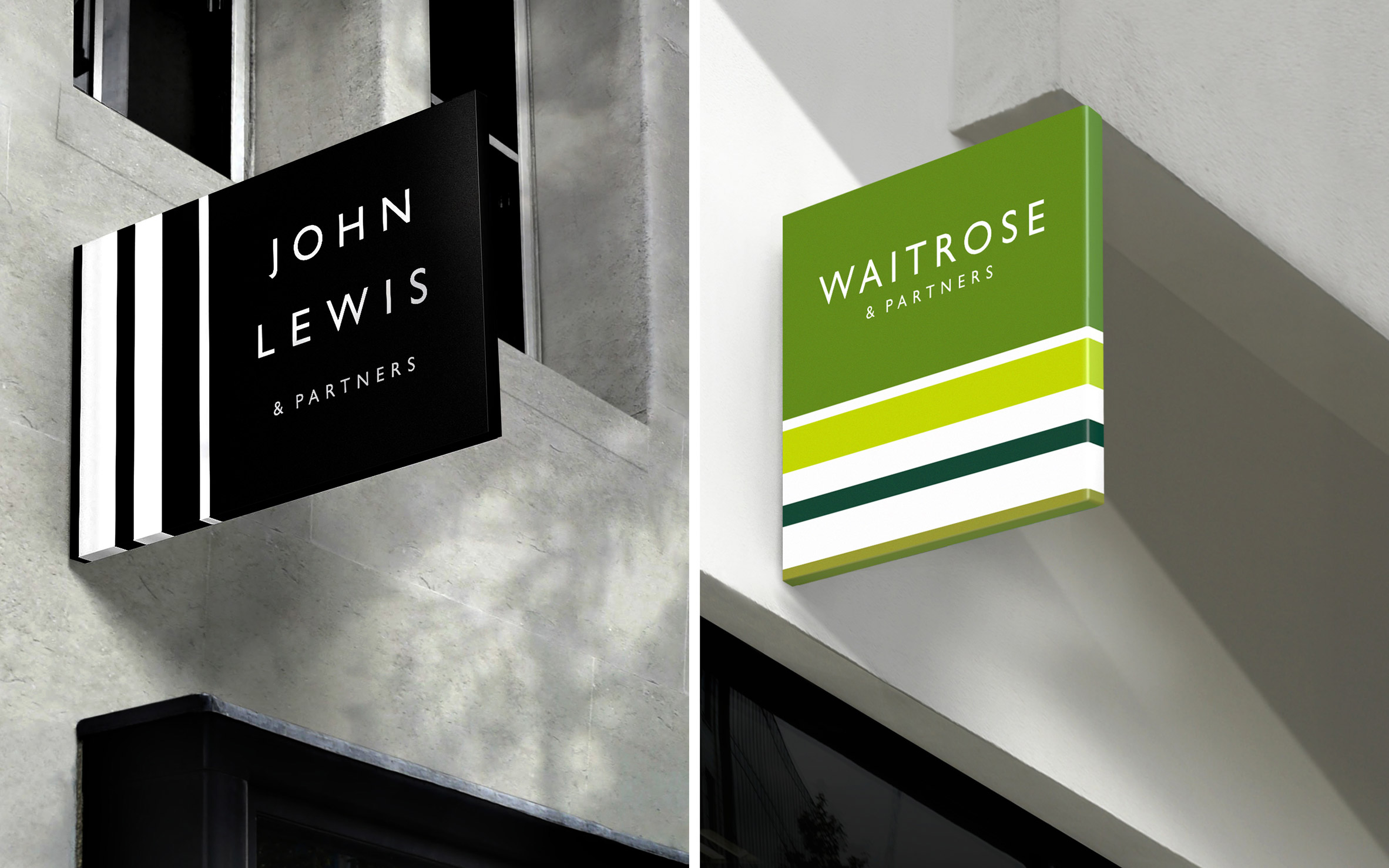
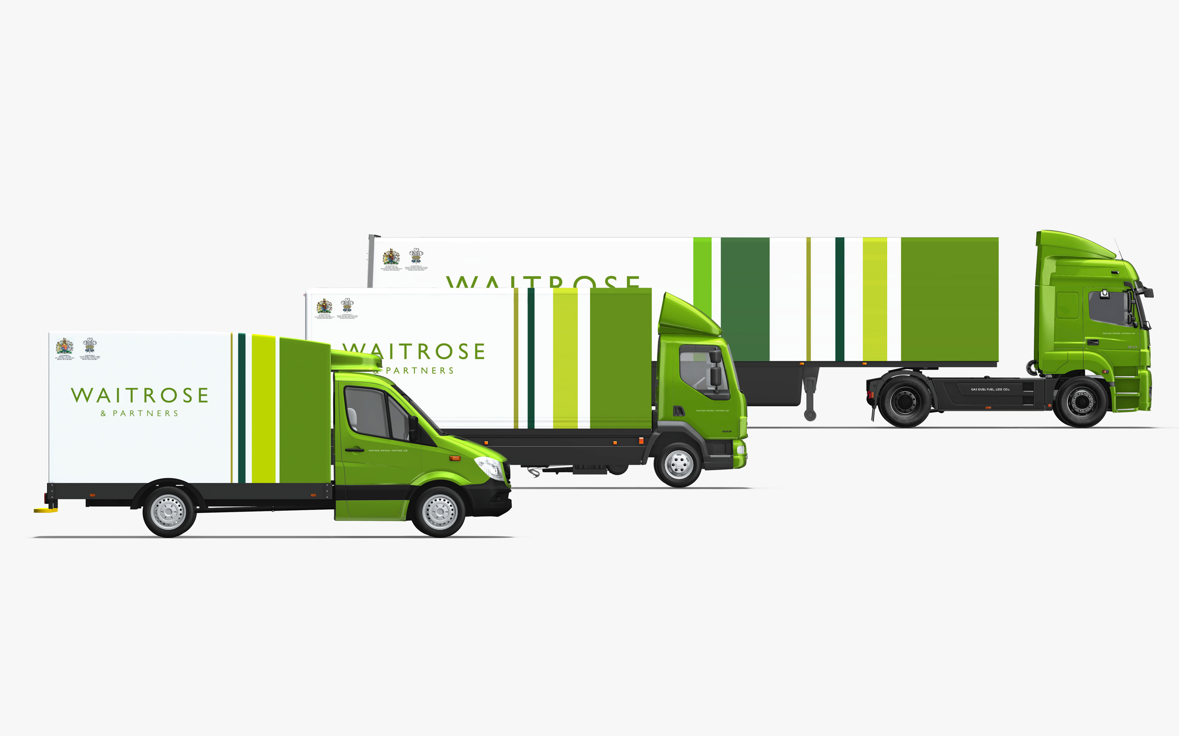
- isn't it trying to be an upmarket home deco shop?Fax_Benson
- I like the JL one. Waitrose greens seem a bit tired.Fax_Benson
- lol, fax :)Gnash
- nice.Nairn
- https://www.pentagra…Hayzilla
- So if I make some cool animations, truck templates and fake 3D, I can also add a few zeros to my fees?? Awesome.formed
- ^ grumpy old meninteliboy
- I'm left completely indifferent to this.
Which is just about the best review Pentagram could ever hope for from me.Continuity - It's finedocpoz
- what do they do? flowers?mekk
- ^
John Lewis is like a Macys
Waitrose is like a Whole Foods
Upmarket stuff.Hayzilla - @Continuity - exactly what I thoughtformed
- It's all for nothing, post Brexit Waitrose & Lewis won't be able to stock their stores, when they do, they won't have any customers as we'll all be unemployed.shapesalad
- Could they not have waited for there to be no people outside the Marylebone High St Waitrose store? The scruffy guy on a call doesn't look a typical customer.shapesalad
- Clip Art Heaven®utopian
- this reminds me of military ribbons
https://pentagram-pr…dbloc - It's a bit M&S meets Sephora...see_thru
- Not every rebrand is a client-free b3hance project. Confirms the common heritage, fits the brief, job done. I'm the sort of wanker they sell to.MrT
- reminds me paul smithshapesalad
- the thick / thin stripes - I don't know why but feels.. off. like it's awkward for my eye to flow over them.shapesalad
- I'm usually the first to post here, but I gotta say I dig this rebrand.i_monk
- MHDC7

- betterseacapn_ron
- Battering Sea ~ the most horrific wave of violence seagulls have known.shapesalad
- shapesalad0

^
I performed some veterinary surgery and gave the poor souls their eyes back. Look how happy the daft mutt is now.
- i_monk3
- better than before but lacks consistency... guess they couldnt decide on a single animal to represent their business.trooperbill
- Poor cats and dogs at Battersea.. They have had their eye gouged out!shapesalad
- before.. they were sleeping. well they're awake now, the poor mutt and kitty.. Pentagram have shown no mercy in removing their eyes!shapesalad
- the dog ears are filled solid and the cats aren't. that inconsistency is distracting so, fail.MHDC
- Also BATTERSEA sounds like a delicious chippyMHDC
- The dog's ears are folded forward, the cat's aren't.detritus
- It was better before... I would have just taken the type out and moved it underneathnbq
- i like it.utopian
- This font, mandocpoz
- Great work! Love the new one and its applications.Krassy
- Great. Love it. I walk past this place a few times a week. Most people just call it battersea dogs home so I guess they wanted emphasise the dog AND cat aspectset
- Works for meset
- love itinteliboy
- I like it.Hayzilla
- A friend who recently acquired an old mooch from Battersea responded "neutered testicles?" when I showed him thisdetritus
- kgvs72-2
- i_monk0
- I think it's excellentset
- hah, the E is shit on the own, penta did it... then they dumped it on MCKL to make the rest of the font (which actually makes sense of the e) FFSkingsteven
- https://www.undercon…kingsteven
- ^ that works exquisitely. What's the problem?set
- Utterly abhorrent. Yeesh.Hayzilla
- it's a weird one. I initially really liked it but if you keep looking at it, the bottom of the e starts to deform. or maybe I need some food.Fax_Benson
- where the straight meets the curve is horrible if you focus on itFax_Benson
- Yes, it's an improvement over the old logo but the "e" does look weird on its own, and doesn't look like it belongs to the rest of the alphabet.Maaku
- http://cdn0.wideopen…face_melter
- the e has a very weird "weight" distribution. it's off balance for me.renderedred
- I'm not ashamed to say I think it's utter shit.Continuity
- Its crap, both from a typographic and conceptual standpoint.cannonball1978
- Detritus digs™detritus
- is expedia™ a Kids toy or kids TV show? dafuq?!Krassy
- Paula is probably a multi millionaire and she's laughing all the way to the bank as we here bitch about their work. lolM01XXX
- ^ Sadly, this.Continuity
- hahah I love this, it looks like someone's cock got caught in a wringer washer.fate
- No, i agree set ... MCKL is a genius, the e is that bad and still he pulled it off.kingsteven
- Do companies hire Pentagram and approve their work just because of their past reputation? Is it all on autopilot at this point?chukkaphob
- https://media.giphy.…chukkaphob
- I think the 'e' is greatset
- I just vomited in set's mouthutopian
- i prefer the work of set
seriously set you make way better work than this shitty logo.Bennn - At a glance...probably one of the worst identities that I have seen come out of Pentagram. Is Trump running that firm as well?utopian
- ASSnudes
- I actually like it. Distinct and very 60s. Cool to see them taking a risk.mandomafioso
- I think it looks like shit, there's my professional opinionpinkfloyd
- Wish I could illustrate these comments, lolMaaku
- How do they convince corporate that this is a good idea...Used car salesmenFawnDog
- Those of you who like it, do you think your opinion was at least a lil influenced by the fact that it's Pentagram work? be honest.chukkaphob
- Not at allset