Pentagram Sucks...
- Started
- Last post
- 189 Responses
- fate0
If Pentagram applied the same Pentagram approach to their own identity, they'd be laughed out of every room.
Pentagram sucks. And they've sucked for a long time.
The occasions that Pentagram doesn't screw up royally are those where they do an expected, serviceable job (John Lewis, Waitrose) or barely-there refinements on existing identities (Fisher Price, waze, Amex). The kind you'd expect from every single competent designer who can push a mouse.
Pentagram recently defaced the Natural History Museum's identity as well
https://www.underconsideration.c…Which reminds me of Pentagram's god awful redesign of the NYPhil. To no one's surprise, this was ditched
https://www.pentagram.com/work/n…Pentagram's toilet logo made headlines asking "Is this unfortunate logo design the worst of 2021?"
https://www.creativebloq.com/new…That truly insipid identity for Omaha Performing Arts. The applications are embarrassing.
https://www.pentagram.com/work/o…- stop the hateNBQ00
- The omaha performing arts one is so bad. Screams student project.fate
- The old Natural History museum logo was worse.bainbridge
- Why is the spacing tighter for "arts" in the Omaha?bainbridge
- nb0
This thread is a real showcase of turds.
Serious questine: does Pentagram suck or are they victims of their clients’ opinions?
It seems odd that Pentagram bangs out these knockoffs of their own work and is still charging very high fees despite being somewhat of a hasbeen in the space... can they really be this mediocre?
are they going into boardrooms where the client already knows what they want and demand to see it? is it just design by committee of business stakeholders?
- I think they use clout and are really good salespeople to some extent too. Hard to question something when it’s so fucking expensivemonospaced
- Looking at their site, there’s tons of good work. I guess this is just the thread for bitter sourpussesnb
- There are much cheaper ways to get someone to move the mouse for you, why hire Pentagram? That name means nothing to the general public.i_monk
- fate0
Pentagram strikes again.
Now the 6th ranked University in the world looks like a random tech startup that will fold in a year.
/prod01/channel_2/media/images/banner-left-block-3000X1200/New-brand-logo-examples.jpg)
/prod01/channel_2/media/images/banner-left-block-3000X1200/New-Brand-logo-.jpg)
/prod01/channel_2/media/images/banner-left-block-3000X1200/New-brand-mocksups.jpg)
/prod01/channel_2/media/images/banner-left-block-3000X1200/New-brand-items.jpg)
"Nearly 5,000 people have signed a petition asking for Imperial College to change its new logo. What’s so offensive about it? You might be wondering. Perhaps it accidentally looks like something obscene? Or is just plain ugly?"
"It turns out, people don’t like the new Imperial logo because it’s too simple. It may be ranked the sixth-best university in the world, but Imperial’s graphic design skills are something to be desired. "
"Student Anaya Jaffer created the ‘Stop the Imperial College logo’ after the new sign was mocked and became the subject of several memes. According to the online petition, ‘many (if not most) students dislike the new logo; the new colour and font look almost cartoonish and it is not a good representation of the college’."
"‘I wasn’t sure if it was real at first,’ Jaffer told Imperial's student newspaper Felix. ‘I was speaking to more and more people about it and realised that everyone shared this strong dislike. When I saw Imperial was already starting to put it up, I realised it’s actually happening – if we don’t want it to happen, we’d better do something now."
"‘On the website, it said they had 350 survey responses and over 1,600 video views, which really isn’t that much considering there are around 30,000 staff and students here.’"
"An Imperial College spokesperson said: ‘The team will take any opportunity to hear what people think, to listen, and to answer questions.’"
"It added that it was ‘absolutely determined to develop a brand identity that serves the whole community.’"
- Would love to know how much $$$ they paid Pentagram for this.fate
- and how much pentagram paid to download it off of Canva. generic trendy bullshit._niko
- Looks like what Wolff Ollins would dobainbridge
- jonny_quest_lives0
- AMERICAN 8==D CO.crazyprick
- God, is that real? Who the hell hires them??formed
- for when you feel like doing some light treason and going to target to complain to your 13 followers about rainbows, American Weed Co is for you!hydro74
- is Patriot the new hipster?capn_ron
- It's amazing how shit they are. They're marketing to vets, and the bags are MREs? Bravo.garbage
- redneck vibesmilfhunter
- Went into a store for this type of branding just to have a look see & walked out immediately ... so gross.Ramanisky2
- I like the military themed patches, the shade of green used, and the fact that it's vet owned, but the "WEED" is just so bad.stoplying
- If weed was spelt 'waed' this would be fucking great branding.Nairn
- I don't see the A, but I can see a lot of people who live on the outskirts of this northern Michigan city that would hang this next to their bullet-holed BL cancanoe
- That is just atrocious. Military MJ? Is that the thinking here?formed
- lol Zelensky will do anything to make money.face_melter
- i_monk12
- Wow. That's utter shit.Continuity
- jesus christBonSeff
- I will say the logo perfectly aligns with the TNF product. Watching Al Michaels mail it in every week has been hilarious.BonSeff
- Inner shadow? Ffs. Vom.maquito
- I mean, I've trodden on better-looking dog turds on the pavement.Continuity
- CD to designer:
Think you could make the word Football fit?
Designer: No.BonSeff - yeah noticed the weird TNF logo last night_niko
- this one, but it's actually way better https://m.media-amaz…_niko
- throw-up emojiKrassy
- I did some work on the American Idol brand I can confirm this logo is exactly what American clients want.Chimp
- Even the most retarded AI buttfucks Pentagramcrazyprick
- “Can you make the Prime logo bigger?”Chimp
- @Chimp and is that justification?Krassy
- Of course not. Nor is it truemonospaced
- like a shot of wheat grass with a bottled water chaser. BUT whut do I know?bezoar
- PukeOBBTKN
- "i did a thing once, i can now speak for hundreds of millions of people." how dumbimbecile
- Ass To Mouthutopian
- FOOTBALIdoggydoggdog
- Looks like Bud Light to memisterhow
- EOOTBALIsrhadden
- holy crap, just when I think they couldn't get worse. Amazing their name sells this, they pawn off to an intern in high shcoolformed
- lol Bonseffephix
- noneck2
Looks like Pentagram partner ripped off Logo Archive. Not a good look.

- https://www.instagra…noneck
- Mmmmmmmmm yeaAQUTE
- show me a logo and I'll show you 10 that already exist that are similar_niko
- Well yeah, but that's *too* similar.evilpeacock
- I mean it's no excuse for a company like Pentagram, but is there a database that allows you to search trademarks or more broadly any icon/logo?_niko
- Good use for ai ^scarabin
- Google image search? I remember once I closed a logo for client. After the call I went to awwwards and winner of the day had almost identical logo markdpi
- Dpi what did you do? Ethically you created it honestly but once you bumped into an identical logo did you change it?_niko
- Only if they need to trademark it and it's possible to have simlar logos if they are different companies in different industriesgrafician
- DAAAMN lolsted
- @_niko yes there are tools for that.
damn this is bad.sted - Maybe do more than squares and circles, actually draw something, then you can be unique. They didn’t have this problem in the 1800’sshapesalad
- @shapesalad that's a weird thing in graphic design, i wouldn't be sure about that.
there are books collecting ancient shapes from asia to the americanssted - there is a chance that you will find this form in those. which obviously means nothing if you are trying to copy a contemporary work.sted
- they got all the resources to do the proper research and yet here we are.sted
- Making something unique should be a fundamental goal.sted
- Yeah, you fucking hacks. Draw something that works at the size of a postage stamp and on the side of a building because that's how it worked 200 years ago.face_melter
- i_monk-1
- i_monk1

- oofjonny_quest_lives
- this has potential https://o-pa.org/ima…jonny_quest_lives
- 1)Stack futura-like geometric font
2) align ooa for no reason
3) cut off g’s tail because edgy
4) charge 250k_niko - ^Krassy
- performina... niceStoicLevels
- oooooo ahhhhhdbloc
- This is really stupid. Like _niko said If the ooa stood for something it would make sense.dbloc
- The line spacing is way off. This is like logo design fucking 101dbloc
- at a certain point just commit to ITC Bauhaus Bold instead of whatever the fuck that is...jonny_quest_lives
- Can't put my finger on it...on one hand, the negative lines are interesting, on the other, I get a headache looking at itformed
- Approved by omahadesignsNBQ00
- it's not good but it ain't horrible.utopian
- If you squint the overall shape is reminiscent of a semi automatic weapon. Is that intentional?shapesalad
- perf
omaha
orming
artsshapesalad - I think omahadesigns would approve itStoicLevels
- amateur or student work at best. like dbloc said line spacing is horrible.renderedred
- I would do it and charge moreAQUTE
- why is line spacing different?doggydoggdog
- sted0

- mort_0
- McDonaldsutopian
- i don't hate it.milfhunter
- Oh look. More cropped rectangles photos in stacks. How originalmonospaced
- i_monk1
Paula Scher covers High Line in green dots to encourage social distancing
https://www.dezeen.com/2020/07/2…

- Does this not fall into the category of those who actually care will be aware, practice safe social distancing by default in their daily lives by nowprophetone
- ...whereas those who do not will simply ignore the dotted reminders altogetherprophetone
- For me this makes sense, is effective in a private space like a store queue, where you stand and wait, not sure is as effective on a footpath in a park spaceprophetone
- Ok, ok, but how much did she charge for that? Serious question.Maaku
- Fucking genius, now pay us 250k...now!utopian
- I think she's great. Just browsed the 'Works' book about her, lovely stuff.pseud
- THANKS PAULAmonospaced
- That’s not how the walking PARK works.monospaced
- PropagandaHayoth
- i_monk2
- very cool!Krassy
- The mark is very nice, on the other hand the font looks out of place. Why didn't they use a san serif rounded font to compliment and integrate the mark?utopian
- ^ I wondered that too. Surely they considered rounded fonts though, so maybe it was too beaucoup?MondoMorphic
- This looks horrible, imho. I am far from a font expert, but that looks amateurish to me. Why the inconsistency?formed
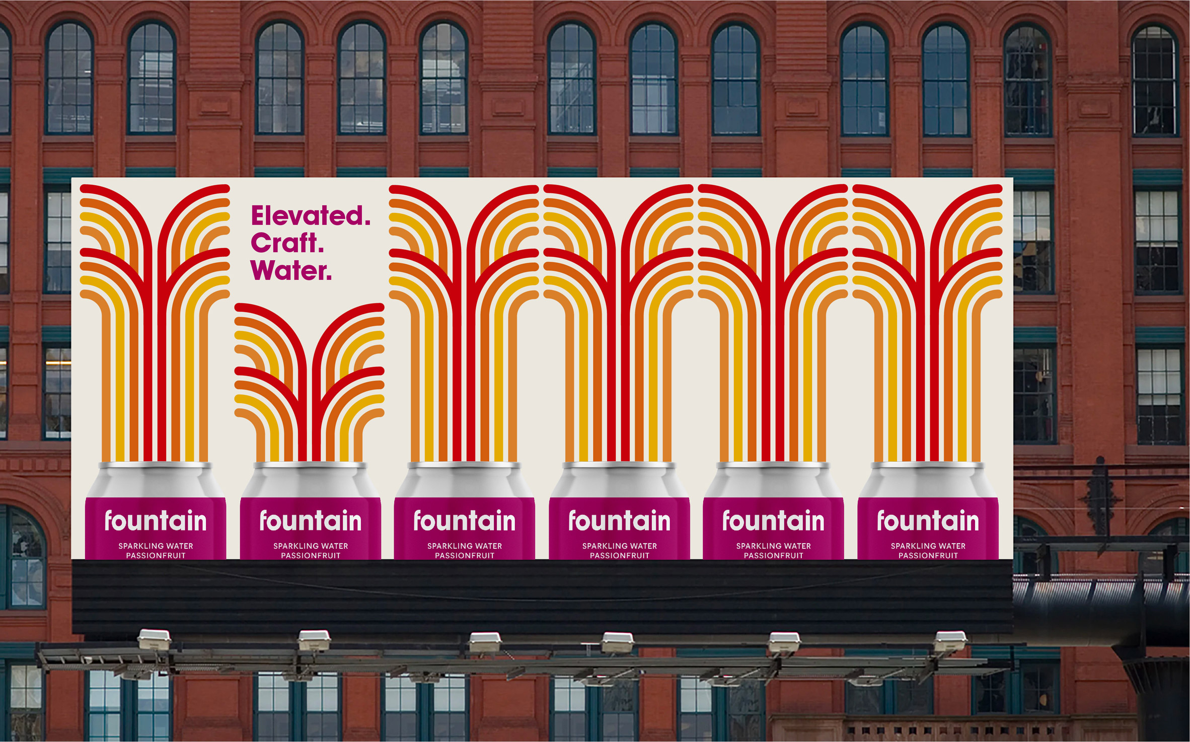
- The Yellow Submarine (presumably) fountains look fun enough.formed
- The colors in the billboard bother me a lot, now that I know that this logo & brand are about water...a poor choice of colors.utopian
- Billboard looks like something I want to clean my bathroom with if I'm in england and stuck using the store brand.monNom
- I think the mark is quite nice, but I'm pretty sure this plague was sent down to rid the world of ridiculousness like "craft water"monNom
- i_monk0
https://www.underconsideration.c…
Doesn't suck.
- What is up with the spinning dolphins? Is it for dolphin safe tuna cans?utopian
- Yet another animated logoutopian
- Tuna & Herringwebazoot
- "the name for the company linked the rivers flowing through London and New York,represented in its logo by two dolphins symbolizing friendship and intelligence"webazoot
- I find this very good conceptually and it looks British (done in their London office).
Retaining the legacy but making it 2020. One of their best lately.grafician - I also laugh everytime I read those comments on underconsideration - lots of people have no clue about design and branding, but looove to comment there :))grafician
- @utopian about those dolphins, they were in the previous logo and more detailed about in the official case study on their websitegrafician
- https://www.pentagra…grafician
- i_monk1
- The package is nice but I feel I’ve seen that logo a hundred times on Pinterest_niko
- Every last logo that they create has some sort of animated gif, I guess a stand alone logo isn't strong enough to sell the concept.utopian
- Lots of logos these days have an animated option.i_monk
- I like their work, always have. but this thread is fun.inteliboy
- Actually this was created by the new partners/former Hudson-Powellgrafician
- It's almost imposible to produce anything new with the amount of Pinterest / Dribble jockeys out there.Chimp
- i_monk-4

https://www.itsnicethat.com/news…
It's so... generic. And for a charity that's worked with top architects.
- blimey that is lazy...fadein11
- i didn't know they outsourcedcanoe
- eewwBennn
- horriblelogos.comomahadesigns
- Yet another animated logo.utopian
- i_monk-1
- (it doesn't totally suck)i_monk
- I like it, but why do they have to make every logo they create animate? It's like they're saying the logo does not stand up on its own without embellishments.utopian
- NiceGnash
- I don’t see it, maybe if they showed us the weapons with red circles we’d get it..._niko
- Funny you should post this today - I saw it on the side of a bus on my way in this morning and cringed at it. But then, I think I'm just getting old.Nairn
- Lol, nikoGnash
- Every time I see their work I think "wow, these guys have a really, really good sales team!"formed
- Gnash2
- I like the revisions. I've done a ton of work for FP and I can already see how much easier it'll be to work with the new brandGnash
- "The hyphen between the names is now a semicircle, echoing the scalloped edge as well as the smiles on the faces of the Little People."ideaist
- the monogram is really nice, should go with that only and bin the main logoBluejam
- ^ true. they had already started to go the monogram route on some of they're products before this.Gnash
- it actually does not suck at all. nice work.renderedred