Identity Crit - rybo
- Started
- Last post
- 133 Responses
- ********0
You also need to remember that this is basically a retreat from endless hours of work. I, and im sure most others, browse and post here almost like a fag break from work, and If I see a thread with rybo or dust in the title, because of your past antics, I am going to get into that thread and join in the fun
- Fag = cigarette, you american cunts********
- It's ok if you're gay.canuck
- QBN is my break from being a fag********
- Fag = cigarette, you american cunts
- 2cents0
I didn't bother to read through all the replies, and maybe someone already said it. How the hell are people going to print onto black letterhead?
You might want to rethink that.
- elpaso0
a fag break??
this IS work..
real.billable.work
- this reply alone is forcing me to read the other relpliesbulletfactory
- browsing QBN is real billable work.... ?********
- fuck me ive been browsing for free all these years********
- free no more!
invoice away!
:Delpaso
- ian0
Rybo, what may help you in this project are simple steps at the start of the discovery process, everyone has their own methods of working and its really down to finding out what process is going to work best for you. For me, I look at a few things before I start up illustrator.
1: Discuss. Find out what the client is looking for, what their aims are and who their audience is.
2: Research. Whats their market, who are their competitors? Who's doing it right and who's doing it wrong? Do they have a company name? If so, what does it mean, ie is it a brand new word or is it named after someone or something? Go to the thesaurus and/or dictionary, see if theres any clues in their name that can provide a springboard for an identity. What can be helpful here is put the name down on a page and do a spider diagram of words that lead off that.
3. Sketch. Don't start off with fonts, even if your sketches are rough, they can provide you with very quick ways of getting ideas down without getting hung up on styles.
4. Refine. Go to illy or whatever and start looking at refining and teasting out fonts. Keep it in black and white, only when you're happy with em should you start looking at colour combinations and applications.
Also, remember that simple wordmarks or simple shapes can make for lovely identites... an identity can be made by how these elements are applied to different things. A circle logo can look simple and 'I could've done that' but how that logo is applied to stationery or brochures or websites can enhance it and make all the difference like 'I wish I could've thought of that first.'
- ********0
"Is this going to be another one of rybo/dusts threads that hits the 180 mark by the end of the day?"
-Ian
- elpaso0
what is Sriran???
is it like Sr Iran?
like spanish Iran?
- ********0
you guys are so fuckin rude.
I feel really bad for dust mine right now.
||
V
- 7point340
i remember my first college drawing class. i had been drawing all my life, thought i was a talent, could draw photorealistic portraits of people, etc.
the professor was a small british guy. total cunt for sure, all but said it himself. first, assignment, we tack up all our pieces on the wall and he comes in and looks pissed. "this is shit. this is all shit"
i couldn't believe it. i was like "great, this will be a wonderful class."
i felt sorry for some of the kids, they were not traditional artists, most of them were graphic designers, film students, people that worked in computers (not that you shouldn't know how to draw, but they had had no formal training) that started a grudge. i thought "he's an asshoile fuck him if he starts tearing apart my work."so one day we were drawing a still life and he comes up to me and goes, "no, no, this is awful. where are these lines going?" i almost went nuclear, "here make this much shorter. are you even looking at it? try again" he walked away and looked at the line he had drawn, and it was perfect. i had been trying to get it right for 20 mins and it was perfect. mine was too long. i immediately lost my grudge and my ego.
people on here may sound nasty but often times they know what they are talking about and have a lot of good advice. listen to it. especially if you are asking for advice. don't expect everyone to love it on your first try. it rarely happens.
- yea nice story********
- Good advice.Glitterati_Duane
- same kind of story happened to me while I was at university...
so true.********
- yea nice story
- chossy0
Hey 7point34
I would have waited until he was going to his car then fucking run him through with a pitch fork then as he lay there breathing his last gasps I would have said, 'Oh god sorry fuck me oh god this is bad this is bad oh god no what have I done fuck fuck shit fuck Fuuuuuck' then I would have dragged his body to the pond at the college..... where I put old motor mouth Mr Crompsie a year earlier.
- actually, funny story... i did that exactly. and then i stood over him screaming "how's this?...7point34
- i think the pitch fork might be a bit too long? what's your advice? are you even looking at me?!?!"7point34
- I would have thrown a bunch of brown recluses at his dick.chossy
- chossy that's disturbing (the last comment)Glitterati_Duane
- haha only the last comment7point34
- i impaled him on a narwhal and while he was screaming, i farted in his mouth7point34
- While you were farting in his mouth, I removed his testicles with extreme keyhole surgery.Spookytim
- you complete me, tim7point34
- pascii0
all ist fine, as long as no one shouts "RIP!"
- pascii0
argh :D but i seriously think that posting stuff here on QBN helped me always to get better. i've even mailed once to some people i knew from around here when i made my first big portfolio and i get some very important answers and crits that helped me here.
some of the posts here should be read with "a grain of salt". it's a free board and everyone is allowed to say fuck you or whatsoever.
- elpaso0
"a pinch of salt"
a PINCH!
cunt
- :D
elpaso - taken with...
TAKEN!!!elpaso - cuntelpaso
- :Delpaso
- someone say something about pinching a salty cunt********
- i suck at english. i mean language.pascii
- i suck at life...
i think we're evenelpaso - i'm fairly sure it's grain7point34
- at least we're lovedpascii
- ahh, two foreigners fighting over an english expression in a note.********
- we wound dare do it in 'public' cause one of us is bound to be wrong you know..elpaso
- :D
- ********0
All this guy asked for was a logo crit, and a bunch of assholes went into a tirade!
- where is this tirade that you speak of? also the guy is a tool. it's not like he is some stranger to us.********
- where is this tirade that you speak of? also the guy is a tool. it's not like he is some stranger to us.
- chossy0


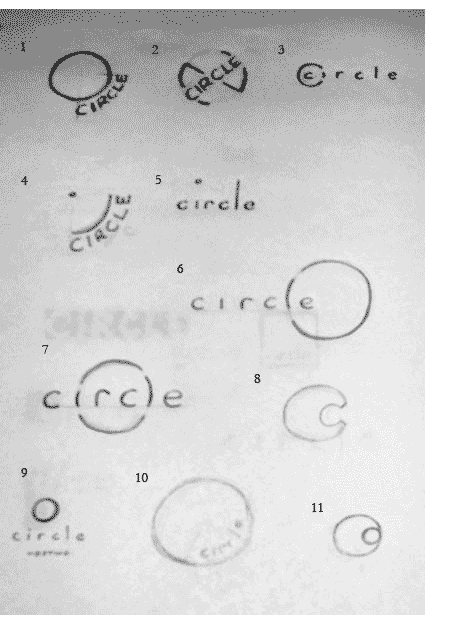


Use some of these to help out ye wee poofter.
- dauntilus0
make the logo 20% bigger lol
- gramme0
I agree with Spoox and ian. The "concept" is not strong. I like what ian said about fitting a round peg into a round hole. I'd explore that direction if I were you.
This is a secondary concern, but just because Build still uses Avant Garde that does not mean everyone else should. Herb Lubalin (the designer) himself once said that the typeface only looked good on the masthead of Avant Garde magazine. To me, it looks childish, and the strict geometry makes setting attractive type an uphill battle.
- chuparosa0
Just peeped James Cullen's site (in the editor's choice) and he has some nice examples of round logos and their application in his portfolio so maybe you might want to check it out for inspiration.
- uncle_helv0
100
