Show some recent work
- Started
- Last post
- 8,734 Responses
- bjladams9

clay and wax in a biscuit tin
- joooo chill your titsmilfhunter
- nice! mold it!bezoar
- That's really good, Ben!
Humungous nipples, mind.
Not sure that's a bad thing though.Nairn - BJ hey i haven't seen your for years, how r u doing mate? I love this stuff, are you planing to make more of these?********
- I thought this was a pie at first.fooler
- i thought its a strawberry sundaypango
- antimotion7
I recently collaborated with PIST6, one of Japan’s most prominent track cycling event companies, and MASH-TOKYO on a project that explored sport as a culture, technology, and spectacle. My role was developing an AI-assisted visual and apparel system for the athletes, translating speculative and generative ideas into real, UV-printed performance gear produced with WAVE ONE, PEARL IZUMI, and SUNVOLT. Tools like VIZCOM helped bridge the gap between abstraction and manufacture.
Some process bits here:
https://www.lasergunfactory.com/…
- antimotion4
I usually don't rock political $h:+... But when I do : )
Generated this dumb app with Gemini hosted on GitHub - it's a personal REDACTION APP called: TRUMPSTEIN.
The TRUMPSTEIN APP gives you all the power of official redaction with none of the subpoena aftertaste.
Try it out here:
https://lasergunfactory.github.i…
*This sample has a 47% redaction rate in honor of the 47th president.
- jbasnight15

Made this animation over the holiday/client work pause just to make something.
- mg3321
In March 2024, when I was laid off from my job as a UX designer, I knew I’d have some time on my hands for a while. I excitedly got back to work on a long-running instrumental music project, and, needing a break from recording one evening, I started working on album cover art, which soon turned into something bigger.
Since I first used Photoshop in the late 90’s as an architecture-turned-advertising major focused on web and graphic design, I’ve been obsessed with layers and transparency, textures, and ways of making digital art look analog. Although my dreams of being an architect quickly faded—thanks to miserable math skills and the intimidation and complexity of physics—the inspiration of architecture and architecture-inspired art never went away. The interactions of shapes, colors, and textures I enjoy so much were born out of that inspiration.
I’ve also been intrigued by code-based art for years. In 2024, I bought a pen plotter and soon found my way into building JavaScript tools to create algorithmic pen-based art on paper. It was as much a spark as that night I worked on album graphics, and across the following months, I continued building tools that augmented what I was doing in digital applications. It’s been an unexpected and creatively rewarding combination of passions, to say the least. I shared a bunch of this many months ago in the generative thread, and if anyone is reading who encouraged me to keep pushing what i was doing, massive thanks to you.
Until May 2025, I thought this would only be images I’d post to Instagram and other sites. With the encouragement of numerous friends and strangers who asked if I planned on printing any of it, I wondered if it could be more than that - and now it is. I never imagined myself as someone with an art store, but I’m giving it a go, and I hope you enjoy it. Hundreds upon hundreds of hours, and late nights have gone into this. The printers I'm using (Artelo) only do fine art prints, and the quality is phenomenal. Everything is printed on Epson Somerset Velvet paper, with great texture that really bring out the textures in the images.
Thanks so much for checking this out. I'd be grateful for some follows and such. Lots more to come.
https://www.shapeandplace.com
https://www.instagram.com/shape_…


- good stuff, best of luck with it.hans_glib
- for the type of artwork you are creating, you should learn to screen print. there is a whole other level of satisfaction of laying down the ink.BonSeff
- Very nice. I'm your first Facebook follower.CyBrainX
- Followed!canoe
- Timeless workcanoe
- Nice @mg33; remind me lightly of https://www.jerrylee….
: )ideaist - ^^ Glorious squiggles.CyBrainX
- Love these.Chimp
- Thank you everyone, sincerely!
:)mg33 - Lovelydopepope
- where_am_i19
Some CGI product stuff from the last year or so (think there are a couple older shots too but mainly 2025)
Finding it tricky to cut reels these days because most of the CGI stuff is vertical format for socials and the more motion design/titles/combination stuff is still wide format. So having to split em. Anyway, lots of hours and lots of rounds of feedback in here haha :/- engagingcanoe
- A lot of work nice!********
- nice!********
- nice!Krassy
- ayyyy front page! thanks guys!
appreciate the lovewhere_am_i - Love it, good work!OBBTKN
- actual design stuff on front page! +2ArchitectofFate
- Pretty stuff. What tools did you mainly use?Longcopylover
- thanks!
mainly C4D, liquid and grain sims in Houdini tho, all rendered with Redshift, comping in AE. Lots of artwork prep in rest of adobe suite etcwhere_am_i - coolNBQ00
- Effort still beats any AI slop!********
- hydro7434
WHY NOT a design related post. :)
Recently my contract ended over at EA (Electronic Arts). Figured since I hit the 50's a couple years back, might be smart to find a spot and show my love for the last leg of my career (FUCK WE ARE OLD)
ANYWAY, it was a temp contract with the hope of getting pulled in full time but due to the buyout from Jared and the Saudi's, there was a hiring freeze thus killing my chances (or at least that is what I was told.)
So, after a year and a half, dropped back into full time freelance, which thus far has been productive. My first project was for Orlando City (MLS team) for this weekend's match against Miami (Messi). Decided to really dive in on this one. All pen tooled (except the typography) and old school mouse. Took a minute, but felt nice diving back into the illustrative world.
anyway, thanks for coming to my ted talk...


- YO DRO! beautifuldopepope
- Amazingskinny_puppy
- Lovely!mort_
- Whoa thats awesome! Side note, did you work with Stan at EA?instrmntl
- Dope as ever!PhanLo
- No Stan. Was he in the Orlando Office? I worked on Madden & NCAAhydro74
- I think I originally came to this site because of your work. In awe of your career, man.DRIFTMONKEY
- nice!utopian
- Very!********
- Just saw your site. Amazing Stuff. How were you approached for the movies? Like the Sicario Blu-Ray and the Pacific Rim Poster.toemaas
- like a rennaisance paintaing.neverscared
- So clean, you know you're good.
Now we need the Jared tea if it won't get you killed because I've heard horrible things.garbage - And this is not a Stan thing, but this whole sidenote makes me think EA is absolutely reckless with their freelance game.garbage
- Killin' it!canoe
- so dope! great work as always!lvl_13
- Is EA still a sweatshop?robotinc
- skwiotsmith13


Album artwork & design for a new John Beltran 2x12” release. This was done with Noah MacDonald under our tongue-in-cheek moniker, The Future Sucks.
The original artwork (front cover by Noah) is wrapped around the back, distorting and amplifying the desert spaceship scene. The artwork remixed was by me, along with the design as well.
Sample / Order - https://clone.nl/item75410.html
- Nice work********
- Nice! Small world...I grew up with John, he's a good friend of mine. I did one of his album covers years agoprajna
- @prajna that is a small world! @yaku thanks!skwiotsmith
- Looks awesome. He's the most underrated "Detroit" artist imho. Been a fan for years... What up doh Prajna?canoe
- Yeah, nice artwork, remix, and artist all around good workwhatthefunk
- Nice work
- jagara14
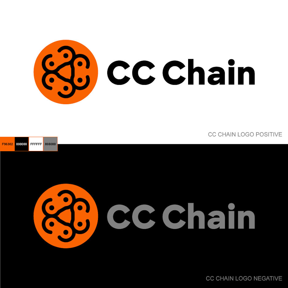
Go easy, children. It's been a while since designing my last logo ;)
- That center shape created by the links i awkward, also links aren't connected so it s not really a chain yet. I like the coloursrobthelad
- What's it for?Nairn
- Well, the links are the 3 C's of CC Chain.
It's a company that has to do with chain links (not for bikes). They aren't public yet.jagara - How is it awkward?jagara
- I see your point about not connected = not a chain (and i considered this myself). But they make individual chain links as well as chains, so i figured it worksjagara
- Hey jagara, is it already delivered / approved ? I have some feedback if not, but if it's done there's no point in making you doubt :)spl33nidoru
- boobieskingsteven
- boobiespango
- I think there are too many elements. It seems as though the 'CC' is lost a bit. I wonder if the icon should just be one chainlink and not in a circle.Morning_star
- Also, does it work if you stack it? Linear logos can be unreadable in limited width spaces.Morning_star
- Defo tits********
- I see 3 chicks together, looking upstewart
- Biohazard Mammariesgarbage
- even the pronhub color palette.milfhunter
- Yes boobs for one, then you probably don't need the thickness variation in the type, and surely there's a way to use the same Cs for type and logo visual.spl33nidoru
- tits, tits, titsdmay
- I agree on too many elements it's a little busy did you try it without the dots maybedbloc
- Or maybe connect them like actual links would be connecteddbloc
- The chain links look like bike chains especially with the dots in the middle. But you’ve got something there, I like the colours and the font too_niko
- I see a lionSalarrue
- i likeneverscared
- Smiling tigersstoplying
- It's approved and delivered. Thanks for the feedback, guys.
ಠ_ಠjagara - @spl33nidoru what thickness variation? It's the same weight.jagara
- you're right, my bad, it felt thicker on the Cs than the rest but it is not.
As long as the client is happy don't worry about us!spl33nidoru - Now that's a partyShenanigansTV
- Could you drop the mark all together and just use the CCC as the links of a chain?monNom
- TITS UNITED FCAQUTE
- This is why I love this site. The only vetted critiques I trust and are found nowhere else.falcadia
- CC boobiesKrassy
- falicidia lol true, also goes for product reviews and recommendations for food, shoes, travel...everything_niko
- I’m glad I'm not the first person to say I see boobies but... boobies.shellie
- proud to be secondpango
- I'm going to motorboat that logo :)
Nice work Jag...utopian - is this a logo for a downloading pirate site to get Adobe CC and boobies for free?CyBrainX
- stewart28
Working on loads of paper model designs, but also typefaces.
Give my new font Doublez a like on Creative Market, that will help!


- Nice !d_gitale
- Cool!PonyBoy
- YEAH BOIII!!!ideaist
- nice work!renderedred
- Great work. If you're going to promote your stuff, as you should, share a link!CyBrainX
- Here's the link to the font.
https://creativemark…CyBrainX - I thought it's better when y'all Google it :)stewart
- Great!Gabriel
- Great work, as always!OBBTKN
- Double the pleasureAQUTE
- Bravo! Encore!!AQUTE
- I bought your "Monogram Rounded" (SO. NICE!) on CM, BUT it says "Access Denied" when I try to download.
: (ideaist - This is awesome. Have it bookmarked for when I need to buy it for a project!hydro74
- Nice!MrT
- +1utopian
- ideaist, somehow CM changed the listing of the font to 'draft'. I think it's fixed now, we'll contact you via CM.stewart
- very nicewhere_am_i
- nice one, StewartGnash
- @stewart; got 'er AND DAMN you're a talented SOB.
T
I
G
H
T
!ideaist - Thanks!stewart
- Double our pleasure!canoe
- Good stuff!stoplying
- One of the best fonts I've seen in a while!!Projectile
- @Stewart what's it like creating a font?
Painful process? Do you make any money?Projectile - @projectile: I love the process and drawing. The tech part like spacing and kerning is a showstopper. I'm still make fonts to find the chicken with golden eggs.stewart
- skwiotsmith10
Over the past few months, I've been doing a lot of experimentation with animation through Vectoraster / Illustrator / Photoshop, and finally got around to building a directory viewer for a more pleasant viewing experience.
Heads up: lots of fast moving / flashing lights. Definitely would recommend being on wifi because of some of the file sizes, too...
- Niceduckseason
- dope! no after effects usage?lvl_13
- Nope...no AE at all. Everything is animated in Vectoraster, with a tiny bit of image processing in Illustrator/Photosho...skwiotsmith
- Excellent!Salarrue
- niceeprophetone
- Not sure what's going on, but I like it.utopian
- Love itPhanLo
- nice! pair em with some tunes!Squiddy
- Hot.skinny_puppy
- How have I not heard of Vectoraster! Also damn, this is all amazing!hydro74
- stewart18
Made some animations to promote my new inline font. It is done completely in Photoshop, screen recording. Fun way to make animations by hand.

- I like this style of chromatic aberration. I've always wanted to shift the RGBcolors to something else but I always forget to try that.CyBrainX
- And the inline font is great as always.CyBrainX
- +1OBBTKN
- Rad.ideaist
- Very seductive you sexy motherfuckercanoe
- Lovely. I’m familiar with the AE method but this looks more refined.MrT
- respect man! looks wonderful.renderedred
- nice animationutopian
- MrT I wish I knew AE that well. I am doomed to look for other workarounds :)stewart
- I think you could do this in AE with a Camera Blur/blur map setup and a Tritone or Colorama for the color.CyBrainX
- THIS is what QBN is all about (IMO):
"Very seductive you sexy motherfucker"
~ @canoe
Bro(s) (& @shellie)ideaist - YummyGnash
- neverscared5


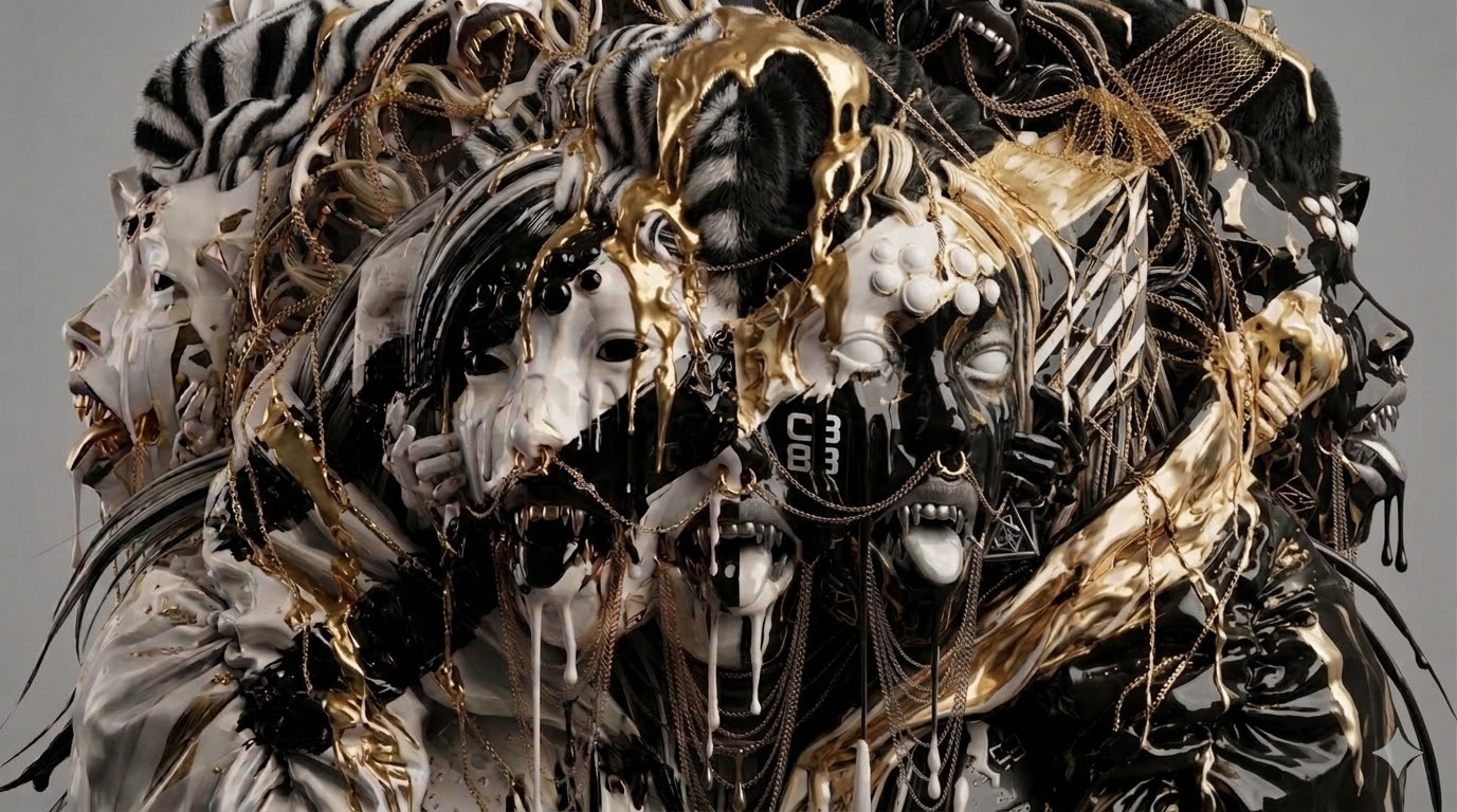
used the 3d rendering out of blender and mapped into a face and jacket structure
- Chaos! This looks awesome.hydro74
- thanks... + photoshop between blender and a.i.. to arrange the renders and then to a.ineverscared
- Do you have IG to follow?canoe
- not yetneverscared
- newcunt24
.jpg)
- I done a painting.
Oil on canvasnewcunt - Love it.Continuity
- <3PonyBoy
- +++PhanLo
- Cool********
- You done good!palimpsest
- Dope_niko
- Very niceGnash
- Strong imagestewart
- like it --- and your name_me_
- Its setFax_Benson
- Like it a lot. If I may, how big is it?MrT
- Thanks chaps. Glad you like it :)
MrT, it's 30x40cmnewcunt - I'd like to start doing some bigger ones. I'm new to oil paint but really enjoying itnewcunt
- +1utopian
- +renderedred
- SET!garbage
- https://static0.srcd…garbage
- LoTR IIIpalimpsest
- I done a painting.
- newcunt26
One more.
Oil on canvas
30x40cm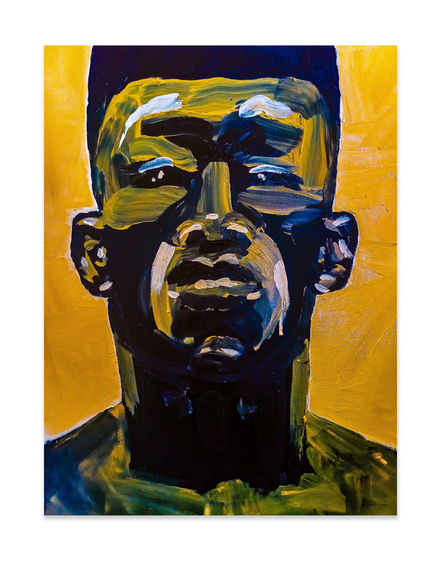
- love emscruffics
- sweet. try one painting on board, you're brushwork is made for itGnash
- niceprophetone
- Grace Jones?utopian
- Do you know what Grace Jones looks like?canoe
- I'm quite taken by the positive feedback, thought I'd get slated on qbn. Thanks fellas. Gnash, I will try board!newcunt
- Welcome back!palimpsest
- ^Continuity
- +1garbage
- stewart32
I created the book design and illustrations for the first Dutch translation of The Maracot Deep by Arthur Conan Doyle (best known as the creator of Sherlock Holmes).
It is a science fiction novel, written in 1927, in which the main character observes mysterious creatures during an unplanned descent to the bottom of the ocean.


- Lovely!PonyBoy
- Great project. As always, so clean. Great lines and palette.garbage
- <3mort_
- Beautiful intricacy, the colours are spectacular._me_
- Beautiful Illustrations, all by hand?NBQ00
- Cool to see after coming home from scuba diving yesterdaycanoe
- Nice Stewart...utopian
- COOL!bezoar
- very nice!Fax_Benson
- Crazy good.CyBrainX
- neverscared8
- Damn, son. This is some of your best. You have to animate this. I can hear it moaning and puking already.CyBrainX
- the machine animated it... https://www.youtube.…neverscared
- Whoa! fuck yes.bezoar
- Now, that's my kind of party.CyBrainX
- nice!renderedred
- Did the machine make this?canoe
- AI? if so, no +1, but still looks coolhydro74
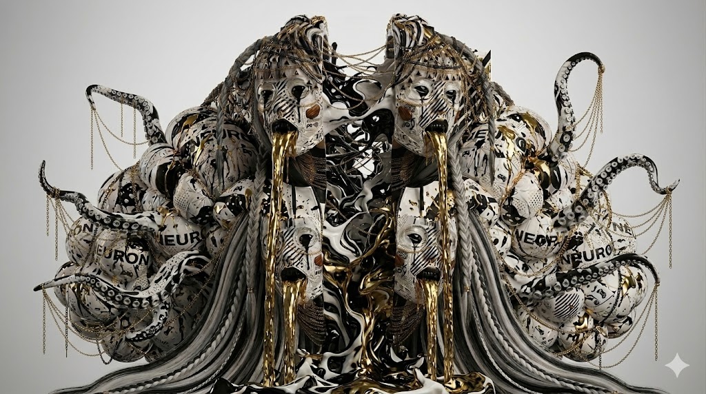
- the little star in the bottom corner tells u gemini watermark, the origin is are 2 3d renders of blender. then manipulated with a.i...neverscared
- stewart23
I have designed another fun paper model, produced in a print run of 2,000 copies. This model can be assembled without the use of scissors or glue thanks to the cuts and creases. Very time consuming production though.

- Your work is inspiring. I was thinking how fun it would be to do the same with architecture, or with hybrid paper materials that can almost snap.monospaced
- I love the work of David Umemoto, somehow abstract architectural paper models.stewart
- So nice. I bet that's fun & satisfying work. Job well done.falcadia
- Slick as usual stewgarbage
- Qualty workOBBTKN
- Dude! Always greatGnash
- Stew-pendous!stoplying
- Take your stuff and get out of here, stoplying.
Also, lovely work as always, stew!Continuity - mien merkmilfhunter
- mantrakid6
im starting a thing thats all about my monster creations (art, prints, plush creatures, figures, etc). Tried to go for a 80-90's cartoon / toy vibe...

- Sounds like a fun project, good luck :)utopian
- thanks man!mantrakid
- Coolskinny_puppy
- Cool. Nice site too.d_gitale
