Show some recent work
Show some recent work
Out of context: Reply #8710
- Started
- Last post
- 8,734 Responses
- jagara14
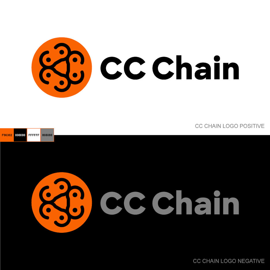
Go easy, children. It's been a while since designing my last logo ;)
- That center shape created by the links i awkward, also links aren't connected so it s not really a chain yet. I like the coloursrobthelad
- What's it for?Nairn
- Well, the links are the 3 C's of CC Chain.
It's a company that has to do with chain links (not for bikes). They aren't public yet.jagara - How is it awkward?jagara
- I see your point about not connected = not a chain (and i considered this myself). But they make individual chain links as well as chains, so i figured it worksjagara
- Hey jagara, is it already delivered / approved ? I have some feedback if not, but if it's done there's no point in making you doubt :)spl33nidoru
- boobieskingsteven
- boobiespango
- I think there are too many elements. It seems as though the 'CC' is lost a bit. I wonder if the icon should just be one chainlink and not in a circle.Morning_star
- Also, does it work if you stack it? Linear logos can be unreadable in limited width spaces.Morning_star
- Defo tits********
- I see 3 chicks together, looking upstewart
- Biohazard Mammariesgarbage
- even the pronhub color palette.milfhunter
- Yes boobs for one, then you probably don't need the thickness variation in the type, and surely there's a way to use the same Cs for type and logo visual.spl33nidoru
- tits, tits, titsdmay
- I agree on too many elements it's a little busy did you try it without the dots maybedbloc
- Or maybe connect them like actual links would be connecteddbloc
- The chain links look like bike chains especially with the dots in the middle. But you’ve got something there, I like the colours and the font too_niko
- I see a lionSalarrue
- i likeneverscared
- Smiling tigersstoplying
- It's approved and delivered. Thanks for the feedback, guys.
ಠ_ಠjagara - @spl33nidoru what thickness variation? It's the same weight.jagara
- you're right, my bad, it felt thicker on the Cs than the rest but it is not.
As long as the client is happy don't worry about us!spl33nidoru - Now that's a partyShenanigansTV
- Could you drop the mark all together and just use the CCC as the links of a chain?monNom
- TITS UNITED FCAQUTE
- This is why I love this site. The only vetted critiques I trust and are found nowhere else.falcadia
- CC boobiesKrassy
- falicidia lol true, also goes for product reviews and recommendations for food, shoes, travel...everything_niko
- I’m glad I'm not the first person to say I see boobies but... boobies.shellie
- proud to be secondpango
- I'm going to motorboat that logo :)
Nice work Jag...utopian - is this a logo for a downloading pirate site to get Adobe CC and boobies for free?CyBrainX