Pentagram Sucks...
- Started
- Last post
- 189 Responses
- detritus-3
Zz
.
Why would anyone - who is not in the business of selling sleep - employ a double zz in their branding?
That's CRAZZY, motherfuckers.
- Domainset
- the only point of interest here is how such a 2nd tier .com can afford Pentagram. Investors money well spent when one of us could have banged it out?fadein11
- I do know what they do by the way, I have to integrate their fakkin' reviews into numerous architect client websites.fadein11
- they're valued at around $4 billion.Gnash
- yes, it's abundantly clear the domain was the limiting factor here, that's obvious. What's not obvious is the lack of any further thought on the subject.detritus
- Asks obvious question. Gets obvious answer. Says obvious answer is obvious. lolset
- @gnash, Uber is valued at [insert inflated meaningless price here] but they are still an utterly shit company not worth anything near.
And Jesus, I was joking.fadein11 - Sorry, set - shall i dig out my badge machine and make you a congratulatory badge for your profound insight here? What's your address again?detritus
- LOL.detritus
- "one of us could have banged it out" was the clue to the seriousness of my comment.fadein11
- 72 go fuck yourself avenueset
- hahafadein11
- [engage QBN escalation routine]
no pls don't, let's all just be nice to each other, like jaded bitter dog wee stained snowflakes.fadein11 - Meh. Said with a smile on my faceset
- meh is prob the most appropriate response to my comment(s) and without a smile on your face. I've done it again :(fadein11
- What's your address, fadein? I've got a badge for you too, it's sparkly and has a flop-wristed snowflake on it... .detritus
- Just in case you're sat there weeping, I wasn't being entirely serious, fadein.
Not EVERYONE on QBN loathes you.
Well, almost.detritus - Even I don't loathe fadein. I don't really loathe anyone. Well, apart from mono, but that's unavoidable.set
- lolmonospaced
- Only joking. Obviously.set
- What sort of a micro-penised halfwit would bother downvoting this fantastic post?detritus
- Not this oneset
- haha!detritus
- this thread gave me a micro-penis, I like it.fadein11
- magnificent_ruin1
why did you add an apostrophe to the word logos? that really pisses me off!
- oops - My BadAmicus
- it doesn't really piss me offmagnificent_ruin
- it pisses ME off!monospaced
- LOUD NOISESgramme
- hahaha same hereMiguex
- i_monk0
Have they discontinued their blog, or are all the image links broken at blog.pentagram.com?
- same here mateOBBTKN
- It's called design. Look it up.face_melter
- i_monk-4
New logo by Paula Scher.
- Id like to see the editing process for this. This new logo is just so literal.desmo
- I'm guessing the rarely will need the type/textsince1979
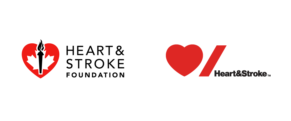
- well it sure beats the Canadian Olympic logo on the left.fadein11
- I'm guessing they will rarely need the type/textsince1979
- A playing card and a penis would equally suffice.face_melter
- E.T. salutes his masters back home.robthelad
- hahahaha robdetritus
- Trying to hard to be clever, designer's masterbationutopian
- ^ Lol can't unsee that nowdesmo
- ET is a goddamn nazi, folkssince1979
- I'll assume the down votes are directed at Scher.i_monk
- wow, this isn't even a first rounder._niko
- Considering this is for a Canadian institution it's a complete failure as it doesn't work in both official languages.zarkonite
- mort_2
Christ on a bike!
- 2005was bestyurimon
- Huh. Didn't know it was them. I love DC comics, far more than Marvel so the logo isn't all that important to me. Still a bunch of hacks though.face_melter
- That "C" looks like its on crack or maybe even heroin.utopian
- 2012 wasn't bad at all, wtf.Maaku
- This is really bad.grotesk_neue
- i love itinteliboy
- utopian2
- I like it.monNom
- what's "on a budget"formed
- diggin thisdocpoz
- i like. ^^ and ya, I wonder what 'on a budget' means at PentagramGnash
- I like it.dbloc
- why not link the end of the A with the start of the R?oey
- Fucking Amateurs!!!oey
- because that would be too conventional.docpoz
- That part bugs me about this (not connecting the end of the A with the beginning of the R).MondoMorphic
- It is the beginning of the R! http://www.handwriti…zarkonite
- mort_-1
Not tampons...

- What would a 'teabox tampon' be anyway?!
http://cdn.hypervoca… ?detritus - tampax padssince1979
- What would a 'teabox tampon' be anyway?!
- BK-2
Untrue:
- Amicus0
era404... they are human. they don't always create something that is great. btw... I know Paula Scher did they NY Philharmonic logo, but I'm not sure who did the other logos I've mentioned.
No one designer is ever beyond criticism... not Glaser, Bass, Rand, Lubalin, Aicher, Weingart or anyone.
As designers we need to get beyond hero worship, discuss each piece on its merits and try to constantly improve.
We can also look through an entire thread before commenting and realise this post for what it really was – A rant fueled by sleep deprivation that I've since explained in more detail, and with less loaded terminology than I first used.
- i_monk1
- I watched this with the sound off and I yet I still want to flatten everyone involved.face_melter
- i think that's the ideahans_glib
- i dont get it. are they making fun of the current ad jargondeathboy
- yeah, but this is horribly dated. seems so out of touch.garbage
- That's an ineffective pleastoplying
- JAY - Z ?robthelad
- univers1
I disagree....
- imbecile0
"We’d ideally like to code [the logo] so it could react to different conditions," Willer says, explaining that Pentagram could create a gridded visual logic so the logo always looks good. "They don’t want to have that yet because they’re quite scared of the diversity. So we ended up giving them a set."
- That's how they did it on a budget. By making it not actually a responsive logo? Still, I like Pentagram. Cool shit.nb
- jkmohr0
- and I want to listen to her because the citibank logo is so damned good right?zenmasterfoo
- i_monk1
^ ugh

- <ugh_niko
- to be fair, the previous logo was quite possibly the ugliest piece of shit ever, so this is an improvementmonospaced
- Amicus0
haha....
even Pentagram is on my side in this debate. They keep making my arguments for me now.
- thoughtandtheory0
Most of those identities are pretty solid. There are a couple questionable choices but to think everything they do is going to be perfect is just naive.
- cannonball0
This whole industry is managed by perception. How the hell do you think they got to the top of their roost? Through hard work? They perpetuate the illusion of being better. Maybe there's talent there and maybe there isn't. When it comes down to it, I don't see their work as better than anyone else's, but somehow they "appear" that way. I believe it's that quality that largely differentiates us designers to other people (and to a huge extent, to each other as designers). Selling yourself. I for one am awful at it, no matter how good I may or may not be at designing.
- simply put: pretentiousnessJG_LB
- Big, nice office, famous clients = more famous clients.bainbridge
- NBQ00-3


