Logo of the Day
Logo of the Day
Out of context: Reply #710
- Started
- Last post
- 934 Responses
- _niko-3
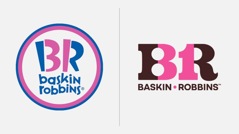
- Funny, I remember posting the new one on the left a few years agofooler
- new one's not an improvement but I do prefer the chocolate to the blue_niko
- Not a fan. It's lost personality and isn't very well resolved. Always wished it was Robbin Baskins.MrT
- The old one did a better job of disguising the 31 also felt more appropriate. New one feels 70s and the 3 & 1 are too conspicuous and also nasty letter formsBaskerviIle
- Looks too forced and not as fun as the old one.dbloc
- The 3 bugs me but i like the color schemescarabin
- 8RKrassy
- 8KKrassy
- I don't like the circle but the type is fun. New one is too corporate.doggydoggdog
- old one was OK and appealed to the right (kids) demographic just fineKrassy
- the old one was all right! Why does company changes their logo all the timeBennn
- I like the new one over the old one.MondoMorphic
- The new one feels more like their old brand and less like shit which is what the last logo embodied.monospaced
- I feel late to the game here, but I only just now noticed the 31 in the first logo..autoflavour