USA Today rebrand
- Started
- Last post
- 71 Responses
- fresnobob0
I guess the USA takes up the whole earth now?
- 20020
vs
- monNom0
I love it for how easy it will be to repurpose it for social commentary and other sorts of meme-ery.
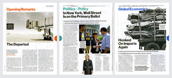
USA TODAY

USA TODAY

ETC
- Fax_Benson0
They're future-proofing for the global warming end game - half the planet submerged below the seas. The colours just represent whichever chemical might be the major pollutant.

- lowimpakt0
it's a vertical shot of an erect penis
- ETM0
I just find it odd that their pitch is a "moving logo" in a static medium.
- static?prophetone
- You think a newspaper is dynamic?ETM
- isn't more than just a paper?prophetone
- utopian0
Not that I don't think that it looks nice, minimal, interchangeable and all but, come on....
- brandon_phillip0
I wish they would have left the tight kerning on the lettering, would have been better if they just kept that. IMHO.
- cannonball19780
Fuck you guys. I like it.
- randommail0
the red dot is instantly "Japan Today" in my mind
- CALLES0
we have a fierce discussion at my place of work
Is it A Circle??? OR A DOT?!?!?!
tututummmmm
- teh0
^
Come on QBN!
when are you going to support vimeo and bmp?
- teh0

BBC is doing the color-coordinates links for categories. i like that idea but relying on just a colored circle is a little to simple minded.
Would have been nice if they used the existing globe with these colors.
I kinda like their old logo:http://sportsmediamasters.c...
- TheBlueOne0
"Well, how is this different than that disastrous Gap rebrand a few years back. You know, the whole square thing?"
"Well this is a circle."
"Uh-huh, go on."
"That was a square."
"I think I am starting to understand your vision here..."
"Yes, that was a square, in a solid block of color. This is a circle. In different blocks of color. Are you seeing what I am seeing here? Are you grokking me?"
"I think so...these are...circles. I am sold. Let's make the pitch."
- desmo0
Amazing
- TheBlueOne0
Here let me rebrand this site for you.

I'd like a million dollars for the concept. OK thnx.
- lvl_130
would make more sense if the company was called world today, but i like it.


