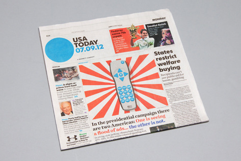
USA Today rebrand
- Started
- Last post
- 71 Responses
- ideaist0
Tough day in rebrands, huh gang?!
: )
- mikotondria30
I'll look out for that next time I'm in a hotel corridor.
- utopian0
WTF is going on here today?
Design world comes to a stand still!!!!
- dirtydesign0
looks like a Wolff Olins creation
- zenmasterfoo0
MOAR!!! The newspaper rebranded too.
- 20020
this brand has a rational. i like this
- prophetone0
i like it. simple yes but flexible.

- indeed indeed2002
- Twister anyone?moniker
- isnt BBC doing this?teh
- Green should have been Sports, too easy to attach green to money.brandon_phillip
- They always use purple in systems for life/arts/community - fucking typical.brandon_phillip
- isn't that why it is money tho? i suppose money could be yellow for gold, but this is US.instrmntl
- Took someone 5 minutes to come up with this.CygnusZero4
- lvl_130
would make more sense if the company was called world today, but i like it.
- TheBlueOne0
Here let me rebrand this site for you.

I'd like a million dollars for the concept. OK thnx.
- desmo0
Amazing
- TheBlueOne0
"Well, how is this different than that disastrous Gap rebrand a few years back. You know, the whole square thing?"
"Well this is a circle."
"Uh-huh, go on."
"That was a square."
"I think I am starting to understand your vision here..."
"Yes, that was a square, in a solid block of color. This is a circle. In different blocks of color. Are you seeing what I am seeing here? Are you grokking me?"
"I think so...these are...circles. I am sold. Let's make the pitch."
- teh0

BBC is doing the color-coordinates links for categories. i like that idea but relying on just a colored circle is a little to simple minded.
Would have been nice if they used the existing globe with these colors.
I kinda like their old logo:http://sportsmediamasters.c...
- teh0
^
Come on QBN!
when are you going to support vimeo and bmp?
- CALLES0
we have a fierce discussion at my place of work
Is it A Circle??? OR A DOT?!?!?!
tututummmmm
- randommail0
the red dot is instantly "Japan Today" in my mind
- cannonball19780
Fuck you guys. I like it.