Apple
- Started
- Last post
- 3,894 Responses
- hans_glib4
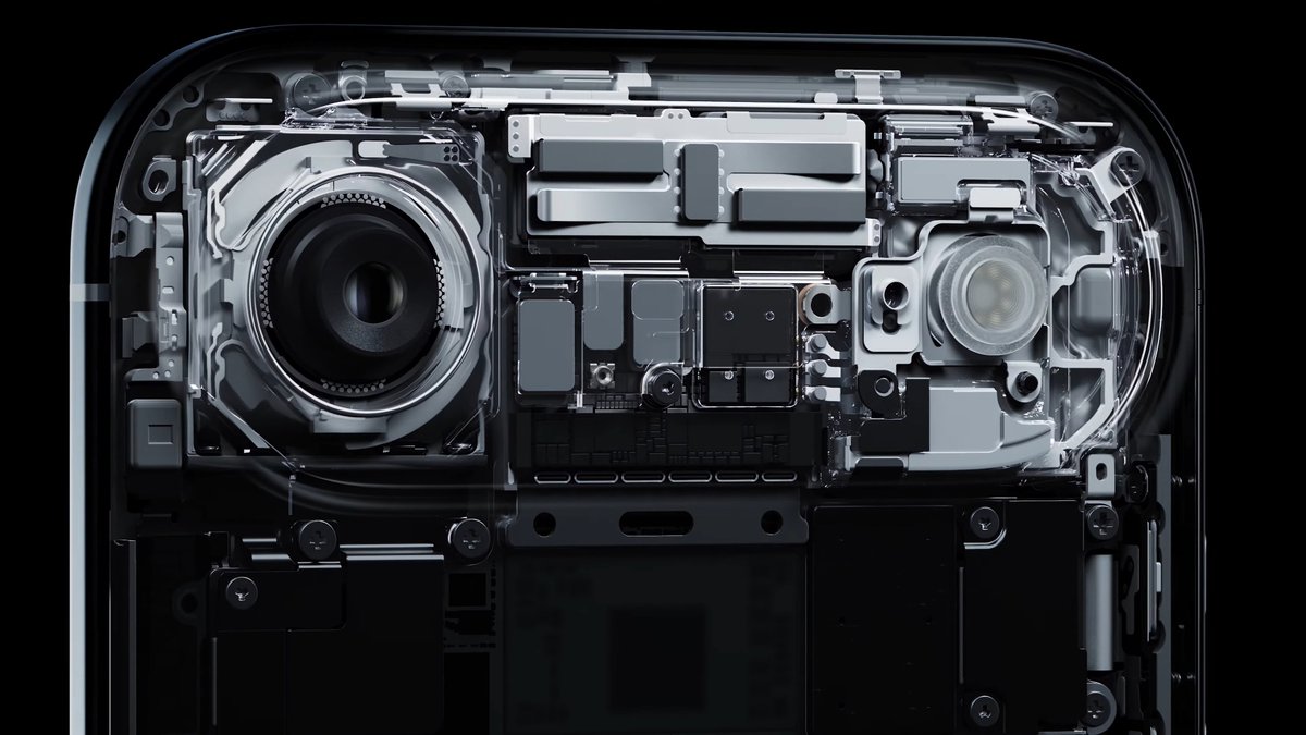
i don't really understand how they can claim thinnest phone ever with that clunky lens array up top.
it seems uttely pointless to me.
i hate the way my phone doesn't sit flat on a surface, rocking around if i have to use it on a desk. such poor design.
make it flat, ok so it'll be thicker - teh horror, teh horror - and use the extra space for a bigger battery, ffs.
- the iphone 6 was as thin:
https://x.com/HYPEBE…milfhunter - i think you'll find it was actually 0.01mm thickerhans_glib
- They cut the optical zoom from the camera to make it that thin********
- brighter screen which runs at 120Hz on the 17 too, because battery life wasn't shit enoughkingsteven
- the battery will last nineteen minutes and you'll fucking like it.face_melter
- worthless without "phyisical" microphone & cam on/off button on the side. why does apple not offer simple camera privacy slider or more protection?api
- I believe it's a transition to a foldable phone. Next version will be flat square when it's foldedzaq
- All the hardware is in the camera array up top!********
- the iphone 6 was as thin:
- ********-12
@hans
- meh. spread that shit out, install a better battery and make the fucker lie flat ffs.
it can't be that hard.hans_glib
- meh. spread that shit out, install a better battery and make the fucker lie flat ffs.
- ********-9
- ********-6

- lower wages, less jobs, higher prices for shit products we don't need!********
- "Designed in California, made in USA" for $10k********
- Yeah they tried that with their VR headsets too and look how many of them sold.dee-dubs
- Actually quite a lot based on their own estimates********
- Also
https://pbs.twimg.co…******** - $10k?monospaced
- What the fuck is that cow graphic all about Graph? You can't call people using a cow. You can't get train times from a cow. Dickhead!!Ianbolton
- Humour is hard for dumb people...********
- Apparently so is your self awareness.monospaced
- lower wages, less jobs, higher prices for shit products we don't need!
- robthelad0
What's your favourite colourway?
- 17 PRO silver with back-case orange from https://suti.coGabriel
- Yeah, just the silver ones this time********
- I was curious about the Orange, i wonder if it looks different in person. BUt yeah, silver is the winner hererobthelad
- Those cases are cool @gabrielrobthelad
- zaq0
Tahoe?
- To hoe or not to hoe.
that is the questionzaq - Will skip this one********
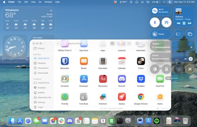
- First thing I will do: reduce transparency effects in settings.NBQ00
- Just use light or dark (auto) icons; this clear setting is nonsensical albeit (sometimes) attractive.ideaist
- this is giving Konfabulator, c.2003kingsteven
- No. What the fuck is that?maquito
- I will not install it until they fix this shitGabriel
- To hoe or not to hoe.
- mg331
Some good things with the new iOS but why did they have to mess with the size of keyboard keys???!?!?!?!!
Like, there was no reason for this. The cadence of typing is all off because of it.
Safari is gonna take some getting used to. It's two clicks now to see all open tabs. It was just one click previously.
- Key size is fine. What drives me insane is why they have a full stop next to the spacebar when in safari. All it does is add fullstops where you wanted a space.HAYZ1LLLA
- robotinc0
Checking out the new ios. Boo-urns to so much of it
- slappy0
iOS 26 feels kind of dated, like throw back theme. Also the contextual bottom menu (in contacts etc) combined with the info below is a mess.
- mg331
There are several things that feel clunky and feel like mistakes, but I'm surprised at how much I like the liquid glass aspect.
Note: if you have high contrast turned on in display settings, you need to turn it off to get the actual liquid glass effect.
- ********-5
- ********-5

- I see these:
https://tse1.mm.bing…dee-dubs - WTF is 2020?fooler
- 2020 is a failed Covid remedy.CyBrainX
- Who had them all? :))********
- @fooler AirPods Max :))jagara
- Still rockin' 2012 style.jagara
- HA! seriously didn't recognize the side view not to scale over the ear version! 07,16 & 21 fit me the best. I dont like the rubber tips.fooler
- I see these:
- cannonball19782
The increased in corner radiuses are a typographic nightmare.
- jagara6
Updated to IOS 26 "Glasshole".
Thanks, I hate it. Phone more sluggish, everything les legible.
Everything now looks like a cirka 2005 melodic trance rave flyer.
- it all looks totally fucking gash - christ knows what it'll do to the iPad and apps like AUM. i'll hold off updating for as long as possible.face_melter
- They have to redo whatever random design elements they can to make people feel they evolve. Meh x 1000jagara
- It is so kitschfisheye
- *lessjagara
- Is a shit! Terrible designGabriel
- It is a shit, I wholeheartedly concur!jagara
- ********-4
- it's all so mediocre, like people dressed by Gap trying to sell me Jesus. also, the perspective correction in almost all the shots is fucked.face_melter
- like, the backgrounds were all shot at chest height so the perspective is mangled and they tried to correct it. clowns.face_melter
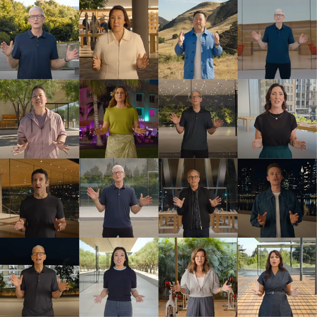
- All of them using the same gestures to present...how big is the apple :))********
- But seriously, having the same media training and presenting in the same manner seems unauthentic********
- Unauthentic, yeah, no shit. But I guess you don't want to leave it up to chance, when you're dealing with trillions of dollars.jagara
- Bland people telling you bland things.jagara
- Gabriel1
What a horrible design... some design director should have their fingers cut off.


