Apple
- Started
- Last post
- 3,894 Responses
- mg332
- yuekit0
What were they thinking? Maybe the new UI will turn out to be good once you use it but the way they're presenting it looks terrible.


- the aqua glass looks so cool on the demos, but this desaturated icon version is jut bad, I 100% search for apps by their colour._niko
- In motion it looks slick. Kinda bad messaging/advertisin... with how they're showing it in stillsinteliboy
- Ugly AF ... yet another sad desperate attempt by Apple to appear relevant. Where innovation goes to die.utopian
- Nah it's just there's not enough innovation to dish some out every year to justify the latest model they need to sell to keep the profits rolling.MrT
- pointless update is pointlesshans_glib
- Indian designersOBBTKN
- My phone is 5 years old and works like new. I can't imagine what benefit there would be to spending upwards of $1000 to upgrade.CyBrainX
- lol, if you watch the video they posted where they talk about the design they seem to be American. What's the excuse now?yuekit
- the "acqua" ui looks disabled, IMOmaquito
- And the leadership of Apple saw this and apparently signed off on it.yuekit
- Horrible, already outdated.milfhunter
- looks like the ui died and became a ghostNutter
- "updates" are just the modern version of a mechanic cutting a hose to get u to bring ur car into the shop for repairs. Dumping apple = best updatecherub
- timeless fresh magic look...u can never go wrong with that claim...neverscared
- https://vm.tiktok.co…maquito
- utopian-1
Analysis: Apple manages to keep up with AI but doesn't lead on innovation.
The new software updates that Apple announced today showed that the iPhone maker is keeping pace with AI tools that currently exist. But it didn’t show anything new that feels like its own fresh take on how AI can change the way people use their devics.
Remember: The annual Worldwide Developers Conference today came at a crucial time when the tech giant is under a lot of pressure to compete on AI. Apple has struggled to convince consumers and Wall Street that it’s a leader in the crucial technology, which is promised by tech executives to overhaul the way people work, communicate and find information online.
Apple announced new features today like translation of calls and messages, phone call screening, and the ability to search for items in images on your phone’s screen.
But these were some of the earliest applications of AI that arrived on Android, particularly from Google and Samsung. And while Apple is keeping pace, competitors continue to barrel ahead with new AI tools and services.
- LOL AI is shit, Apple won't put shit tech in their tech********
- Eh, siri...robotinc
- LOL AI is shit, Apple won't put shit tech in their tech
- inteliboy0
worth a watch
https://developer.apple.com/vide…- Seems like a natural transition into haptic feedback / screens and inputs that meld reality and AR, eh?ideaist
- ********-5
- ********-8
Glass UI, just not enough contrast man...
- And I know the guy doing it and I told him the same :))********
- The one guymonospaced
- Well...if you've worked in product design, you would have known his name :)********
- You're like the town liar right?********
- I know Barry too, cool guy, likes glass.robthelad
- Barry Apple, right?pseud
- No matter who they are, I think all of us here agree that they should have listened to you, grafpseud
- Again, if you working in Product you basically know whois who :)
If you don't you don't******** - But it's the same guy that designed the Dynamic Island and previously gestural UI for early X model********
- I guess it depends on the context. For apple vision it would be great to have opacity. You can choose a monochromatic, neutral UI if you want to as well.maquito
- I think much of what we see is biased, and we rush to judgment on something that's probably undercooked.maquito
- Leaving preferences aside, it seems to me that the exercise of early criticism is overstated and the opportunity and the process it demonstrates are understatedmaquito
- And I know the guy doing it and I told him the same :))
- inteliboy1
be cool if it actually looked like this, not just in the UI animations, but across the board:


- Not for professuonal use & work. I like the current flat look and would've appreciated some of the new transparency glass effects...NBQ00
- But there's just too much now and the corners are too rounded too. I'm sure I'll get used to it.NBQ00
- This is getting a hugely negative reaction on social media from people who are trying the developer preview. It's sad but Apple really seems to be flailing.yuekit
- when does apple not have negative reactions? no matter what they do it's greeted with whining and hateinteliboy
- Many times, for good reasons.********
- < !jagara
- yuekit0
Maybe one of the problems is that Apple is afraid to ever rethink the fundamentals of their UI. iOS is still the same grid of icons as when Steve Jobs announced it and apparently when you buy an iPhone in the year 2030 or 2035 it will still look like that.
So instead you get these endless tweaks to the superfluous aspects of the UI. They keep redesigning the native apps and sometimes they get better but many times it's actually worse than the previous version. The entire concept of this new "liquid glass" seems to be that it floats on top of the old UI.
Almost every successful company falls prey to the same problem. Google search still looks like it did decades ago but has steadily gotten worse as they patched different features on top. If we could really reimagine things from scratch things could be designed much better but there's no path to get there.
- Keeping it safe. The idea that users are stupid and everybody needs to make UI dumb proof.
But users are smart and can take changes.******** - Form follows function and until the mechanics of our touch, sight, hearing and speech evolve it'll be an evolution not a revolution when it comes to UI design.Morning_star
- am just not sure if any of these OS's need a full redesign though? we're not redesigning how a toaster works... or a power drill...inteliboy
- at this point all an OS needs to do is - screen wakes up, get to app in 1 click, and give me a good notification UIinteliboy
- "Form follows function" and ease of use doesn't mean you can't ever change the design. I think it's just a result of companies not wanting to change what makesyuekit
- money for them or risk confusing/alienating their users.yuekit
- I think there's only so much you can do and it's all quite cosmetic.
Would you like to buy one of these newly designed three armed shirts ?Morning_star - Well there are only so many ways you can design a shirt. Don't you think the Google search experience could be a lot better?yuekit
- Keeping it safe. The idea that users are stupid and everybody needs to make UI dumb proof.
- i_monk2
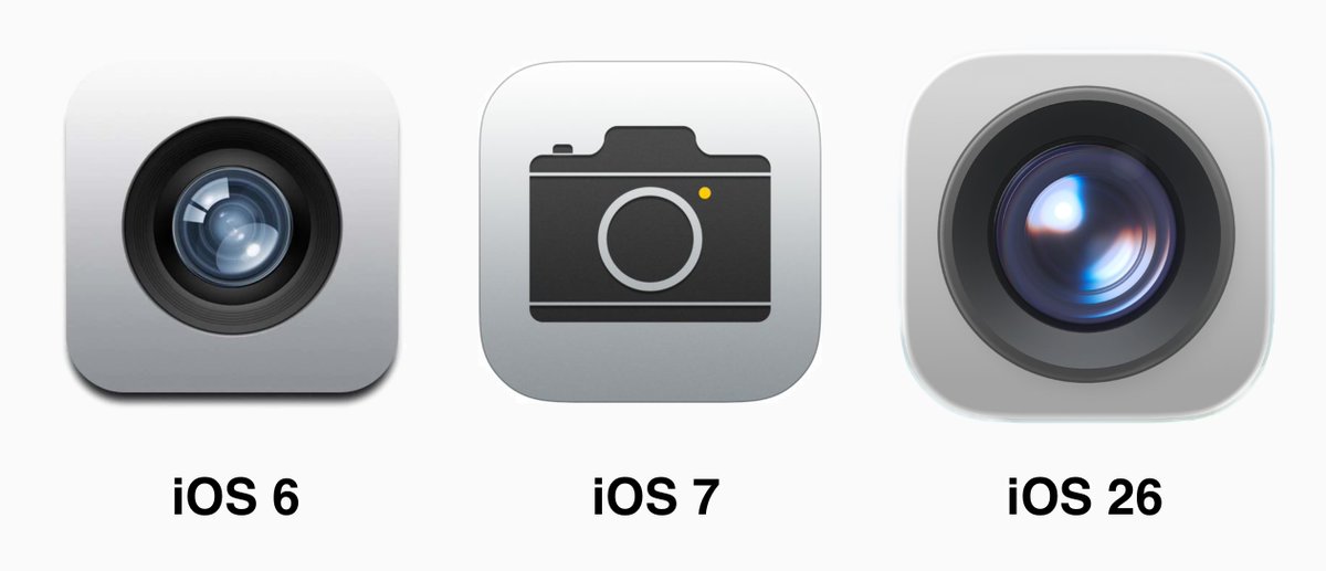
The return of skeumorphism.
- can't wait for the leather bits!_niko
- niko ... I had no idea you leaned that way!Continuity
- ********-7

"every day we stray farther off steve’s light.. #ios26"
https://x.com/merterdir/status/1…
Mert really has a point:
"okay we all had our fun—now here’s what’s actually wrong with iOS26:
bugs? whatever, it’s beta 1
but the liquid glass UI as it's implemented now? a hierarchy, legibility, and complexity nightmare
jony ive said it best referring to bauhaus: “they figured out how to bend tubes, so they made everything out of bent tubes”this is what it looks like when:
the CEO isn’t a product guy
PMs infiltrate and erode a functional org
no one is personally held accountablewithout maniacs with taste at the top, you can't ship a great product. esp one this complex.
everything looks good in isolation—but the big picture? it’s chaos.
and the PM disease is showing: every element screams for your attention because each team’s optimizing their own KPIs.
this is an orchestra without a conductor
and it's extremely disrespectful to the designers at apple who likely poured incredible amount of effort into making their own individual pixels look perfect. tim cook MUST do better conducting the incredible orchestra that is apple"
- It's just a phone.ideaist
- Jobs said otherwise.********
- But it's just a Beta version, they will probably change stuff until final release.
Otherwise for us designers it will be a big pain to design for this system.******** - Btw Sketch already released the UI library
https://www.sketch.c…******** - Steve, whether we like it or not, is dead. He can no speak.maquito
- *notmaquito
- NBQ001
Already giving me a headache: https://x.com/UniverseIce/status…
- stewart1
This what amazed me, and it's already 23+ years ago.

- Stripes!NBQ00
- remember when PS came with those gel styles as presets, oh those were the days.robthelad
- I thought these gel styles came from the transparent hardware at the time - I hope they do something like that againSlashPeckham
- Make it look like apple, was all we heard back thenBonSeff
- Really hated the jump from the old system to that, Some things just looked super cheesy.PhanLo
- NBQ003
In an isolated presentation like this it looks really nice and well designed. But once random content comes into play it's a different story.
- why are their office backgrounds so sterile and corporate dreary?hans_glib
- Probably not real and just for presentation purposes.NBQ00
- They do virtual sets and fake sets for their keynotes after all.NBQ00
- sold well.milfhunter
- i_monk4

- I trust that some of the problems that appear today in relation to GPU demand, accessibility, contrast, etc. will be solved.maquito
- What we are seeing today is still a beta.maquito
- They put so much effort in it to create a new design language just to say "still beta"? Do you think they will revert it back or something? :)NBQ00
- Idk, maybe water it down a bit (jk)maquito
- It’s definitely cleaner in light mode than dark. It’s like their team just didn’t think about it (which was a common problem at [big-tech-company].5timuli
- They definitely haven’t figured out how their accessibility features integrate yet. Adding an adjustable the scrim to the glass overlays would be a big help.5timuli
- In dark mode there’s a fuckload of noise caused by the edge highlights. Total overload. It’s equally contrasting on either side. Tone it down and soften5timuli
- the opposite edge. It’s actually amazing to me how companies still get away with a11y failures like this today. It’s not like it’s a difficult to be inclusive.5timuli

