Typography
- Started
- Last post
- 118 Responses
- utopian9
Playing around with Midjourney.


- Sickmonospaced
- Fun and chaotic.ideaist
- Nice! AI doesn't seem to get type, but these are dope.PhanLo
- i can imagine how great this would have been in the type connect daysBonSeff
- damn how did you got this look?
i was sucking to get gradient letters few days ago.sted - nice uteAQUTE
- really cool color pallet, these are great to start something really coolfeel
- Kinda constructivistmonospaced
- nice!fadein11
- looks like a destruct modifier gone wrong in blender...neverscared
- not meant in an negative way - gone wrong - thingy... can anyone point me to a tut where it´s explained how to feed a 3d rendering to a the a.i and thenneverscared
- manipulate inside ? i saw daytoner doing some of his stuff inside and it looked kinda good...neverscared
- †garbage
- It's amazing how confused AI still is with type. This takes advantage of thatCyBrainX
- Krassy13

Gerald Cinamon / The National Book League (NBL) / Typography / 1974
- Nice one!palimpsest
- datz nicestoplying
- The minimalist trend in logo design during the 70s is at odds with the rest of a culture saturated with excess.CyBrainX
- Always loved the Mill logo.Wordsworth
- Again with the 45 degree shitcannonball1978
- grafician9
These book covers by Alex Trochut for Penguin Galaxy collection look amazing

- Loving the 2001 and Neuromancer coversContinuity
- As I am currently reading Neuromancer, yeah I think it's the best one, second place Dune covergrafician
- wow! love it.renderedred
- stunning. love these.pedromendez
- That Alex guy always delivers.dopepope
- I have that Neuromancer signed by the grandmaster himselfcannonball1978
- Bluejam8


- Kachi-Buwa is a variable Katakana typeface expressing Japanese onomatopoeic expressionsBluejam
- https://www.itsnicet…Bluejam
- Noice!BaskerviIle
- CoolGnash
- https://en.wikipedia…SlashPeckham
- I do wonder what all this dynamic typography that's come out recently will evolve into. Continuing on a hundred years. it's v. interesting.Nairn
- This is awesome. Now we can read the Predator's text messages over his shoulder.garbage
- Krassy6
- oooh.detritus
- noiceset
- how? text mapped to 3d object in illustrator? cant think of best way for that...deathboy
- I tried in Illustrator, and it only works over a small section at a time.monospaced
- it's funny, there was a time -- and not that long ago -- when you could say for sure that someone actually drew it.Gnash
- someone did actually draw it.
Charles Williams
http://www.madeup.or…imbecile - too perfect to be hand. Its possible in illy just a pain. Im unfamilair with capabilities of C4D but Id imagine that would be easierdeathboy
- http://i.imgur.com/n… reminds me i should use more mapsdeathboy
- did the 'draw' it (old school) or use a combo of 3d software and filters?Gnash
- I don't mean to diminish the talent involved. I'm just saying that in days of yore, one needed to put brush to paper. twas the only way.Gnash
- Maybe cinema 4ddirtydesign
- +deathboyimbecile
- Come on. It's a piece of piss in illustrator with some Photoshop to finish.Muncher
- I would bet the house this was done in a 3d package. And it would be much faster and easier to do it that way than any other, including by hand.CyBrainX
- Gnash2
For you non Greek readers, does the title work? While I get what they’re doing, all I see is CLSORDTRD

- yesshapesalad
- works for me. knowing im look at a somewhat cleopatra person.milfhunter
- ΛΟΛ
@ CLSORDTRDpalimpsest - Yes it works fine for me. That T though... I hate the "Futura crucifix".stewart
- There's a wee Greek takeaway - run by genuine Greeks - that's opened up recently that's nearby called OPA (lol), typed 'ΩΡΑ' - I'm guessing the Ω's wrong there?Nairn
- But yes, I'm sorry to say that I'm ignorant enough to just read your poster example as the designers intended. No confusion here.Nairn
- @nairn, the omega letter is correct at your Greek joint. There are 2 letters in Greek that are similar sounding, omicron and omegaGnash
- Also, not ignorant at all, lolGnash
- Isnt she jewishdrgs
- Not sure, she’s Israeli, so I guess so?Gnash
- Gal Gad-HOT, am I right folks?ideaist
- I'd no kick her oot'a bed for fartin'.Nairn
- Gal Gsdot is as interesting as a golden retrievrrcannonball1978
- Golden Retriever you said?palimpsest
- http://clsordtrd.com… is available if you're looking to bank on thismisterhow
- I thought she was black. ;)monospaced
- i_monk7
Free fonts based on the handwriting of Bowie, Cobain, Lennon, Cohen, and Gainsbourg:
https://www.songwritersfonts.com…

- Gnash2
So Netflix had ditched Gotham and replaced with a proprietary font, Netlix Sans.
Here's the hot-take: "saves the company millions of dollars a year as foundries move towards impression-based licensing for their typefaces"
How much are your clients' spending on font licensing for their digital products? How much is this considered in your workflow?
/cdn.vox-cdn.com/uploads/chorus_image/image/59108471/TYPEFACE_CASE_STUDY_09.0.png)
- millions. I had no idea the fees could get that high.Gnash
- Another generic Swiss style font, meh. But if it saves them money, +1.Maaku
- the red and white color choice augments that Swiss Style feelinguan
- https://www.youtube.…utopian
- Arial Bold?utopian
- There definitely are some kerning issues here.CyBrainX
- make sense for big brands to make their own font. But it looks so similar to other san serifs, are we going to see lawsuits?shapesalad
- Meh.Continuity
- @CyBrainX Yeah, I'm surprised they let this out as is...the kerning is just all over the place.skwiotsmith
- jeez, even Helvetica Neue has issues "out of the box"monospaced
- it's not so much the font that's news. it's how much they paid in fees for Gotham! damn. that's crazyGnash
- I laughed at the "enhanced geometry" around the circle!mugwart
- https://www.prototyp…imbecile
- BannedKappa0

---
The 's' in this seems like it's too far, I'm trying to match the kerning but don't want them to overlap. I've tried joining them but haven't been able to product a result I'm happy with.
Any examples or suggestions on the fix for this.
- I hear what you are saying, but I don't think there is a fix beside modifying the letter "k".utopian
- BTW - I think that it looks fine, as is.utopian
- thanks for you reply utopian! I've prob been looking at it too closely, much appreciatedBannedKappa
- adjust the tracking of the other letters?_niko
- What _niko says. Loosen it up a little.Ianbolton
- Utopian's "k" modification advice
+
_niko's & Ianbolton's suggestion to loosen up the other lettersKrassy - BTW, what's the use/application of this "links?" context? maybe you should "link" the letters if meaningful to do so?Krassy
- What Krassy said - why not "play" with the word and link the K and Smicrokorg
- yeah, if you're looking at it in totality, the optical relationship between the letters is the issue, not just the k/s. What Niko said.ben_
- Yeah more space between the other letters perhaps. Also you could look at extending the k so that it's more evenly balanced...pedromendez
- At the moment, the top seems very short and the bottom extends a lot, something more even might help? https://imgur.com/a/…pedromendez
- This may be 2 mundane questions but
1. What is it for?
2. Is this a type setting job or a logo job?
This'll help me with what to suggest :)notype - the spacing is so tight, scale it down and the gap will go and it'll like like you crammed the letters into one. Is that what you're aiming for?shapesalad
- *look likeshapesalad
- I mean the gap between the letters on the serif part at the bottom. he heshapesalad
- rechtssted
- i_monk4
- Well, now I'm erect.detritus
- i_monk... you just made at least two straight men erect... impressive ;)PonyBoy
- I'm not familiar with this tool. what is it?Gnash
- detritus haz strange bonerutopian
- Handmade from a can!mugwart
- tbf, much of what i_monk posts here gives me a hint of chub at least. I should rat on him to his bf, let him know what a teaste he is online...detritus
- @Gnash, it's called a ruling pen, you can buy them or make your own. http://www.paulshawl…Maaku
- det: we're open, he won't mind
https://media.giphy.…i_monk - thanks, maakuGnash
- shapesalad3
LOVE LOVE LOVE
https://www.instagram.com/explor…
How to get a job designing old style European store fronts?
- Work in filmGnash
- +Wordsworth
- Simple, just invent a time machine and travel back to the job you wantnb
- all the good design exists in the past. all the bad design is before us in the future....shapesalad
- Don't bother. I took my daughter to go see a shop sign I loved here in Italy (I know..) and it had been replaced by some sad plastic crap.Nairn
- This was so good. Also, I want to take a European vacation.CyBrainX
- i_monk3
- 85 out of 100grafician
- 99 / 100PonyBoy
- https://i.imgur.com/…
how is this 100?sted - Degree of tolerance?i_monk
- Yvess one is hard!Krassy
- 86SlashPeckham
- mekk7
- give that man a cookiehelloeatbreathedrive
- dude's pouring the paint at the same time... :OPonyBoy
- Krassy7
Kurppa Hosk / Tink / Lota Grotesque Bespoke / Numerals / 2018

- chukkaphob3

- Mother Auckers?dee-dubs
- Mother Aucterszarkonite
- Donald Trump?
https://cms.qz.com/w…Krassy - Mothery Tuckersfadein11
- @fadein11 +1chukkaphob
- Bluejam5


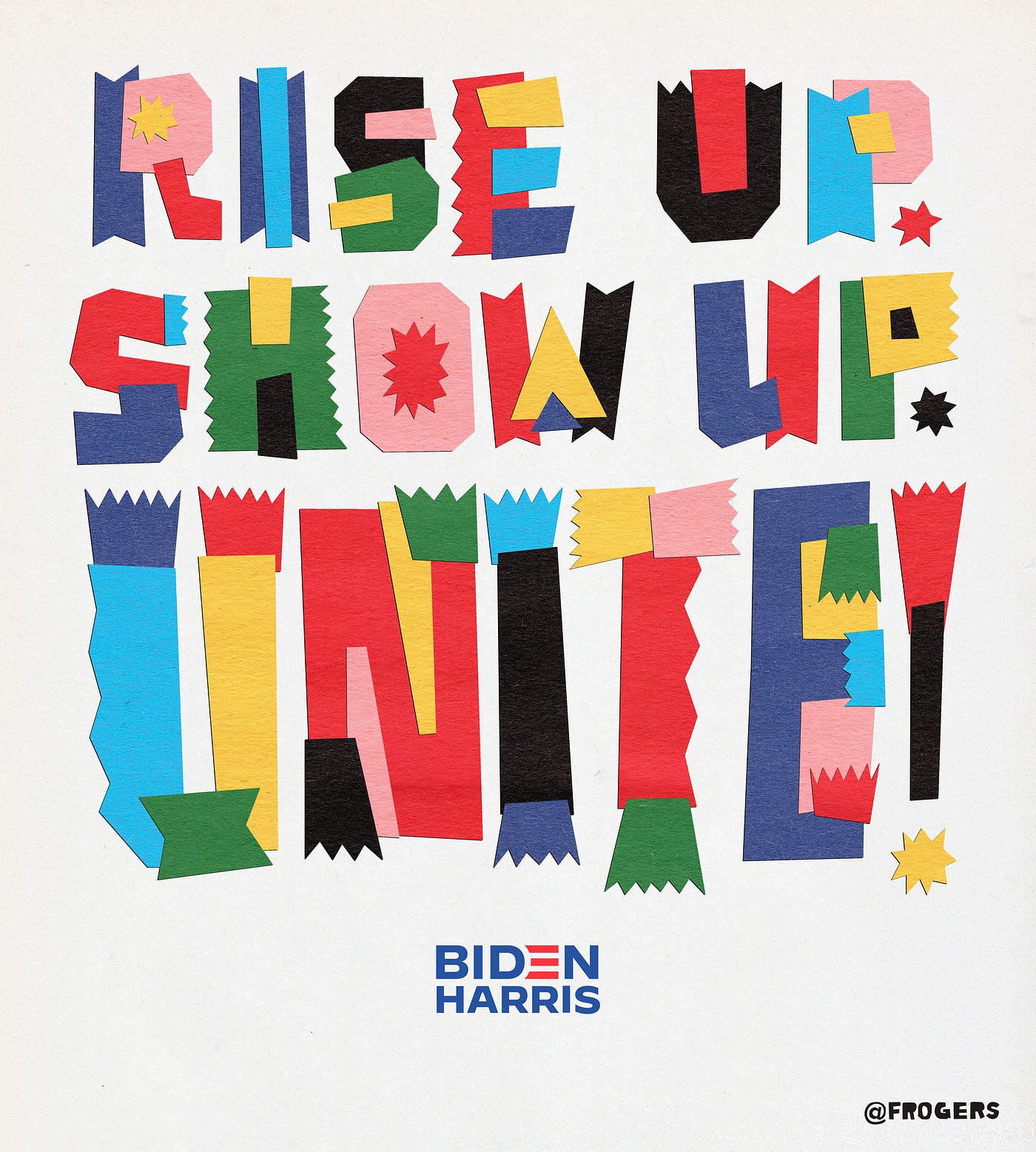
- Rise Up. Show Up. Unite!
By Jessica Hische
https://uxdesign.cc/…Bluejam - https://www.qbn.com/…imbecile
- Rise Up. Show Up. Unite!