Logo of the Day
- Started
- Last post
- 824 Responses
- misterhow0
I don't need the apostrophe. I'd rather see a period if anything.

- I think you need it when you drop the g_niko
- I think it needs the apostropheHayzilla
- They just had to keep some pink in the logo. And too bad their donuts and food blow ass.utopian
- is there a reason for everything to turn into logotypes? what's the reasoning for it?pinkfloyd
- https://youtu.be/F-z…Hayzilla
- Personally don't need any of it. Terrible product.ben_
- Sterling fought to remove the "Donuts" from the brand about 12 years ago. I wonder who has the account for the redesign now?
This is an improvement.MrAbominable - I like it. It also gives them room to keep moving upstream to take Starbucks on. Hell, I might buy their stock because of this!formed
- albums0
- LOLOLOLOL!!!!
For REal?!pango - for squaresWeyland
- I like it!orrinward2
- it's just a treatment, not a new logomonospaced
- oh, wait...monospaced
- Mouse padsnb
- what? who uses mouse pads anymore?yeeblazer
- trackpads?23kon
- apple is made of windowsmoldero
- LOLOLOLOL!!!!
- DRIFTMONKEY-1
- Designed by DonaldM01XXX
- Oh it was Melania.M01XXX
- Whiteboard marker?R_Kercz
- Love that I can only hear that phrase in her accent.Gnash
- I think it's awesome :) she's taking the piss out of herselfGnash
- +1 Gnash. There is no other way to read it.monNom
- "designed" 5 min before her presentation. Just had Baron write it in marker real quick.chukkaphob
- "Hello"aslip
- It aint bad. The color is too political.docpoz
- https://twitter.com/…whatthefunk
- sarahfailin2
- great logo analysis heresarahfailin
- we should post this vid to all threadssted
- Sounds about right. It sure tastes unholy!MondoMorphic
- proves nothing but the fact that mclean design built a perfect brandsted
- I imagine she'd rather that be true than not, so she can smugly tell everyoneset
- hmmm... I always thought they were a Christian company. This changes everything... and the devil laughs.sofakingback
- ...and it breaks gods heart.sofakingback
- sarahfailin2

- 2008, 2009, 2012.
the early 90s were not kind to this markscarabin - I like 1977, 1992 (the '92 one will always be the proper one to me) and 2008 (Nolan)BaskerviIle
- yeah '77 is really nice tooscarabin
- ha, 90s look like tribal tatsIRNlun6
- 2003 is a nice balanced onemonospaced
- quick glance i like 2 of the movie ones the most, tim burton's and nolans dark knight version. the others are sillyCygnusZero4
- 2008, 2009, 2012.
- SlashPeckham0
AFTER:

- +imbecile
- interestingutopian
- great markmonospaced
- Don't like. Its hard to read.desmo
- most of their viewers can't readtrue_cut
- don't need to read it, it's not meant to be read, it's a nice markmonospaced
- I am help but imagine that dog talking like Austin PowersmonNom
- I cant help but...monNom
- I digmoldero
- mrpt1
- hmmm, it's nice but it's kind of like well done on making the premier league look like every other trendy brand on the interwebs...set
- It's the kind of thing I'd whip up in ten minutes, because it's absolutely the most obvious and creativity free directionset
- My bollocks threaten to crawl back up inside my body when I think how much would have been paid for this.set
- Hakuna Matataweirdname
- I think the lion looks pretty fantastic, but that type...yeesh.skwiotsmith
- I like the transition.i_monk
- way too generic. Old one was stronger_niko
- I agree the old one is stronger and has the feeling of tradition. Although this execution is good... just not as good as the original.sofakingback
- grafician2

- That’ll never embroider! Glad to see fashion brands moving away from the monotony of black serif wordmarks_niko
- yeah that's what I thought also
the knight it's a mess!grafician - they used an old version from 1901, basically just retraced the knightgrafician
- That's prorsum!sab
- don't like the knight or their AU$750 Ts.MrT
- sem1

- someone got camel toe.ohhhhhsnap
- that has to be on purpose. the mouse even looks like a dicksarahfailin
- Fakeset
- It's from GTA lolHAYZ1LLLA
- I made that! And yes, it's meant to read dick and yes the mouse is meant to be a wee bobby spunking out love. Fame at last.josimar
- you should feel badmarychain
- grafician-3
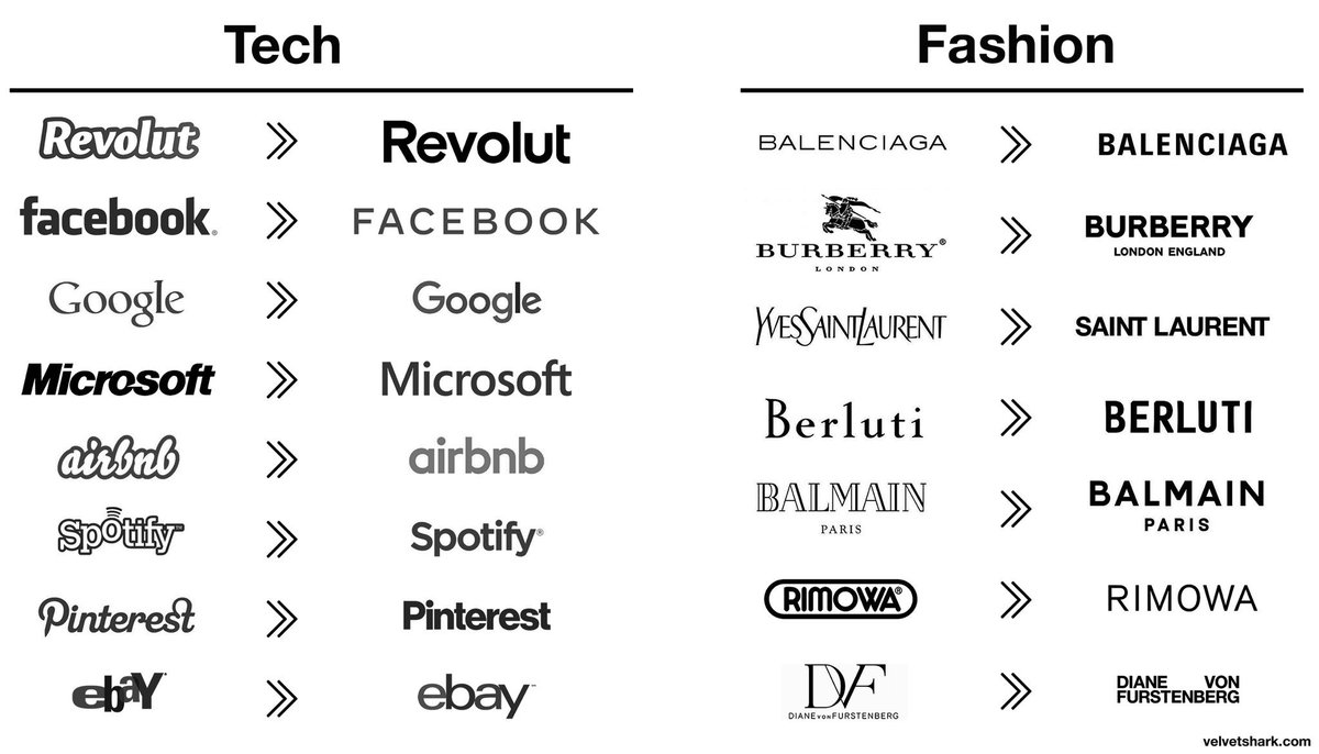
This ridiculous discussions about these fucking logos...a meme really
but...reasons:
- Revolut going from a startup to a EU wide bank
- Facebook going from Zuck to Zuck under Sandberg
- Google going under Alphabet (and material fucking design)
- Microsoft going under Satya
- airbnb going worldwide
- spotify going global adding podcasts and shit
- pinterest rulling google images
- ebay dropping paypal and trying to still be relevantsame with all the fashion logos, almost all changes driven by changes of the owners, CDs, etc.
I might be mistaken, but all these were strategic, business decisions, then design decisions followed...
But then some idiots copy pasted these logos all together and called it a "trend" or something.
Oh well...
- Graphic design is nothing new for almost a decade and we still discussing this shit...grafician
- But yes...discuss™grafician
- The "Diane Von Furstenberg" logo is not bad at all.utopian
- You cannot scale without a sans serif logo
Discuss™grafician - https://cdn.neow.in/…Salarrue
- cleansing your logo of any character is the best illustration of how devoid of inspiration corporate life ishans_glib
- Legibility would be the trend, no? Some of these were just atrocious logos before (ebay??) Some did lose character, though, like Burberry.formed
- @formed yes, scale to other markets and the logo needs to adapt easily
And in the case of Burberry, the branding switched to their famous patterngrafician - When adobe makes font management so shitty in Illy, you just go with the same font for every client request...shapesalad
- "Yeah you need your logo updated? Remove anything that might trigger, sure, let me type that one out for you..., and ok, we're done, so that'll be $100k..."shapesalad
- wordmark ≠ logo
Most/all of the techs have an actual non-generic logo.i_monk - People like boring stuff. The cleaner the betterPhanLo
- The fact that so many companies made this move over the given time period is the definition of a trend.monospaced
- @shape, lol wut!? no.monospaced
- i_monk3
- "draws inspiration from labels in motion" I don't really see that, but it's an interesting shape.dbloc
- Picture paper unrolling. That's the animation on the project page.i_monk
- I was just looking at this last week.
https://www.instagra…CyBrainX
- Projectile0

- for ... ?MrT
- for Africa?faxion
- i see africa.renderedred
- ...to cover Africa in concrete?
detritus - Africa broke my hexagonFax_Benson
- tilt your head to the right... It's Australia.Amicus
- to convert Africa into America?jpm
- grafician-1

- I like it!MondoMorphic
- C still needs work, and it's a bit more clean-ish
But the old one has that authentic flavour, you know? Even Warhol recognised that...grafician - Their stock is now soaring!!!!
https://i.imgur.com/…utopian - I still don't get the uppercase Eutopian
- that's small caps not uppercase E and was probably part of the flavourgrafician
- Done by https://www.ianbrign…grafician
- he knows what he's doingFax_Benson
- The dual apostrophe thing is sort of like having fake quotes on the brand name.evilpeacock
- COVID safe logodbloc
- They should make it white on red, and add a curved stripe at the bottom for flavor.jagara