Rebrand of the Day
Rebrand of the Day
- Started
- Last post
- 15 Responses
- Gnash0
Should have used the Palimpsest method when starting this thread.
That said, this doesn’t not look like a sports brand at all. But I would go to them for all my boat hardware needs
- Remove the double negGnash
- What’s the palimpsest method?_niko
- And lol yeah looks right at home on signage at a marina_niko
- ^^ save the content for the 2nd post — that way comments can be sidebar instead of the main threadGnash
- Ah got it yeah one of the things that bugs me about the functionality of the site_niko
- utopian3
The Love Boat Hates This!
- Continuity0
I don't hate it.
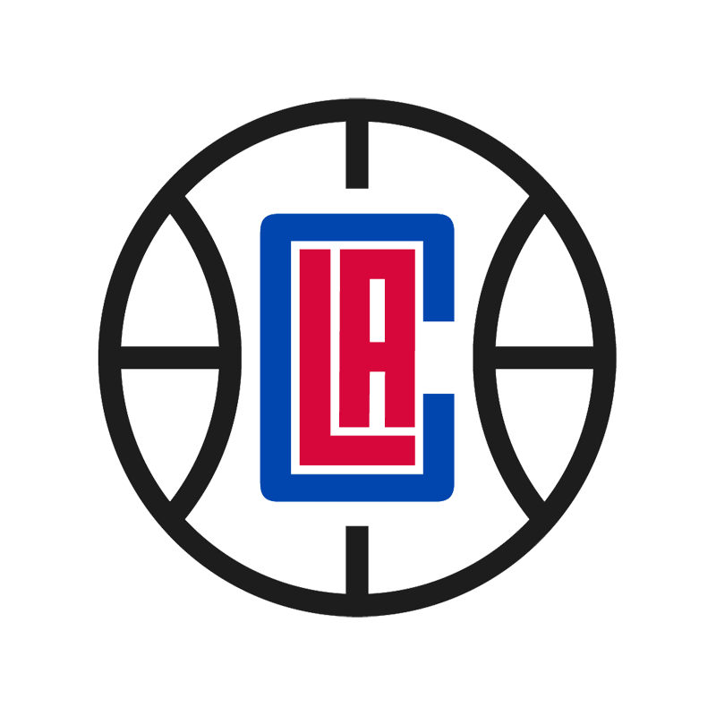
Kind of brings to mind a football (not handegg) crest, mashed up with a marina logo as niko says.
- sarahfailin1
- Yeah, clipper has sails & what not. This totally looks like a modern cruise ship, which isn't great.ideaist
- duh, it's a C for Clipper plus an actual clipper (maybe) plus a compass plus a basketball...plus that c is supposed to be the thingy you tie the rope to_niko
- LA Disney Cruises Clippershydro74
- To me, if supposed to be an old clipper ship vs cruise ship... the sails should somehow appear wider than the deck width, that's the big characteristicprophetone
- This could be a Carnival Cruises logoprophetone
- Nailed it. It’s a fucking luxury covid liner. Ugh.monospaced
- seems like the view from a periscope.."torpedoe... away". why not do something the S.. practically a sail already in that script72339
- *torpedoes72339
- It is like a periscope view, like submarines and clipper ships ever co-existed... If it were a compass, wouldn't north be up top? Why is the ship a basketball?sarahfailin
- Without a construction grid or tote bag I can’t take this seriously.MrT
- and lol at basketball seams on the hull of a boat. That’s a fucking big basketball.MrT
- gives mee nazi Germany vibes.milfhunter
- Definitely not Carnival because they are damn committed to that three-color toothpaste squirt.garbage
- And not the Clippers, and I say that because their team is capable of much worse than that. Probably the worst in the NBA.garbage
- https://first-classl…garbage
- https://content.spor…garbage
- https://mir-s3-cdn-c…garbage
- I stand corrected. This is their rebrand. Lol, it is so bad.garbage
- https://www.forbes.c…garbage
- "Without a construction grid or tote bag I can’t take this seriously"
Nailed it @MrT!ideaist - Know what would have been a great rebrand? A clipper in profile busting waves heading west. It was right fucking there.garbage
- _niko0
- Makes flatmilfhunter
- https://www.lamborgh…ideaist
- cheaper to make the badges i guesshans_glib
- Walmart Iron-onutopian
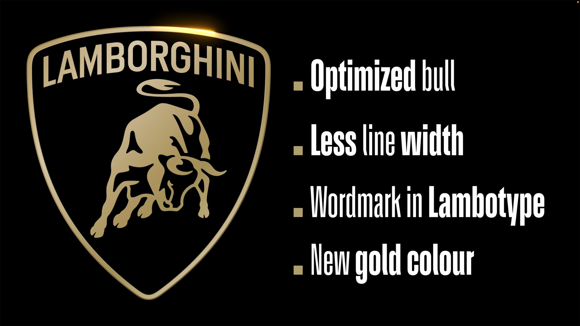
- "Lambotype", eh? Looks suspiciously like DIN.Continuity
- totally "driving humans beyond" ...Bluejam
- they forgot the s word after 'bull'Krassy
- _niko0
- https://www.nytimes.…ideaist
- I THINK its done by https://www.flowersh….ideaist
- Well makes sense, a design shop in New York that has no idea what makes Toronto Toronto. How is this going to inspire the next gen of girls to pick up a stick_niko
- No creativity, no imagination. Completely uninspired hack job. Misses the mark on a million levels._niko
- Yeah, it's kind of "meh"; works BUT uninspired / unimaginative IMO as well.
Meh.ideaist - The logo itself is fine...for a yacht club or something._niko
- If i was the client i would have shoved this up the agencies arse for two reasons. 1. Symbolically, the orb represents the power of God and it's a reminder...Morning_star
- to the monarch that their authority derives from above. And most importantly 2. The Orb shape is not a million miles away from the male gender symbol.Morning_star
- If you're gonna make up ridiculous justification for the symbolism in logos at least give it some thought.Morning_star
- wow great point about the male symbol_niko
- I've lived in Toronto for almost 50 years and not once have I heard anyone ever ever refer to it as the Queen City. not on signage not on ads - fucking nowhere_niko
- silly logo is sillyutopian
- lol orb of unity. ughGnash
- The sharp lines on that T really convey a sense of precision and presence.monNom
- More Catholic private school than women's hockey team.i_monk
- Yeah monk actually quite nice in that context_niko
- Feels religious.monospaced
- There’s a cross, a snake, and a forbidden appleGnash
- A little Catholic Church a little monarchy a little colonial roots this is perfect, we don’t want little squaw girls or dirty immigrants taking up the sport_niko
- oh wait, I forgot about the orb of unity, scratch that last comment_niko
- I keep wanting to say "specters"monNom
- spectres would be so much better_niko
- Nairn-4
- GMiesfan
- Was this done in canvajamesbeat
- people with money have no taste, and thats a fact.milfhunter
- Agree, the tackier it is the more they spend on it_niko
- Shitty branding for shitty carsOBBTKN
- Like wtf is this https://tinyurl.com/…_niko
- _niko - I don't know, but given the rest of the branding, I can only assume 'some sort of coffee tamper'Nairn
- I wanna see it in use. It's so easy to slag off a piece of work without seeing it alive in the world.Ianbolton
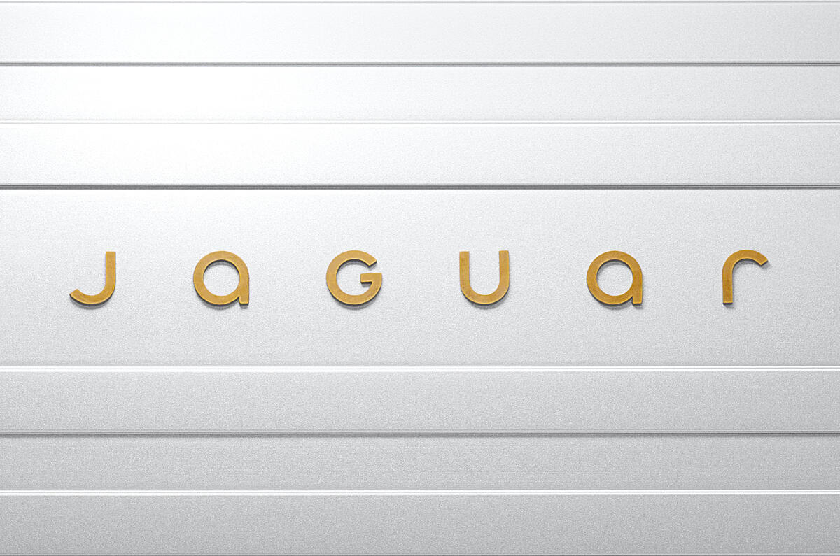
- of course that font is called "exuberant"hans_glib
- April fools?i_monk
- LHBTQUARstewart
- lol @jamesbeatskinny_puppy
- @niko - touching tips ...skinny_puppy
- This is bad enough Pentagram could have done it.i_monk
- Agreed with Ian. Also, my problem isn't so much the wordmark, as it is what they've done with the actual cat logo. It reminds me entirely too much of Puma.Continuity
- They will get sued by Pumagrafician
- Come on it’s not a leaping puma it’s a pouncing jaguar huge difffernce!_niko
- WHO SHOT J.R.?!prophetone
- flol james. Also punches for that U.garbage
- haha niko sorry, my bad!Continuity
- They will get sued by Guggenheim for the "G"grafician
- Obviously we are not the target audience which is why it falls so flat. Makes me wonder who the target audience is though. Who chooses a jaguar these days?monNom
- Comments are wild
https://x.com/Jaguar…grafician - Apparently a new design vision is coming in December. It’ll be interesting to see how they reposition themselves in light of this new logo.monNom
- 'Well-off women and men in touch with themselves'. i'm guessing Jaguar are going full high-end consumer Dyson.Nairn
- Is this real life?utopian
- Ahhhhh those twitter comments are gold.
Rip_niko - For such a classic and refined company, this just doesn’t seem right. The capital g, the “fun” retro font, and the stripes just don’t speak jaguar to memonospaced
- @mono so true. @jamesbeat said... too funny because I was handed work from a canva intern today that had the same typeface... she's been mvd to the content teamcanoe
- FaguarChimp
- @Chimp you dirty boomer hehhsted
- Wow. HorribleGnash
- joguorKrassy
- _niko2
^
new creative director Mugatu
- Luda4
Spurs announced an extension of their current brand and it's quite nice. I'm very happy the monogram is back.
https://tottenhamhotspurs.shorth…
- was chatting about this yesterday at work. What do you reckon? Looks like they could have a lot of fun with it, but Spurs fans are miserable cunts!Ianbolton
- It hasn't been well received but I think a lot has to do with the timing - the Ipswich loss right before an Int. break still tastes bad. Levy isn't popular.Luda
- BUT, modern sports is also a race for branding/recognition in the marketplace. I think the whole "brand remastered" is really good. Adding orange to the...Luda
- ...palette is brave as it's so close to red. The font changes are nice. The bespoke Spurs font can now be used in sentence case. Small touch but nice.Luda
- Levy is a dick and the fact they thought they were big enough to be part of the super league a few years ago was almost hilarious.Ianbolton
- But as a designer i'm all for seeing good football brands work and bring more life to the game.Ianbolton
- Spurs were invited to be part of it so it's obvious that they're a big enough BRAND to be involved, which is what the Super League was about.Luda
- But the gap between the board and the fans is big. The timing of this branding has been seen as "tone deaf". Only on-field success will appease fans.Luda
- This is a good one. Nothing major but nice all the same.HAYZ1LLLA
- A chicken on a Segway?skinny_puppy
- The bright secondary colours feel a bit too similar to the Premier League branding, which as become widely imitatedChimp
- cock on a ball :Probthelad
- minor tweaks really, hence the overblown super swish page showing it off - lots of movement to disguise the fact that not much has changed.hans_glib
- sadly i think they've blown the monogram. they've tried too hard and ended up ruining it.hans_glib
- Probably won't help them win the league #YNWAKnuckleberry
- VERY spursystoplying
- Nice cocksab
- Me likeGnash
- akiersky6
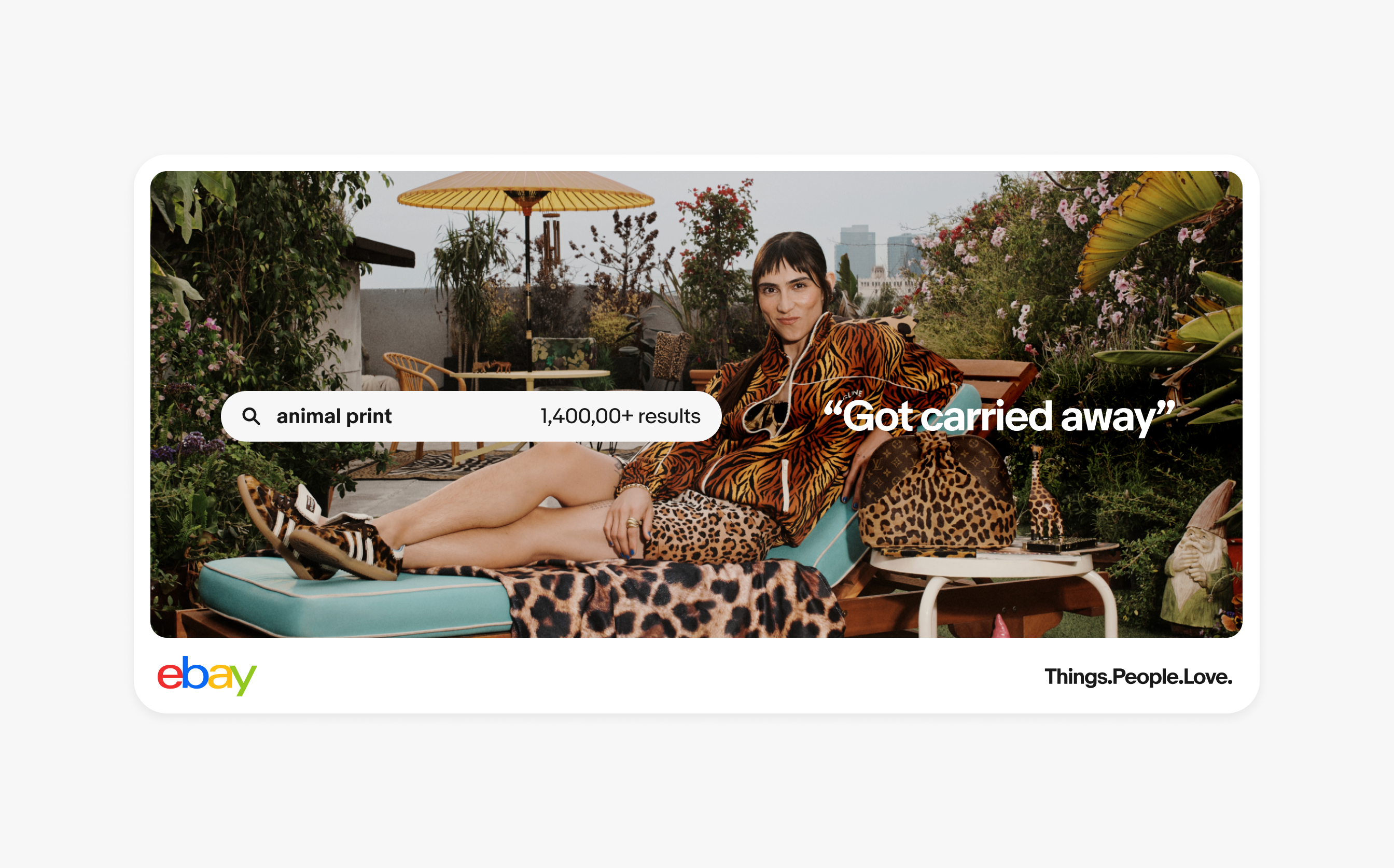
Ebay's new design system
- I mean is ebay still relevant?
Marketplace kind of bullied this, craigslist and any/all other classified(s) full on, eh?
Design system is slick AF though IMO.ideaist - Still relevant in EuropeOBBTKN
- ooh nice presentation!! Yup, love it.
Now, about that logo....Projectile - Very very well doneprophetone
- I quite like the site itself.. very nice.exador1
- not designed by pentagram.oey_oey
- It looks like a credit card company that's trying to be friendly. It sucks.cannonball1978
- Let’s call it a Swiss derivative. Also, a color palette that includes ALL colors, and a style that includes any type of illustration or photo. Real tight.monospaced
- Or are we just getting excited about pill shaped buttons and round corners again?monospaced
- TL!grafician
- hey look Uber!milfhunter
- This could be any brand these days.Chimp
- Sadly, it really could be any brand of the last decade.monNom
- It's a great presentation but it's hard to judge in this context. All those bells and whistles will never be seen all at the same time.CyBrainX
- I mean is ebay still relevant?
- sarahfailin3
qBn
- cuebienetheonlyengineerhere
- more like
q B n_niko - q B n
Insult everyoneChimp
