Colors
- Started
- Last post
- 40 Responses
- ESKEMA
any one with good resources on the use of colors and it's meanings etc?
- set0
- this is actually really inaccurate when you actually look at the companies represented.iCanHazQBN
- Facebook = Trust? BP = Peace & Health? Walmart + Phizer = Trust?iCanHazQBN
- I almost posted the same thing.set
- then I realised it's irrelevant, because it's what the companies want to project rather than the reality...set
- but yah, funneh.set
- Kmart and Avis rental, does it get more exciting?Peter
- uan0
blue -> sky/ocean
red -> blood/fruits/flowers/animals/sun... color
green -> vegetation/plants
yellow -> sun/flowers/lightblack -> no light/dark/close/shadow
white -> light/clouds/snow/openglobal brands use basic colors or combinations of them because it's easier to print/reproduce stuff (the brand) with the same looks this way.
that's how I see it...
- lol thanks for those colour explanations captain obviousset
- black = no light
white = lightset - cheersset
- yellow = sun
blue = skyset - http://media.giphy.c…set
- yes, it is obvious. but sometimes designer think first of some hidden meaning chart lookup before they think about the obvious associations colours trigger in customers.uan
- obvious meaning colours trigger in customers.uan
- :)set
- I may use this to explain colour to my 1 year old. thanks :)fadein11
- brown = poop.iCanHazQBN
- oey0
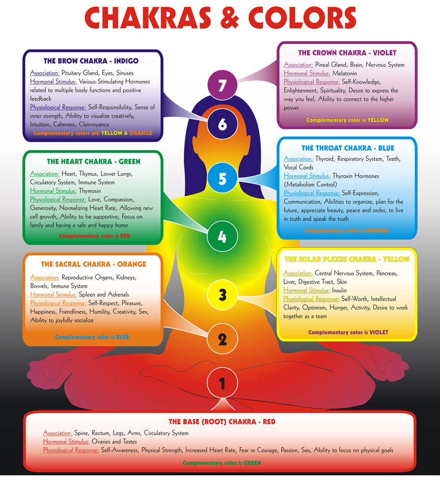
Collected infographics from QBN's Official Infographics Thread


- oey0
- oey0
- oey0
not what you asked for but...
- ESKEMA0
Cheers, keep 'em coming..
- uan0


- also the history of color systems: http://www.eizogloba…uan
- nice!oey
- uan0
- stoplying0
Wonderful, wonderful Colours:
- mugwart1
Colours ;-P
- Mattjanz3n1
Anyone else have issues with brand colors having piss poor CMYK options?
The brand color chosen is super nice and vibrant but CMYK falls on its face! Can't come up with anything even remotely close. What to do?

- I would suggest, instead of using the bridge, to choose a new CMYK color that resembles more to the Pantone you are trying to re-create.maquito
- Yeah, two people here have tried but it's still pretty off.. It's just one of those weird blue-greens that land right in the 50/50 zone.Mattjanz3n
- Oh, I know... some Pantones have that special tone that is very hard to match. Good luck!maquito
- Blues and greens are notorious for limitations in CMYK due to being built from only yellow and cyan.monospaced
- Add in the variables of printers and stock and you can end up pages away from what you're after!MrT
- Mattjanz3n where most of these experiments fail is that you need to use the proper color profile to get close to that color...sted
- sted is correct, I deal with Onyx & Versa RIPs daily. Depends more on the RIP to produce the color. send RGB using a CMYK profile to get even more variationimbecile
- not that it helps but I had the same problem with an old client, green is a nightmare. Only way I found around was to print it as a spot color.mattwrightgd
- maquito2

I used the formula guide coated to select the Pantone, and the CMYK coated to "match" the Pantone with a CMYK value. Hope it makes sense :)

- drgs1
https://en.wikipedia.org/wiki/Pa…
"market researchers determined that it was the least attractive colour"

- ..it's the colour they chose for all cigarette packaging here in the UK.Nairn
- Oh, clearly you know that already, given your Wikipedia article says as much, and that you have the same in Norway too!Nairn
- Not all cigarettes are in this color, but yeahdrgs
- #tlimbecile
- that's racist!sarahfailin
- this is a nice color, as it complements all kinds of other colorsmonospaced
- use a bright turquoise on it, might work...shapesalad
- Kanye West's fashion line colorKrassy
- Sort of a raw umber, isn't it? Good thing Rembrandt and Vermeer aren't around to learn they were using the ugly colour!monNom
- I'm wearing a shirt this colour right now.inteliboy
- barfy pooBustySaintClaire
- i_monk3
My new employer has a terrible secondary colour palette—a mix of drab, muted tones (think dirty RGB), a few neons/florescents, and a random grey—that absolutely doesn't work with the primary colour (a navy blue). I have no idea where they came from (the person who picked them no longer works here), they really haven't been implemented, and it's my job to fix this sort of shit, so I'm going to change them.
So let's talk about secondary brand colours for a minute. How do you pick them? Are you just using a colour wheel like (...jesus, there's a lot of these sites now...) or go with your intuition/rote rules? How many is enough? (The current six were pared down from a longer list of 16! Why do we need three slightly different shades of light grey!?) What uses are you thinking of when picking secondary colours?
—
Brought to you by the campaign to Make QBN a Design Site Again.- (Dammit, should have said Committee, not campaign.)i_monk
- i_monk2
Here's an interesting read about generating an accessible colour palette with a perceptual uniform colour model:
- utopian-1
Pantone Color of the Year 2020