The Resume Thread
- Started
- Last post
- 61 Responses
- d_rek
It had to happen sooner or later.
Feel free to post well designed/organized resumes for your appropriate career/industry. It can be yours or someone elses.
I'll start with mine....

Flat size: 11x8.5"
Finished size: 5.5x8.5"
Stock: Classic Crest Avalanche White, Linen, 70# text
- fiver0
watch that kerning yo
- jpg render is really killing the APA i seed_rek
- APA?monospaced
- The 'apa' in Kapa.duckofrubber
- MyMommies0
What about not so well designed/organized resumes???
- http://www.qbn.com/t…monospaced
- oh, I see it's been re-linked to a redesign.monospaced
- ukit0
Ever heard of putting space below a title?
- can't please everyoned_rek
- Looks good otherwise, but the spacing under the titles feels too tightukit
- +1 agree.akrokdesign
- MadisonCole0
When we hire staff at my small company and I can tell you more than a designed resume you need to be typo free, well organize4d and thought out. Don;t just make it look nice give it some substance and don;t try to hard make it you because eventually they will put together the person from the resume.
- yeah fuck nice. pop up word and use times roman. woohoo.akrokdesign
- I believe Calibri is the new default font.monNom
- i think you should try out your advice on forumsephix
- LOL @ ephixDRIFTMONKEY
- akrokdesign0
nice, has a "london" feel to it.
- d_rek0
Uh, lets try to not ruin this thread, mmkay? I was thinking it could complement threads like the POTD - Identity / Photography threads.
Also note i did not ask for critique but for others to post their resume/cv. K thx.
- stewdio0
I'd like to see this thread survive, so here's to putting my money where my mouth is. This is a draft CV that I'm considering putting into use in the near future. It deviates a bit from the conventional format in order to emphasize / de-emphasize some things. For example the "work experience" segment is really a condensed "my favorites" list rather than the standard "organization / position / location / dates" sort of thing. I think in many settings these types of quirks in a CV wouldn't be advisable, but I think it better frames the way I've been engaging in work of late. So here goes . . .

- By "favorites" I mean these were really interesting places to get involved with.stewdio
- Yikes... I'll definitely be kerning that before finalizing this draft.stewdio
- The 3rd person narrative seems out of place for a resume. Consider that deemphasising work experience may appear that you have very little.
monNom - ...as though you have very little.
nicely presented otherwise.monNom - I've considered the "experience" section and I'm not worried about it.stewdio
- "experience is an excuse for those who don't want to give you want you want"identity
- bulletfactory0
based on my identity package
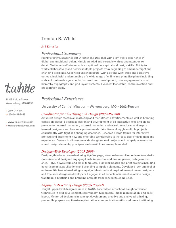
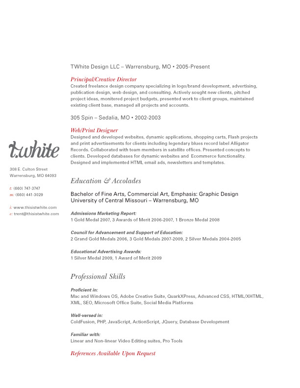

(pdf)
http://www.thisistwhite.com/docs…reworking my site now to work better with my id package.
- Aren't these supposed to be one page?wmeredith
- depends on which position you're applying for and how much experience you have. keeping it around 2-3 is fine.bulletfactory
- I like this a lot...jfletcher
- harmsie0
Well here's mine its not as nice as the others, but someone has to bring the quality down. It is in HTML5 and its best seen in FF and struggling with the page break in the print style sheet
http://www.kingharmsworth.co.uk/…- I really like this, but you need to have a button for download PDF/DOC version.dMullins
- Do you think? the idea was that you could just print it directly.harmsie
- put a print button on it? onClick="window.prin...kingsteven
- Yes, need a PDF, not everyone will printformed
- dMullins0
I like your idea Derek, the whole sharing the resumé thing, but personality and cheeky humor are not one and the same. I would lose the explicative symbols on the cutline.
- stewdio0
@bulletfactory Cool stuff. Having gone for the a thin column layout myself I've become very aware of the difficulties with ragging short lines. You have really fat lines so plenty of room to manually adjust your rag. It's the first thing that jumped out at me.
I tend to agree with @wmeredith about keeping it to one page. I'm sure there are some good exceptions to the rule, but part of the challenge of a CV seems to be giving an impression of what you do in a restricted amount of space. Just my preference though.
- thanks - designing a condensed version has made it to my to-do list - an interesting design challenge, looking forward to it.bulletfactory
- digdre0

- this looks more like a resume than cv to me. no?mcmillions
- stewdio0
Also was expecting the baselines in your left gloss column to "lign" up with the baselines in your body column. Particularly because the leading seemed really loose enough in the gloss given the smaller type size. I know dropping in right-aligned elements in a sea of flush-left/rag-right on a CV is normal but it still throws me. Ok, sorry :p Just have type on the brain right now.
- nice input - i took a look at this, tweaked the baseline grid and adjusted a few other things.bulletfactory
- d_rek0
stewdio,
I think you raise an excellent point - typographic detail on a designers resume. Since the comments above about my resume i've since gone and scrutinized the bejesus out of mine... the PRINTED version of course. :)
@bulletfactory, I agree about setting your info to a baseline. Setting up a simple baseline can be really help for collating not only your resume but bits and pieces of your identity collateral, creating a very consistent set of documents.
- agreed - i've updated, condensed slightly and replaced the images and pdf in my original post. ^^^^^^^bulletfactory
- doesnotexist0
yay!

- stewdio0
No more takers on this journey through the CV jungle?
- ... and this was an actual design thread with serious comments and critiques... sans lolcats.bulletfactory
- give it timemonospaced
- stewdio0
tick. tock. tick . . .
- maikel0
There's one more for all you cocky designers to hit.


- get rid of the full black top,
you don't them wasting their toner printing 3 pages.georgesIII - A bit much, but I like this. I agree w/ the comment about the black masthead.d_rek
- it looks more like a brochure. i like the data graphics though.jazmine
- by brochure, i mean so many pages. thought cvs were sposed to fit on onejazmine
- thx for the feedback. i'm thinking on a thinner version.. and c'mon don't be that tight about a bit of toner!maikel
- simple is better, no one has time to read all of thatJazX
- That's why you have all the info condensed in the first 2 lines! But yeah it's getting too longmaikel
- holy fuck my eyesmcmillions
- get rid of the full black top,