Close to Helvetica
- Started
- Last post
- 71 Responses
- janne76
What fonts would you recommend that comes close to Helvetica but has a little more contemporary feel, if possible somewhat friendlier?
THANKS!
- neue75_bold0
Haas Unica
Akkurat
BP Neutral
Swiss
Univers- all poor substitutes though, yet still, have their place...neue75_bold
- you are always the man. spank you. 1 pannekoek voor jou.janne76
- "all poor substitutes though, yet still, have their place..." i can identify with that..janne76
- Haas is nice, but has a few weird characters, same as Neutral, Akkurat is lovely and probably the best of that lotneue75_bold
- in terms of being friendly..neue75_bold
- yeah, i got only 1 weight of Akkurat here for comping.. :(janne76
- myoldredhat0
Gotham
(the new helvetica)
- YEAH I SAID IT!myoldredhat
- I HAVE USED GOTHAM TO MANY A TIME FFS!
NOT NOW, NOT NOW!!!!janne76 - well it does fit your description to the 'T'myoldredhat
- janne760
hmm... after looking at neue's suggestions, they are perhaps a little bit too close to the swiss home.
anything a little bit more 2009?
- you had to go there didn't you...
* makes new blacklisted entryneue75_bold - how many pannekoeken this time?
ffs..janne76
- you had to go there didn't you...
- ********0
Benton sans has a little of the old time friendly funk of franklin gothic and some of the cleanliness of the newer sans
- good call..neue75_bold
- nice suggestionmyoldredhat
- where can i get a hold of benton directly?janne76
- http://www.fontburea…gramme
- jimbojones0
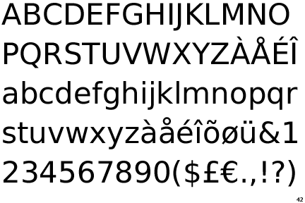
National
- wonky..neue75_bold
- been trying to use it lately as an alternate and it's just plain odd..neue75_bold
- you have to admit it's a lot friendlier than H. Another shot would be Bosch Sans, but janne doesn't have it ;)jimbojones
- indeed, I guess to me, friendly = wonkyneue75_bold
- ok, but besides that you CAN set 10-12pt with National. H simply sucks before 16ptjimbojones
- yeah but I'd never [by choice] use H as face I'd use for anything other than the logo... if I did I'd cheat and possibly use Haas..neue75_bold
- use Haas as it's much more legible..neue75_bold
- i stopped using anything that looked like H for logo work long time ago ;pjimbojones
- yeah well, I've seen your work..neue75_bold
- haha, j/k :)neue75_bold
- now I've seen yours .pjimbojones
- I set small type in Helvetica all the time. It's beautiful at 9pt.monospaced
- it works much smaller than 9pt as wellmonospaced
- ahh, gooood for youjimbojones
- ********0
yesterday I drove past the giant construction graphics of the new Barnes Foundation by Tod Williams and Billie Tsien and realized once again that most of the modern sans are a bit too antiseptic for my tastes
- I've been trying desperately to find a nice 'modern serif' for an ident that I'm working on and for the life of me cannot findneue75_bold
- anything that I'm comfortable with..neue75_bold
- even pushing myself beyond my comfort zone still, I end up with benton..neue75_bold
- for the logo itself, or as the "corporate typeface"?********
- which is not something I'd build an identity..neue75_bold
- ha, yes, good editorial face, but for an identity/logo..neue75_bold
- neue, I totally know how you feel. Somehow Benton is still the best...jimbojones
- is is type only, or will it have a mark?********
- you do mean modern sans serif, right?jimbojones
- proposing both I reckon.. always kinda have to..neue75_bold
- yeah jim, modern sans..neue75_bold
- huh, that was ironic..neue75_bold
- have you given archer a test run yet?myoldredhat
- Have you tried BP Neutral? Not that neutral after all (+ construction errors...). Still trying to find a contemporary Trade Gothic substitute...jimbojones
- both Unica and Neutral have that frutigeresque uppercase "R" that drives me up the wall..neue75_bold
- ironically, if there's a decorative element, I often end up with Gotham all caps, spaced a bit, because it is so generic********
- like a cleaner sackers gothic********
- http://pentagram.com…********
- you mean, because it's so perfect right?myoldredhat
- I don't do all caps since I'm not in fashion...neue75_bold
- or hospitality..neue75_bold
- huh? Neutral's R has a straight leg, never was a fan of the curved one. Works for Univers thojimbojones
- does the company name have an uppercase R? if so, you're fucked********
- fuck you're right, just unica I'm thinking of..neue75_bold
- hahajimbojones
- but Neutral still isn't contemporary enough, or neutral enough... Don't like the spacing eitherjimbojones
- we're all fucked..neue75_bold
- slams H********
- logos should be banned********
- contemporary sans = shit like Apex, neo sans, et al..neue75_bold
- apex and neo are out of fashion already :) Have you tried PF Encore?jimbojones
- klavika = shoot me nowneue75_bold
- or Plakat by Schwartz?jimbojones
- looks like a benton mashup...neue75_bold
- klavika is a great face, way too overused thoughjimbojones
- whitney, barf, seravek, barf, proxima nova...********
- whoa, used properly whitney outfucks trade any time! proxima = gotham for poor peoplejimbojones
- * sigh.. I hear ya jim, but these faces just aren't for me... but hey, this thread was never about me anyways, so..neue75_bold
- proxima = inbredneue75_bold
- ...let's start a new one!
gloriola would be fucking great with a better M btwjimbojones - glory hole? let me have a boo..neue75_bold
- utopian0
I am personally a Trade Gothic fan if I am not using Helvetica. ITC Franklin Gothic is nice as well...
- monospaced0
Frutiger is known as a friendlier sans.
- close to H?jimbojones
- Yes, of course. I wouldn't have recommended it if it wasn't.monospaced
- It's pretty different, but still a classic sans that is somewhat friendlier.monospaced
- but besides the sans nature and the cult status I can see very little similarities?jimbojones
- sorrymonospaced
- no problemjimbojones
- ********0
where is plakat? can't find
- jimbojones0
http://www.christianschwartz.com…
it was called plakat at some stage...- not available********
- looks good********
- available on rapidshare et al...jimbojones
- link?********
- not available
- blaw0
Bau is nice.
http://new.myfonts.com/fonts/fon…
- baseline_shift0
Din?
- armed_rob0
- yeah, tried Avenir. But I think the kerning sucks.janne76
- wat?! Frutiger's fonts are pretty much the only ones with perfect kerning (you mean spacing btw)jimbojones
- Avenir Next is beautifully kerned. Don't really like the condensed versions, though.gramme
- monospaced0
At one point I believe a lot of designers believed Meta to be the Helvetica killer. That didn't quite work out, but it is a decent friendly typeface.
I'm not sure how similar you're going to stay to Helvetica while getting much friendlier anyways. Good luck.
- neverblink0
- and it's free / open source ;)neverblink
- nice!
ps. mail crit coming soon!janne76 - ugly chars: G, J, M, S, W, k, r, s, t, w, 2. If you work without them it's all fine :)jimbojones
- identity0
British Rail
- identity0
Example:

