Close to Helvetica
- Started
- Last post
- 71 Responses
- TheAnthonyWallace0
ive been using berthold akzidenz grotesk and gotham the past couple years for my bold sans text. really great fonts.
gotham seems to be the latest winner.
- quamb0
new rail wins.
wish the set wasn't £1k. would kill for it. soo nice.
- gramme0
Well, it was mentioned before, but when I think of a friendlier grotesque, I go to National. Just started using it this year, and it's gorgeous. The thing you have to get used to is that the letters are small, i.e. short. Not a short x-height mind you, but I'm finding I have to set it .5 to a full point larger than I usually would for a sans of average construction. Beyond that though, it's space-efficient and very well kerned. The various figures and small caps are a nice touch. In fact, to me it's like a much more evenly-colored Akzidenz. Personally, I hate Akzidenz for text; the unevenness of weight between the capitals and the lowercase is distracting and even under great conditions, it looks like poor inking.
See recent issues of Eye Magazine for great use of National. I think they also use Newzald there, another good one from Klim.
- vaxorcist0
like any true designer, you've got to find a pricey, tightly liscensed font that looks ALMOST like a totally "normal" font, that way when your client attemtps to fix typos on their own, it will look strange and you can enjoy the freaking out and make some money....
- Josev0
My next sans purchases are going to be one of these two:
FFBau

Breuer Text: http://www.typetrust.com/font/br…

- Etype0
there was some new faont i saw awhile back Nue something
- Etype0
If anyone wants to send my knockout? or british rail... that would be great
- ukit0
Maybe it's not all that close to Helvetica, but I've found Reader by Colophon to be a great sans for a number of uses.
- plusminusbox0
franklin gothic
- Coffeemaker0
i have always found the uppercase R in Helvetica a bit gay.
- Josev0
Whitney, from Hoefler, has been my replacement neutral font.
- miesvan0
Unica Haas

- jaylarson0
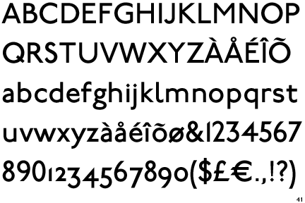
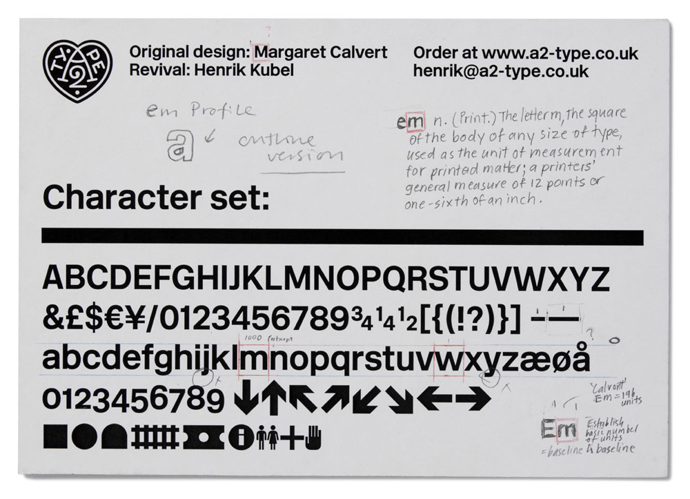
- new rail alphabet:
http://www.newrailal…jaylarson - i'm confusedjaylarson
- features of these i like more than helvetica.. interesting.Coffeemaker
- I mentioned this on Page 1identity
- good thing i was paying attention //jaylarson
- new rail alphabet:
- bulletfactory0
First thought was Univers.
- Gs are quite differentbulletfactory
- Univers is considerably less friendly. Like Rand said, it's the world's most sterile typeface.gramme
- Well, maybe #2 right after Futura.gramme
- 3stripe0
The caps are pretty similar, look at the 'a', '£' etc tho...

- 3stripe0
SH = Scangraphic Headline?