Show some recent work
Show some recent work
- Started
- Last post
- 8,593 Responses
- kona0


- i like the zico logo and the photography/colors are nice._salisae_
- good work.moamoa
- Really good work, kona - very accessible layouts, delivering a lot of complexity. Bravo.detritus
- whoa whoa check you out, you've been busy... very nice work!OSFA
- Nice layoutroundabout
- I really like the Zico website.roundabout
- very nice doug. very nice.grunttt
- Good to see some decent high contemporary design.JerseyRaindog
- Don't know where that 'high' came from!JerseyRaindog
- thanks everybody. i really appreciate it!kona
- not bad for a chickOSFA
- moamoa0
↑ reminds me on this

- yellowbirdmachine0


- I really dig the 2nd illustration!
nicedyspl - the dog is nice... but the gradient in the back is to hard.. make it softer
moamoa - noyellowbirdmachine
- i think it works. they both are beautiful.sea_sea
- ups. I wanted to say: I would make it softer and not: make it softermoamoa
- lolsea_sea
- i agree the gradient cheapens it._salisae_
- funny. when i first saw it i thought it was the deer with his hind leg up so he could sniff himself._salisae_
- nahyellowbirdmachine
- would be nice to see them higher resdyspl
- nice workakrokdesign
- MAKE IT SOFTER, GODDAMNIT!!!janne76
- second illustration is awesomeCabein
- I really dig the 2nd illustration!
- antigirl0

- raymond saunders?arthur
- no clue? googl'n now.antigirl
- OMG. thank you so much.... an ex that i cannot talk to anymore showed me his work in 2001ishantigirl
- AND i have been looking ever since and omg. today! found him. THANK YOU.antigirl
- no prob - he was a teacher of mine in college.arthur
- nice one tif tart...neue75_bold
- i like the direction_salisae_
- that's awesome - happy to close that loop.arthur
- yeah that is pretty fuckin weird and wild. im happy to have found him again. :)antigirl
- moamoa0

- client?opak
- my website.
yippihmoamoa - haha...neue75_bold
- I was shopping at livesurface..
oh la lamoamoa
- Meeklo0
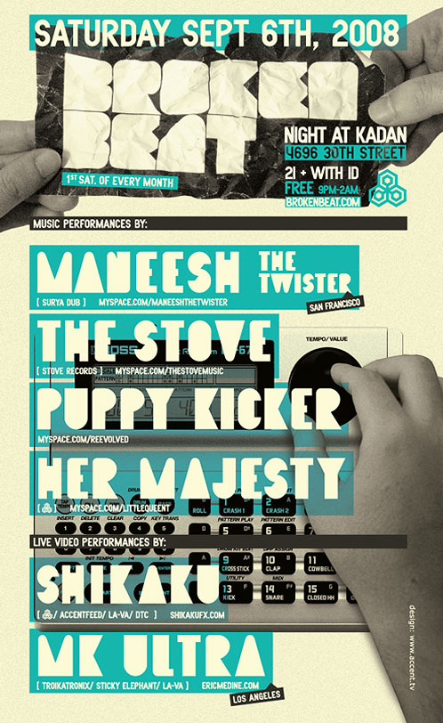
Poster for a live electronic/ visuals event
- louve it.katekelly
- thanks kateMeeklo
- love that. well done.grunttt
- i like thisinvisiblechamber
- kult0
Just completed this for Nike Soccer

- 3stripe0
2 late night sessions and some Blueprint CSS puzzles later...
- digdre0


- nice! That sushi mark is great.monNom
- yeah, already saw it on your site. Real nice, but the kerning could be better.neverblink
- nice. the sushi logo is sweet.armsbottomer
- i agree the type needs love_salisae_
- mark is great tho_salisae_
- very good, esp. considering you are so young! type needs more attention though.janne76
- kodap0
- Awesome as always, kodap!Concrete
- Oooh, that's nice.JerseyRaindog
- wow, cooldigdre
- very nice.akrokdesign
- sweeeeeeet, kodap!!!janne76
- this is nice. love it.cosmoo
- bulletfactory0
Not liking the 'quick links icons' but I'm happy with the layout overall.
these are now in production (building the flash elements now)

- soynutz70
http://magazine.org/
its not exciting but designed every page.
- THA0
- What did you do?Ampersanderson
- The concert posters for the band "Nite Club." Screened & put up in NYC. The Emerica shirts as well, but not able to show them cause I would have to kill you ;)THA
- GORADIO0
"This thread constantly makes me feel like an amateur. "
Couldn't agree more...
- You're a youngling - take it as inspiration and learn from it - remember, there will always be people 'better' than you...detritus
- ..and there'll always be people 'better' than them. We're creatives - we're naturally paranoid and angsty.detritus
- I thought it was just me!thestevo
- but what about the best? he must be lonely... he has no people better than him..janne76
- we all know the best designer in the world.janne76
- and we all know everyone is better than detritus...and I'm not talking about design...OSFA
- imnotadesigner0
Just finished tweaking this series


- beautiful!neue75_bold
- nice colourHuebert
- I loveeeeeeeee it. great work!moamoa
- me digDr_Rand
- The color is wonderful.Ampersanderson
- How did you give it that colour/effect? Know of any good tutorials showing how to do this?fodcj
- beautiful work!dyspl
- lovely, colour too - but what's the dealio with that first guy's head-size? Is that 'shopped?detritus
- lovelyMeeklo
- Thank guys... I wasn't expecting such great feedback. Makes me feel all warm & fuzzy lolimnotadesigner
- I played around with the curves... alot and did quite a bit of manual touching up with the dodge/burn toolimnotadesigner
- color is a bit contriveddoesnotexist
- crazy.non
- Huebert0
just dickin' around in illustrator before crashing out


