Show some recent work
Show some recent work
- Started
- Last post
- 8,592 Responses
- jonatne0
quietly thanking you all for maintaining a legit thread here
- skt0
quick microsite:
- designed and built in a day.skt
- By just you on your todd? Did you have to make up all the assets as well?detritus
- looks cool. i'm sure you got a lot of $$ for it.
I see the guy of The Wire is in the moviedigdre - niceJaline
- just me, title style and illustration were supplied.skt
- Gosh, well done. I'm sure I'm not appreciating your library of elements & expertise - but that would take me at least a week!detritus
- it was a loooong day. cheers though.skt
- but that's for Guy Ritchie?
*mentally crosses skt off non-existent xmas card list.JerseyRaindog
- slappy0
And my new cards for my side project.


- i like.
make some for me?omgitsacamera - haha. nice.Ampersanderson
- i like.
- slappy0
Some business cards for my brother and his business partner.


- You know the Paragraph rules have 2 different offsets?tank02
- Yeah this is just the mockup, need to refine all the spacing etc :)slappy
- This is a free job so you dont get consistency haha.
Ok fixed, have to stop being lazy.slappy - nice - I think it would look cleaner without the dots thojevad
- you got a lowercase m and a uppercase M, :-) on the other.
akrokdesign - haha I suck at print!
Thanks for the feedback, I'll try removing the lines.slappy - The ampersand looks a bit awkward!!phatlee
- That secondary font blows. Sorry.dirtydesign
- whats font is the esp?
Llantera
- tank020
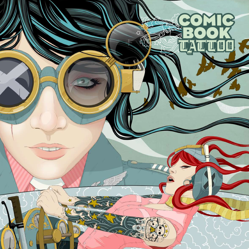
My entry for the QBN moleskine project:


- ximeraLabs0
- nice, did you also draw the cover?tank02
- Thats fukkin sexydauntilus
- No. Cover art is by Jason Levesque aka http://www.stuntkid.…ximeraLabs
- aha i really love the red haired girl.tank02
- sweet! I almost bought this too.Jaline
- tank020
Small part of the Protime Identity


- nice work. :-)akrokdesign
- All this smart print work is making me depressed... I'm hating web right now haha.slappy
- funny because my background is actually motion designtank02
- moamoa0


- nice work... went through your website the other day by the way, hadn't realised it was updated. all lovely.skt
- not a big fan of the type going across the spine (unless it is the centre, can't see) top job though moa *clicks on siteDancer
- Love itdigdre
- Dancer I agree with you, I am not really happy with the big type site.. awwwwmoamoa
- is that silver ink? looks great.Midge
- its fairly nice but a bit bland, although of course I havn't seen the briefset
- ja silver..moamoa
- nice.akrokdesign
- Nice, i actually like that the type is going over the spine...tank02
- Very slick!slappy
- nice one...neue75_bold
- It looks 'nice' though I can't really see what it's saying or meant to be achieving. Not liking that hyphenation sorry.
Fussy eh?max_prophet - fussy fucker aren't Imax_prophet
- Looks lovely but not sure about the copy. Read sentences like that spine one all the time...JerseyRaindog
- atslopes0

SKATER GIRL
- +1 for Brewer hatkatekelly
- her head is too big, arms too short, feet to large.. back to the drawing board!janne76
- agreed brewers hat kills itwordsinyourmouth
- love itwordsinyourmouth
- boobs0
Here's a site I did recently for a photographer:
- digdre0
iluvsoul, check email please.
- Samush0
took this in rome couple of weeks ago...

- omgitsacamera0
Downtown

- what city?digdre
- san mateo, CA.
B and Second.omgitsacamera
- marcostill0
Photo i took.

- MSTRPLN0
Mock up

- glad to see you'r getting job from big sport companies.
dyspl - but, beware about showing WIP products, that's not appreciated....dyspl
- this is just conceptual work to juice my gears, not a WIPMSTRPLN
- ok :)
will you send some to oakley at the end? or do you keep that for yourself only?dyspl - polka dots seams kind a girly. cool doh. :-Dakrokdesign
- I like but the form looks like a ray bandigdre
- Is this just really good rendering, or is this an actual mockup - how did u make it?Machuse
- I would buy those upon sight!ThirdEngine
- glad to see you'r getting job from big sport companies.