AOL logo a rip off?
- Started
- Last post
- 15 Responses
- __TM
found this article yesterday,
http://www.welove72.com/blog/201…
Apparently, Why Not Associates created a logo concept in 1999 for OM Group (unused, but published nevertheless), that looks exactly the same as the "new" AOL branding by Wolff Olins.
Pretty blatant, if you ask me. Thoughts?
- bigtrickagain0
Yeah, looks like a rip. It seems like it would take less than 11 years for another agency to pick up that idea and use it, though - so really, this is overdue.
- ukit0
I don't think the logo has really worked for them. It looks shit on their site.
- jfletcher0
I like the OM one a lot better.
- _me_0
every design agency who has pitched on any major brand has put a white out logo on a whle bunch of "stuff" - it means - your brand in transcendental, it moves with the times, it can be anything to anyone, it unique wile all encompassing, AOL just bought it - OM? who ? - obviously some design pitch boards that never happened.
it happens.
- jimzy0
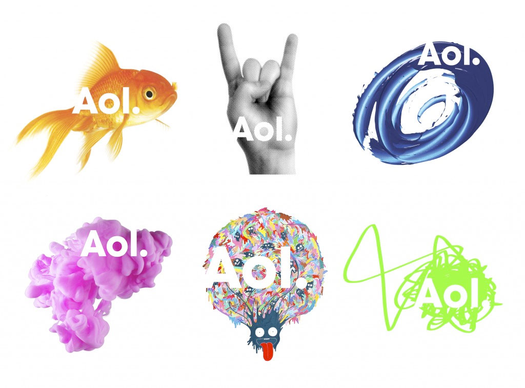
its a different fish, a completely different fish!
- ukit0
I always thought they should have just used the bottom middle image for the logo.
- _me_0
^
http://www.johnsonbanks.co.uk/th…
The ’09 chutzpah award...
...goes again to Wolff Olins for continuing to push the boundaries of identity design and getting up the noses of most of the blog commentators at the same time.Ok, their Aol scheme might look like a scheme we’ve all presented without much hope at some point, but you know what? They got it through.
It’s a strange commentary on current identity design that one of the biggest firms often tries something new, whilst the smaller (and in theory nimbler) ones often don’t. Odd.
- flashbender0
hrmmmmm
quite odd
*puffs pipe
*strokes chin
- indeedy indeed. *pops off to find a young foresaken wench junior to massage his kerning._me_
- monospaced0
_me_ is right. DDB did this too at one point.
- fooler20
OM gawd!
- akrok0
they do look the same.
- doesnotexist0
wolff olins, what do you expect? bunch of hacks.
