Logo critique
- Started
- Last post
- 62 Responses
- instil_design0

to much like mansion?
- monospaced0
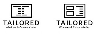
I'm starting to really like what you've got going on using ONLY the ruler marks as the window frame. It speaks to both elements and stays abstract and simple enough to act as a mark. Great revision.
- thanks :) do u think it needs the gap in-between or joined ?instil_design
- the gap implies a dual pane window and preserves the "sides" of the ruler. Go with that. Also try something new.monospaced
- i_monk0
I don't see ruler marks when I look at these, or windows for that matter.
- But, if someone told you it was about windows and measuring, would you understand?monospaced
- They shouldn't have to tell me. That's the logo's job.i_monk
- zing!CygnusZero4
- i disagree look at fedex you need some1 to tell about the arrow ;) hehinstil_design
- Not the logo's job to explain the company to you! Why would you think this? What does Nike's swoosh say about shoes?duckofrubber
- shoes?duckofrubber
- Nike hasn't been a shoe company for 30 years, at least.i_monk
- duck is right...if you think a logo has to explain everything, then you've missed the whole pointmonospaced
- If you have to explain the logo then the logo isn't communicating what you want it to. If you don't want it to communicate something specifici_monk
- something specific like "windows" and "rules" then that doesn't apply.i_monk
- The main goal of the logo is to be memorable and represent a company, not tell its storymonospaced
- bulletfactory0
I think the refinements are an improvement. I wonder, are the measurements necessary on both sides?
this probably isn't the solution you're after, but might suggest window a little more, maybe not.
- Tailored Page Layout Software™i_monk
- ...or even try and work in the "T" as the measurement marks. i dunnobulletfactory
- habulletfactory
- The one on the left is better than all the rest combined.i_monk
- job done, pay the man with gold coinspowershot
- I like the original more than this.monospaced
- i_monk0
Windows are boring, conservatories are much more interesting.
- i_monk0
bump
- fyoucher10
Not crazy about the latest type and window icon. I don't see how it pertains to wondows at all either.
Personally I would go back to the original lowercase lettering. Maybe even play around with using the cross in the lowercase "t" and "i" or "l" to create a window.
- fyoucher10
Obviously not a shitty as this, but the idea...

- uhhhhhhhh wtf?monospaced
- lol...I did it in a minute...just a "wireframe" !!!!!fyoucher1
- fuck no********
- the idea people. I just took his original logo and added some lines to get the idea acrossfyoucher1
- dragonfruit0
everything in this thread is way too complicated... why not just use one element instead of 20? instead of windows, rulers, frames, hidden $ signs 3 fonts all in one logo why dont u go a bit more simple that that ?
i mean even a square would look better ffs.
- instil_design0
i think the client is leaning towards this

- me toomonospaced
- thats nice, does look like the Mansion though...dragonfruit
- No shit********
- i like this oneelektro
- instil_design0
@dragonfruit, yeah i was worried about that too, but the concept came from something totally different lol i guess if you dont know how it came about you would think that.
- dragonfruit0
well i say who cares, different enough i guess

- ********0
nothing about [] feels "tailored"
- the measurement lines are to indicate tailored made, made to measure etcinstil_design
- "if you have to explain it, it isn't working"quack
- heh this argument has been had further up :)instil_design
- explain the Mansion logo to meformed
- Logos don't need explaining!monospaced
- instil_design0

just to show how the negative space can be perceived :) or even used- windows/doors etc, they do doors to tho not in there name lol :)instil_design
- fxone0
im not seeing the measurement lines at all, they look like either blinds or bricks... maybe there should be a 3rd size of lines, or even be around the text or something and anyway maybe that idea is too "technical" ...my 2cents
- by 3rd size i mean like a ruler http://www.bdbase.co…fxone
- yeah i get u, its based of the cm ruler on there :) not to be awkward lolinstil_design
- yeah i just googled ruler and got the 1st image...but u know what i meanfxone
- yeah i do mate thanks :)instil_design
- quack0

- interesting, but I feel like I'm looking at blinds now, hahahamonospaced
- fxone0
the Mansion > hexagram 48 > the well > nourishment > mind = blown
- awsomeinstil_design
- thanks for spelling it for everyone. glad you did your research!!!!mrghost
- SigDesign0
like the top left of these:
