Logo critique
- Started
- Last post
- 62 Responses
- instil_design0
yeah monospace i see what your saying, thanks. all part of the learning experience! heh
- I wouldn't be so participatory if I didn't see potential in this.monospaced
- thanks :)instil_design
- fyoucher10
Obviously not a shitty as this, but the idea...

- uhhhhhhhh wtf?monospaced
- lol...I did it in a minute...just a "wireframe" !!!!!fyoucher1
- fuck noset
- the idea people. I just took his original logo and added some lines to get the idea acrossfyoucher1
- Jimbo820
Just to add a positive amongst all the negativity in here (rightly or wrongly), instil_design, you've got a good attitude pal, good luck to ya.
- dragonfruit0
everything in this thread is way too complicated... why not just use one element instead of 20? instead of windows, rulers, frames, hidden $ signs 3 fonts all in one logo why dont u go a bit more simple that that ?
i mean even a square would look better ffs.
- instil_design0

A few colour choices so far, and messed with the kerning on the top one. am i getting there?
- I really hate to say this, but no.
Why are you insisting on a background color at all!?monospaced - the blue/blue combo might work, but I really enjoyed the single color approach you started withmonospaced
- heh no worries, ill go back to the single colour format, and go from thereinstil_design
- I really hate to say this, but no.
- quack0
thread = uninspired > bad > worse
- = help for me = learning = improvinginstil_design
- = start overquack
- to late for that :)instil_design
- dbloc0
what is the symbol?
- see page 1
;)monospaced - I just see an O logodbloc
- not that interested.dbloc
- ok, try reading page 1
;)monospaced - page 1 sucks. It's all about page 3dbloc
- lolmonospaced
- Told you.i_monk
- see page 1
- fresnobob0
work on the proportions of your layouts. i.e where the logo is placed on the business card. Youre trying to keep the space around the logo even, but it makes you cram all the type into the bottom little section and it looks really ugly. You also have your logo center justified and the type left. Since you have a line running through the center of the logo implying symmetry/centering, why not compose the type as such also? Look up classical page proportions for more inspiration.
Oh, and the way you are lining up to your rules is inconsistent. the sign has space on both sides, as does the business card, but the letterhead has the type aligning to the ends.
and i like the light on dark color scheme better
- thanks for the good feedback, looking up classical page proportions now! :)instil_design
- i_monk0
I don't see ruler marks when I look at these, or windows for that matter.
- But, if someone told you it was about windows and measuring, would you understand?monospaced
- They shouldn't have to tell me. That's the logo's job.i_monk
- zing!CygnusZero4
- i disagree look at fedex you need some1 to tell about the arrow ;) hehinstil_design
- Not the logo's job to explain the company to you! Why would you think this? What does Nike's swoosh say about shoes?duckofrubber
- shoes?duckofrubber
- Nike hasn't been a shoe company for 30 years, at least.i_monk
- duck is right...if you think a logo has to explain everything, then you've missed the whole pointmonospaced
- If you have to explain the logo then the logo isn't communicating what you want it to. If you don't want it to communicate something specifici_monk
- something specific like "windows" and "rules" then that doesn't apply.i_monk
- The main goal of the logo is to be memorable and represent a company, not tell its storymonospaced
- johndiggity0
oh man, so many tick-mark-type vertical elements in that name. this all could have been pulled off in a nice typographic mark utilizing the verticals to allude to those ruler marks...
- instil_design0
i think the client is leaning towards this

- me toomonospaced
- thats nice, does look like the Mansion though...dragonfruit
- No shitpillhead
- i like this oneelektro
- bulletfactory0
I think the refinements are an improvement. I wonder, are the measurements necessary on both sides?
this probably isn't the solution you're after, but might suggest window a little more, maybe not.
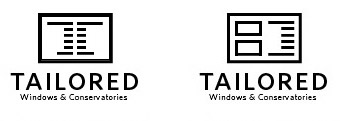
- Tailored Page Layout Software™i_monk
- ...or even try and work in the "T" as the measurement marks. i dunnobulletfactory
- habulletfactory
- The one on the left is better than all the rest combined.i_monk
- job done, pay the man with gold coinspowershot
- I like the original more than this.monospaced
- i_monk0
Windows are boring, conservatories are much more interesting.
- benfal990
i will ignore the colors. because i really hope you will change it.
top one has better potential than the other one i think. maybe i would try more fonts. the window has an old style, like it has been engraved in wood. I would try serif fonts.
- heh yea i will change the colours without a doubt :) thanksinstil_design
- quack0
the logo and text should be the same size on the card, envelope, letterhead
- monospaced0
Start simplifying (top one). Big time. The beveled and outlined frame are too much. You could do with half the measuring tape lines also. Less is more in this case. The font choice is questionable and it doesn't really marry well with the mark right now. I do prefer the wide-format window.
- 23kon0
in the 2nd one with houses the ruler lines are too small a detail to see.
not a fan of the first idea with the measurements inside a frame.
i think its actually the frame itself that is overcomplicating things with its bevel and shadow.
just creating a window shape from the ruler marks would work better - logos should be simples!
- bored2death0
I don't see measuring tape... I'm trying to figure out what the negative space shape is supposed to be.


