Sour Pickles!
- Started
- Last post
- 55 Responses
- a_iver0
Out of curiousity, what did she think about this one:
If you simplify the details a little bit, I could see that being a pretty good balance between modern and delicious
- something makes me want to rotate the circle to the right just a little bit thougha_iver
- maybea_iver
- she liked it...but then she thought the flourish wasn't her...coco_ono
- you're right, iver...i did rotate it to the right a bit...looks better, i just never updated to my blog.coco_ono
- Yep. and balance it on the opposite 45° plane. So the whole thing locks up inside a square.MrOneHundred
- ...and I would thicken the inner circle.MrOneHundred
- haha and to go on, what if the flourish took up a little more space but was less ornate?a_iver
- SuperPickle0
I love the simplistic (2nd one) the green circle w/white text. It is "spot on" so-to-speak. Stay with this....it looks alot like food TV's logo. It works for them
;~)
- SuperPickle0
IMO: there is waaay too much bs comments on this thread. The green with white text is the way to go. It's clean, simple and works.
PERIOD
- i see...u created a new user name just to post on this thread...pango
- BS? Please elaborate.MrOneHundred
- funny how you show up on tis thread with that name.coco_ono
- wait... so it's not a new user name?!?!?! whoa ! :Dpango
- no it's definitely a new user. only 2 responses total according to his profilea_iver
- and as i have demonstrated today, yes i am a mega stalker.a_iver
- are you blind? Citizen since 2006 ... not 2009.benfal99
- a blind stalkera_iver
- coco_ono0
well, if nothing else, at least I chose a decent type face...
- MrOneHundred0
I’m still waiting to see which comments were BS. Come on Pickle, enlighten us.
- identity0
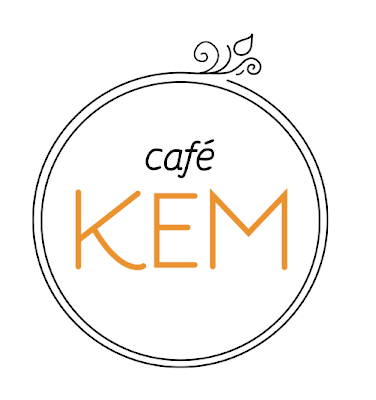
this is just a preferential thing with me - and by no means is it a rule - but optically, when you make small scale differences with the type ("cafe" - to - "KEM") it feels a bit wonky. You could play with diff. weights if you're set with a justified bar - but I think it might look nice to increase the size of KEM dramatically. Take some of what was working with your first design (scale/oblique shifts) and apply it to this.

Not exactly your proportions/typeface - but an example of what I'm talking about
- I think this is a huge improvement on the original.Sandman_1982
- NotByHand0
Dolly, I rarely get involved in critique threads, but I can't help but ask one essential question in regards to the identity you're working on here. (Granted, this is the first time I'm seeing this and I honestly haven't read through all 3 pages of posts, so this may have been dealt with previously).
My question comes from this observation. The clearly most distinguishing element in regards to this client, is that it's 'Vietnamese Ice cream'... not just ice cream. Being fairly familiar with the $20+ billon United States ice cream industry and the brands involved, I know how saturated in parody the market is and how hard every single player tries to distinguish themselves.
So obviously my question is, why is there no focus on the 'Vietnamese' aspect in the identity work? Is this intentional?
- Melanie0
Perhaps suggest she do a consumer test. She has to appeal to what her audience will want, not just what she wants. Besides, you're supposed to be guiding her, not the other way around.
- Juddly0
You should've just shown her the first one!! (with some variations)
Take the decision out of her hands... ah well... next time ;)
- coco_ono0
NotByHand - Just a note i mentioned earlier in this thread...she's not just offering ice cream. There will be coffee, tea, pastries and wireless internet for those people who like to lounge with their laptops. I have tried a couple of variations that would incorporate Vietnamese qualities. In the beginning she wanted me to incorporate sugar cane...but sugar can looks like bamboo...so the visual message didn't make sense nor did it have much meaning. Later on during my exploration, she told me to get rid of "Vietnamese ice-cream" because of the aforementioned.
And I have tried to incorporate it in a French way as the French influence is what has helped shape the Vietnamese culture with crepes, pastires and coffee...so I tried that with kind of the whimsical French café look. I don't know if that came across, but that was my intention.
So yes.
And Melanie - I have *tried* guiding her, but she's pretty stubborn...But hey, it's not like she printing anything tomorrow...Maybe I still have a chance with changing her mind and I can gather some more information and consumer tests.
- SuperPickle0
I stick to my original post. Stay with the simplistic (non-wannabe-french-look). The best example that I can give is http://www.pinkberry.com
their logo is nothing like your #2 (green circle w/white text), but it is simple and clean.
In this case, less is certainly more. Seriously, it is a "go"...so go with it and after all, things evolve; logo's certainly evolve.
As far as MrOneHundred is concerned: "I’m still waiting to see which comments were BS. Come on Pickle, enlighten us" ...
yeah, well ummmm.....you get the idea
- airey0
here's my hat in the ring.

- SuperPickle0
coco_ono: don't even bother with the 'airey' reply. the logo with a simple color (whichever green shade you had) and the white text works great. It will work on coffee mugs, cups, cone wrappers, shirts, etc.
run with it.....your client knows what they want....and it simply works!
