Sour Pickles!
- Started
- Last post
- 55 Responses
- coco_ono
That's what I'm in...
For those of you who followed my logo critique for Cafe Kem...
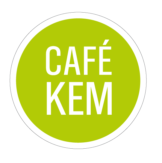
From this:

To this new direction:
I don't know how to persuade her back to the first one, but she's pretty set on this minimalist direction.
What do you guys think here?
- slappy0
I like the top one. Tell her people like the top one?
- tparsons0
uh oh looks just like http://www.letsmakeaspace.com/
- In other words, "looks like a lot of other generic logos out there with no brand personality."dontsueme
- To generic.... this guys logo got copied by a mobile home manufacturer trademark couldn't be protected since its a plain circle with plain text in ittparsons
- ....plain circle with plain text in ittparsons
- coco_ono0
I told her that...
- Melanie0
I really like to top one too!
- coco_ono0
yes, I know there are loads or logos with circles...show me more so i can show her...
- Melanie0
The top one looks delicious. The bottom one could be a logo for a cellphone provider.
- coco_ono0
Her reasoning for this is because she's not "frou frou" like that...She likes to stay in pretty neutral as far as identity. Her current restaurant jasmine26.com is set in helvetica...
That's the type of person she is.
- Yikes! tracked out lowercase Helvetica! RUN AWAYidentity
- ********0
well, what direction does the client want to take the brand? do they want to look whimsical, local, small, friendly etc..?
or do they want to look bigger, more contemporary, clean, fresh etc..?
the logos say completely different things, what is the client trying to say?
- slappy0
Wow, she should really look at her target audience here, who buys the most ice cream?
- coco_ono0
Also, she's not offering jsut ice cream...it's a cafe that has ice cream...so vietnamese coffee, bubble tea, pastries...
- scarabin_net0
i'm seeing boba tea referred to as "bubble tea" a lot lately. is this a new name for it or are there just more people making the mistake now
- it's both...I think Boba became a brand...coco_ono
- ahscarabin_net
- for all i know.
Vancouver = bubble tea
San Francisco = boba tea
and direct translation from the chinese: foam tea.pango - ... chinese : foam teapango
- emukid0
even though i like the first logo a lot more than i like the second one, it really depends on what kind of an image, atmosphere, etc she wants to have for the cafe.
it might be worth pursuing the angle that her customers might want to be in a cafe that feels more fun than modern. but if she wants a modern, clean kind of a cafe then second logo is more appropriate.
skt said it much more eloquently than i did though. that bastard.
- coco_ono0
Okay...well, heh...I already purchased that font on Veer...
Any suggestions for the bottom one?
- coco_ono0
It literally took me 5 minutes to put the second one together... and it took me 20 hours to work up to the first one.
- whatevs...right? you guys go through this shit all the time.coco_ono
- of course bill her for 25 hours.emukid
- pfft...bill? what bill? this is an unpaid internship.coco_ono
- well at least there is hope that you can get ice cream and boba at this place for free.emukid
- in college i was always jealous of tibor kalman for getting free food from his restaurant clientsscarabin_net
- you went to college with tibor kalman? rad.coco_ono
- ********0
client wants 'contemporary, clean fresh. '
'Top one is waaaaaayyyyy better for what it is made for.
the other one would be a mistake. really. 'not sure if people are reading the thread or not... at the end of the day this doesn't come down to personal taste.
- It does if the ice cream taste funny... like chemical greentparsons
- emukid0
there is no room for dignity in design

