Pic of the day - DESIGN
Pic of the day - DESIGN
- Started
- Last post
- 1,446 Responses
- mg3316
- the motion stuff is pretty incredible!fadein11
- It's really beautiful work.mg33
- I like the typeface but looks better with the mark.fadein11
- niceGnash
- Superb work.Continuity
- niceKrassy
- SOH good.stoplying
- +bklyndroobeki
- Nice work, but I was more impressed with the graphic design over the motion stuff, with some of those spots seeming increasingly tenuous as the video wore on.detritus
- very nice indeed, their motion stuff looks slickfeel
- Proper.set
- +1mrpt
- They could of shorten the animation by 3 minutes.utopian
- Brilliant. Much as I love the motion, the type work is outstanding.MrT
- Wonder what the budget was. Fantastic stuff.wagshaft
- Excellent.mekk
- I love this type. I like the big O in the second image a lot better than the first O in the first.CyBrainX
- nicedrake-von-drake
- The animation work on this is just amazing, love it.wheelBoy
- mg332
Any of you familiar with the online t-shirt / lifestyle site UGMONK? He just updated the logo and site, and has a nice case study on creating the new logo and branding. I always like seeing process-based stuff like this.


- yep read that post recently - really good blog on that site.fadein11
- Reminds of your logo:
http://shop.ugmonk.c…utopian - Only took him a year to rebrand?
LOLutopian - there some good stuff there.wheelBoy
- utopian3
Some of the nicest designed award plaques that I have ever seen.


By Laura Thomas
www.laurathomas.co.uk/gallery/re…...
- whatthefunk-4
Jetblue unveils ‘RetroJet’ paint scheme on one of its Airbus A320s

JetBlue says it “dug into an archive of popular logos and notable companies from the mid-1960s to essentially reverse-engineer the JetBlue brand and envision what the customer-friendly carrier of today might have looked like some five decades ago.”
- skwiotsmith1

- bad typesetting ≠ design
e n spacing on tange nt is awful
2/10 would not banghans_glib
- bad typesetting ≠ design
- arne2
- Krassy3
how is this made?
- the beastie boys did it https://www.youtube.…sarahfailin
- Flag tool illustrator :/Hayoth
- Magnetsset
- yurimon0

- Look at this utterly transparent attempt not to get banned now the moderators are getting involved, haha.set
- das lame broset
- (I do hope you don't get banned though)set
- im the only one who posted design related material.yurimon
- You get an upvote from me - that's real neat.detritus
- but then a downvote from me, because i'm an asshole and you're Yurimon.detritus
- drake-von-drake0
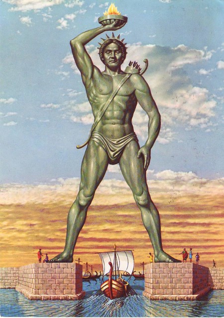
- i heard there are plans to build a new onescarabin
- That would be bad ass! Colossus at Rhodes!drake-von-drake
- imbecile2

- excellent!cjfclarence
- Yup, those old Yasaburo Kuwasama books are the blueprint of every identity you see now.tank02
- hmm and yet the poor designer of the tokyo olympics logo got crucified for ripping some obscure logo that he didn't know about._niko
- Yupset
- i_monk0
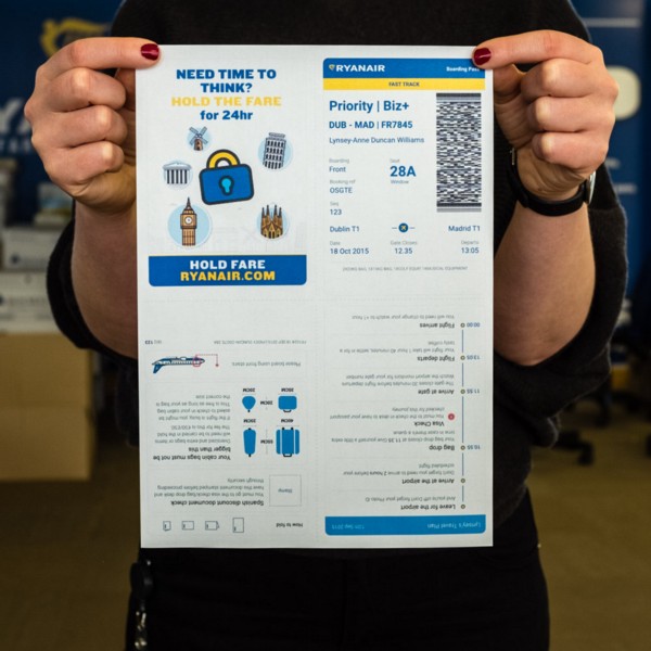
RyanAir's redesigned boarding pass