Poster Crit.
- Started
- Last post
- 36 Responses
- rybo
AHA what you have all been waiting for....
Iv been asked to do some posters to give away free at an event to promote myself, please may you gents give me a crit i am willing to listen..promise.

- laahshi0
can we see a higher res image?
- tank020
Please read this:
http://www.amazon.com/Elements-T…
than try again.- Excellent book. Its full of useful info, not just a 'oh thats pretty' lookbook.ian
- http://webtypography…Anders
- rybo0

- laahshi0
that wavy line in the background, is that from illustrator templates?
- ukit0
Bad design, fonts don't match, but beyond that it doesn't even make sense. Get rid of the "New" font and the text and think of a better way to say what you want to say.
- chossy0
hmm the composition is a bit of a mess really.
society47 sticks out like teets on a boar, the description text of what new is over rides the new graphic which is what I assume you want to hightlight by creating a sweet graphic to say the word new, so the description text totally detracts from it. the text new is not very nice because it is like three different fonts, try to use a similar style to the e in new for the rest of the letters as this might be quite nice, also the waves in the back ground seem too simple too easy to do embellish them more add to them make them more complex spend a bit more time making it look like an art.
- laahshi0
what if the word "new" was the same colour fill as the background?
- dyspl0
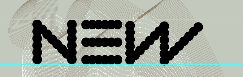
you should spend more time on details ; the W is not aligned with the other letters, the dots don't match the other letters dots on the center (there might be a way to arrange that -adding more dots and making them smaller?).
- rybo0
Thank You Chossy.
I was aiming for system overload so if its not working i will change it, i will work on 'NEW' so i get it looking quiet nice hehe, i did try and keep it consistant as the i used the N reflected to then added the accender of the W.
and i will re draw the lines
Thank You again
- hallelujah0
how does a definition of the word "new" promote you?
- brandelec0
not sure about the text. almost engrish like?
- ukit0
^Yes, exactly. Wouldn't worry about the details until your message makes sense.
- dyspl0
to answer your question, about the text, I'd say that you could play more with the definition and the word "new"
Regarding to your definition, I would play with repetition : a font made from dot as you did. the same word again and again, but slightly changing along the differents words and so the last would finally be "NEW".
this is just an idea and there are many others.The general feeling I have is that you first focus on a meaningfull and strong message (as tDR used to do, and I know you like their work ), and then you try to make the whole thing looking nice, and that's where you seem to loose the path.
for me everything should follow the message, that's the aim of this kind of work, and that waht makes it "nice".just my 2cent.
- doesnotexist0
where's the concept?
- monospaced0
You need to get rid of the second "New" in the definition.
Decide whether you're going to use punctuation (periods) or not; There's a period after "New" but not after the definition.
Left-align the text better and make it much smaller.
I see a hairline gap between an ascender and descender. Fix it.I also agree that this poster is more about looking cool than actually promoting your work.
- rybo0
Cheers guys this is the response i expect, listen im young just need a bit of direction from time to time. all taken in thank you