Poster Crit.
- Started
- Last post
- 36 Responses
- mistermik0
ahh every time i go to say something constructive it sounds terrible.
I'll move on.
- neue75_bold0
is it supposed to be ironic? Like saying something is new, but making it look like it was made 10+ years ago? You might want to harken back to an era a bit more bygone methinks...
- 3point141590
way to many fonts, other than that interesting...
- Llyod0
it looks like something I would've made 5 years ago. Do over
- gentleman0
designers republic back in 1999
also the leading is far too tight.
society 47 - is too prominent for something that has virtually no role
bit of a font orgy & as trendy as them lines are in the background. you havent made them work hard enough. they serve no purpose - they dont have anything to do with 'new' or even interact with text.
it looks like you panicked and used some 'filler' to add more cowbell to your poster.the text looks like its straight out of an 'engrish' dictionary and you could write it a bit better. + who the fuck doesnt know what NEW means..
if you want to 'own' that word - you need to give it a meaning that relates to you. - not just.. 'oh.. well it comes later - cause we do too'
ie. new = something you have not seen before. new = outward looking. etcit basically feels like you are taking a shit loada references from a shit loada places in a complete vacuum. totally devoid of context.
try to figure out why each of these elements belongs on your page and make them deserve a place there.
otherwise you might as well put a dick on the bottom right corner
- laahshi0
can we see a higher res image?
- tank020
Please read this:
http://www.amazon.com/Elements-T…
than try again.- Excellent book. Its full of useful info, not just a 'oh thats pretty' lookbook.ian
- http://webtypography…Anders
- rybo0

- laahshi0
that wavy line in the background, is that from illustrator templates?
- ukit0
Bad design, fonts don't match, but beyond that it doesn't even make sense. Get rid of the "New" font and the text and think of a better way to say what you want to say.
- chossy0
hmm the composition is a bit of a mess really.
society47 sticks out like teets on a boar, the description text of what new is over rides the new graphic which is what I assume you want to hightlight by creating a sweet graphic to say the word new, so the description text totally detracts from it. the text new is not very nice because it is like three different fonts, try to use a similar style to the e in new for the rest of the letters as this might be quite nice, also the waves in the back ground seem too simple too easy to do embellish them more add to them make them more complex spend a bit more time making it look like an art.
- laahshi0
what if the word "new" was the same colour fill as the background?
- dyspl0
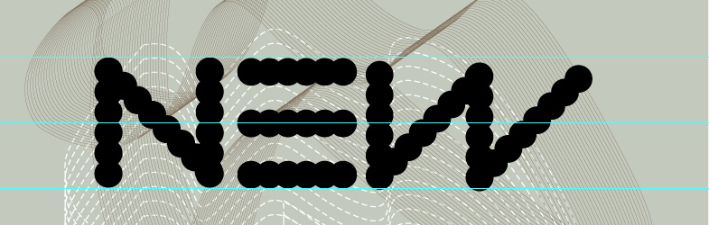
you should spend more time on details ; the W is not aligned with the other letters, the dots don't match the other letters dots on the center (there might be a way to arrange that -adding more dots and making them smaller?).
- rybo0
Thank You Chossy.
I was aiming for system overload so if its not working i will change it, i will work on 'NEW' so i get it looking quiet nice hehe, i did try and keep it consistant as the i used the N reflected to then added the accender of the W.
and i will re draw the lines
Thank You again
- hallelujah0
how does a definition of the word "new" promote you?
- brandelec0
not sure about the text. almost engrish like?