Logo of the Day
Logo of the Day
- Started
- Last post
- 823 Responses
- neverscared-1

- *kerning fail alert*fadein11
- i heard you hate logos so we gave you a logo like the no logo logokingsteven
- MART INshapesalad
- ewwsted
- grafician-3

- https://www.ohnuts.c…slinky
- @slinky yup, they really missed thatgrafician
- from one clip art logo to another.utopian
- Total Energies sounds like something a Gen Z would saynb
- That "old" Total logo was featured in countless logo design books, this new one will never be featuredgrafician
- also these fuckers are part of the team that started global warming now they rebrand into gay logos for "diversity" or whatever
fuckersgrafician - it's a tree branch burning up. Very appropriate, probably aiming for those biomass subsidiessrhadden
- dbloc-3

- I wish the G was kerned a bit closerGnash
- The kerning and angles on the bottom one look a little wonky to me.dbloc
- Ya, the Cleveland sux, but guardian coulda been worseGnash
- Cleveland Comical'sutopian
- Cleveland Steamersdbloc
- Should have gone with their proud locomotive tradition and called themselves the Cleveland Steamers!_niko
- If they don't sing "Let me Groot, Groot, Groot For the home team" during "Take me out to the ballgame" I'm gonna be furious.fooler
- the arched CLEVELAND is terriblefooler
- My friend in Cleveland is a hardcore Indians fan and has a tattoo of the Indians logo. Hahaha.monospaced
- I was born there and my in-laws are still hardcore fans. They have sent a few chief wahoo hats to my kids but I haven't let them wear them in years.fooler
- what are they guarding? the old name?Krassy
- Someone on reddit (Cleveland or MLB sub) did a 100x better job.section_014
- fooler0
The Cleveland Indians redesigning their logo in four steps.
https://pbs.twimg.com/media/E6_J…
https://pbs.twimg.com/media/E6_J…
https://pbs.twimg.com/media/E6_J…
https://pbs.twimg.com/media/E6_J…
- shapesalad0
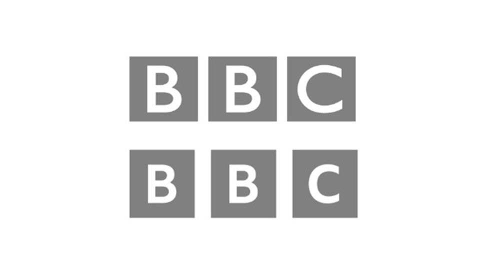
Micro changes. The theme for new logos of 2021.
- font changedbloc
- Geniusutopian
- With smaller letters, they needed to bring the rectangles closer, not even more far apart. Now it looks like 3 rectangles instead of one split in 3!grafician
- ^ I tend to agree...at least they should have kept the distance. but hey maybe it's actually worse than one thinks it would look likeoey_oey
- ^at small sizes the new one is unrecognisable while the old one is still somethinggrafician
- Apparently it already made a big "impact": https://www.creative…grafician
- Isn't bashing the beeb the thing to do now anyway? Rotten timing...MrT
- they fit better in the squares nowmonospaced
- Same same differentChimp
- grafician-1
- Was the new slam logo done in-house? Because the new logo looks older than both companies combined.utopian
- Don't like this at alldbloc
- Ah ha ha ha ha. Reminds of Home Bargains.Morning_star
- Yeah, no.section_014
- milfhunter1

underconsideration.com/brandnew...

- sted0

- Salarrue0

- ?Krassy
- new ubuntu default desktopSalarrue
- tits and ass?sarahfailin
- lolKrassy
- BaskerviIle9
Nice

- Aye. But, needs more distance - that's WAAY too close! :)Nairn
- not if the circles are 1.5m in diameterhans_glib
- Really?utopian
- They can use this logo also for Tokio 2021grafician
- Oh waitgrafician
- ^ LOLoey_oey
- had to be doneESKEMA
- I always think the circle for Australia is missing.SimonFFM
- Isn't that the blue one, for Oceania? Asia the red one, Americas the black one, Africa the green one and Europe the yellow one?oey_oey
- You are probably right. It’s just not intuitive to me.SimonFFM
- Hey Simon, sorry but I totally invented it, I mean the colors corresponding to the continents. but there's 5 so I guess it would be correct?oey_oey
- grafician1
- Done by Shepard Fairey btwgrafician
- And house industries. I bet house did most of the work.monospaced
- Krassy0
New Skrillex logo by Aphex Twin logo designer Paul Nicholson


- https://i.imgur.com/…utopian
- What am I missing with the "ILL"?bezoar
- I remember my first attempts at graffitiAQUTE
- "Ill" as in "cool" or something?
Nah...grafician - Hmm.jagara
- Nah.jagara
- this is badmilfhunter
- ILL SKREXoey_oey
- Shitebabydick
- Should have just used Skrillex's haircut for the logoyuekit
- Imagine being the guy who’s only known for the Aphex logo. The pressure must be unbelievable! This is wankIanbolton
- Hello 2003NBQ00
- Or 1997NBQ00
- def 2003.garbage
- Interesting grid. His unique style balanced with legibility. It’s actually good experimental typography and fitting for the client. Haters gonna hate.monospaced
- without visual reference to any 'grid' I'd of had zero clue the 'designer' wasted their time in an epileptic fit w/the fucking guidelines—this is kinda awful <3PonyBoy
- Just cause you throw lines on it doesn’t make it a grid. Feels like Bitcoin charts validating with the trend lines or whateverwordssssss
- This what happens you end-up with when don't go to design school.utopian
- ^ almost a haikumonNom
- Eh. As long as he got paid, looks like a mid-tier Büro Destruct rip to me.face_melter
- still better than the usual crap that is floating around though..neverscared
- I don't like the post hoc bullshit made up grid rationalisation and the counter in the R but otherwise I think it works well.
*shrug*Nairn - well it's quite close to the original logo. just made more odd. is Skrillex still a thing?shapesalad
- Oh dear lord, I just googled the old logo.
Guise, whatever your thoughts - this is a fuckign masterpiece by comparison.Nairn - Awfulscarabin
- It's like a graffiti mural 1.0 sketchstoplying
- Well... he sure made thataliastime
- The "fake grid" is not even accurate or complete. Haters Gonna Hate, LOLutopian
- This what happens you end-up with when don't go to design school.sarahfailin
- https://searchlogove…sarahfailin