Logo of the Day
Logo of the Day
- Started
- Last post
- 823 Responses
- Krassy1
French electro artist Étienne de Crécy

- Plug in herenb
- GayNBQ00
- https://www.cnn.com/…utopian
- brilliant logo for an e-car startup, wasted opgrafician
- ed's electric - well done; https://logopond.com…Krassy
- Solid. Not a fan of the gradient, though.maquito
- Always loved this.pedromendez
- grafician0

"Matter is set to become the standard symbol for products that can be connected within the Internet of Things"
- extraordinarily ordinaryutopian
- it's rather not compared to the wi-fi symbol or the bluetooth one?grafician
- the logo itself is ok+ but the font, not for merenderedred
- Doesn't say 'connected' to me.i_monk
- neverscared0
Xiaomi’s new ‘squircle’ logo becomes the butt of online jokes with many claiming they could have made it for much less money
Smartphone maker Xiaomi reportedly spent US$300,000 on a new logo inspired by Eastern philosophy, but online ridicule said it just rounded the square corners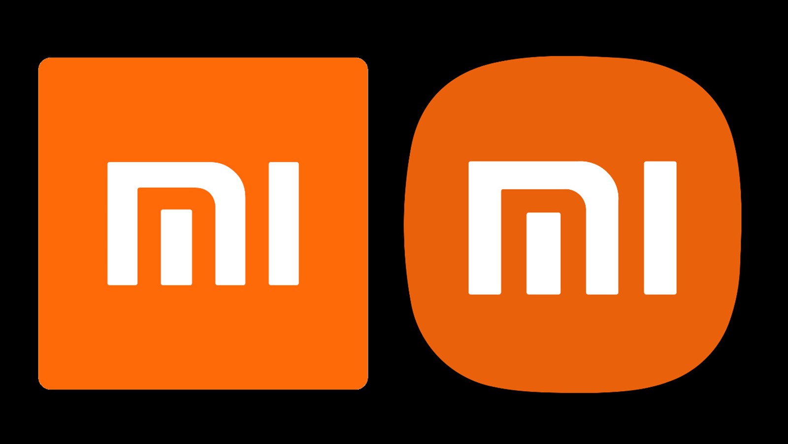
- milfhunter-1
- creating the logo 1.5 hours. coming up with hogwash to justify the 400k pricetag - another 300 hours._niko
- oey_oey0

- not a great update.milfhunter
- Client: You got rid of the FC, now we have no Idea what they do!Hayzilla
- Horrible.Hayzilla
- The original light blue would have looked nicer. That blue is gross.Hayzilla
- IMOoey_oey
- Made by Mirko https://www.instagra…grafician
- what's OTIT?Krassy
- ^oey_oey!Nairn
- There’s a missed opportunity here to have parallel lines in the “m” to go with the “I” and make the letters blue on a black background to visually tie it in to_niko
- Their famous black and blue stripped kit._niko
- Their famous black and blue stripped kit._niko
- And this new thing of i m denoting both inter Milan and I’m as a rallying cry for a new generation of fans is sort of weak and doesn’t speak to Italians._niko
- Nairn2
Just happened upon this, randomly, quite liked it.
- hans_glib4

- no idea if it's official or even a logo, i just liked ithans_glib
- if only the t wasn't touching the o. sorry, it's great but that bugs me.renderedred
- yeah, spacing between letters is all over the place.dbloc
- Also, the Y is the only crooked letterdbloc
- y looks finemonospaced
- Yikes!utopian
- i like itStoicLevels
- It's all a harmonious flow of almost fine. I like it.CyBrainX
- https://i.pinimg.com…OBBTKN
- It looks like a 9th grader created this logo.utopian
- Beeswax1


- it's officialBeeswax
- Where have a seen this revised diamond mark before? It looks familiar.utopian
- 1972 was a good yearoey_oey
- looks sorta like the comunno.com logocapn_ron
- i meant the communo.com logocapn_ron
- inteliboy-2
- the what?scruffics
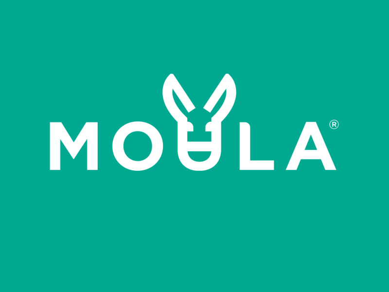
- MOVLA? MOULA?
MOYLA? MOϴLA?_niko - this is so fucked up...over thought I guess. I don't even understand what that might be and what is it all about.oey_oey
- donkey?renderedred
- moula = mulerenderedred
- lol is that what it is? I thought it was a deformed bee. but it's terrible regardless_niko
- yea I hate it. didnt mean to post like it was good.inteliboy
- Pooladbloc
- LOL @niko me too, first it was a 5g bee and then moula sounded familiar. then i saw the head.renderedred
- fooler4
Amazon's new icon for its smartphone app has been mocked online by some customers who have joked that it looks like Adolf Hitler. Many have urged the brand to "rethink" the design
:format(webp)/cdn.vox-cdn.com/uploads/chorus_image/image/68893612/iconcs.0.png)
- Hayomook juts had an aneurysm.utopian
- Sorry what? In which way does it look like Adolf Hitler? It totally looks like Fleaoey_oey
- That time when Hitler died his moustache blue for a rave?Chimp
- Charlie Chaplin wants his royalties.StoicLevels
- sted0

- nb6

- sarahfailin-1
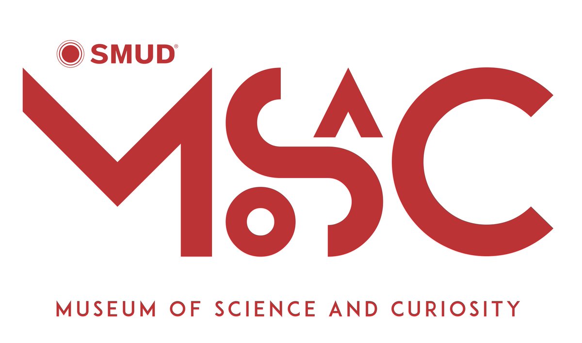
the rebrand of the science museum in Sacramento
"MOSAC" apparently.- pentagram?renderedred
- Looks like a high school project that went wrong.utopian
- Do t mind it, quirky and suits the brand_niko
- Very turn of the millennium.i_monk
- I like it.inteliboy


