Show some recent work
- Started
- Last post
- 8,594 Responses
- neue75_bold0
Basically a compendium of amateur photographs taken as part of an internal campaign/photo competition for Elsevier staff members.. The criteria was to take a photograph that captured the essence of "A Broader Perspective" The book is divided into chapters by various keywords that revolve around what can be gained from reading books.. The photography is interspersed with product facts, staff quotes, quotes from authors and product search results when using the chapter keywords...

- That looks f*ckin brilliant Neue, and I aint even zoomed in yet!!!!uncle_helv
- beautifully designed agency wank job?Dr_Rand
- thanks, and yes, agency fffap, fffap... remember though, I'm in Integrated Communications, not Advertising ;)neue75_bold
- the client must love itDr_Rand
- Lush.JerseyRaindog
- yeah, client was happy, was nice to see the staff at the launch feverishly thumbing through to see if their photo...neue75_bold
- was selected to be in the book... it was also a surprise, they had no idea their images were to be compiled into a book...neue75_bold
- book... but fuck, sifting through 500+ mediocre at best photo's wasn't much fun...neue75_bold
- at least you didn't have to do any large phonetically spelled words followed by dictionary definitionsDr_Rand
- watch thuis space...neue75_bold
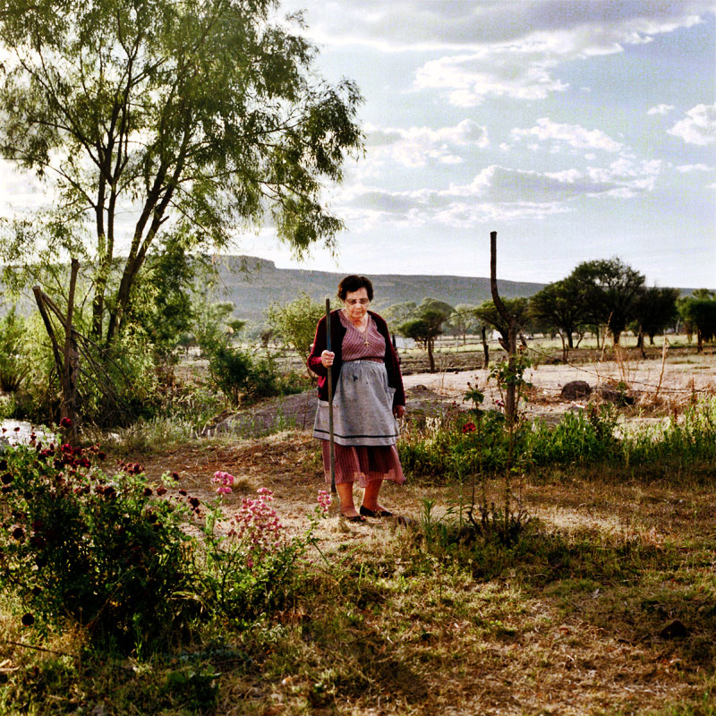
- content : endangered speciesDr_Rand
- I want one
kthnxbyedigdre - beautiful.. but I don´t like how you put the double quotesmoamoa
- very very nice!joqui
- I want that!Concrete
- very good, i need to move to holland...tank02
- is there even any point saying your stuff looks amazing any more, its a cliche in itself ;Pkelpie
- (you're the proud owner of every point I have ever dog eared in this thread)kelpie
- –
nice job
–Dancer - thanks folks. I appreciate it. Wish I could give you all a copy, but I only have 1 for myself :)neue75_bold
- what format is it?
on what paper?tank02 - 120 x 120 mm, cloth cover with stamp, inside is a mix of coated and uncoated like 80 or 100 gsm?neue75_bold
- really nice snuggles.skt
- ilu.!antigirl
- thanks skt. come again tif?neue75_bold
- that 'reading is to the mind...' quote is just wrong. Book looks lovely though nice work.avolve
- nice.Jaline
- AMAZINGMeeklo
- that 'reading is to the mind...' quote is grammatically correct actually.JerseyRaindog
- Yes but its still wrong. Reading is an excersize to the mind, just like excersize is to the body,,,avolve
- its wrong.. they should have used like 'running is to the body' or some action.avolve
- I'll tell you right now, it's just filler, there's a myriad of lame quotes about books in there, as well as rubbish photos...neue75_bold
- Yep i'm all too familiar with nonsense filler. Its still bloody wrong though : Davolve
- 34 comments, this should have had its own threadavolve
- ilu = i love you! ;)antigirl
- 36!!!!uncle_helv
- oh, ilu2 :)neue75_bold
- svenreed0
- and yes i still shoot filmsvenreed
- pretty cool.
digdre - Is that 2nd photo from Haven Skate Park (New Haven, CT)?TheFatBaron
- nice ones.akrokdesign
- yes it is. thankssvenreed
- Are you guys twins?Jaline
- not sure..im behind the lenssvenreed
- graphicart210
i'm new. how do you upload jpgs to the comments?
- You can’t directly upload images, you need to paste in a URL from, say, Flickr or ImageShack.Mr100
- just post direct links to them i.e.
http://mysites/image…...Jnr_Madison - fuckin note stripped me!Jnr_Madison
- The quick or the dead, my friend.Mr100
- Just host it and post the link of the page it's hosted on. E.g., http://thissite.com/…dog_opus
- D'oh. You guys are fast.dog_opus
- thanks
graphicart21 - let me guess my orange cup?studderine
- roger840
http://rogerhaus.blogspot.com/20…
why i never show the pictures correctly? i don't know why... so...
Good night to everybody!
- roger840
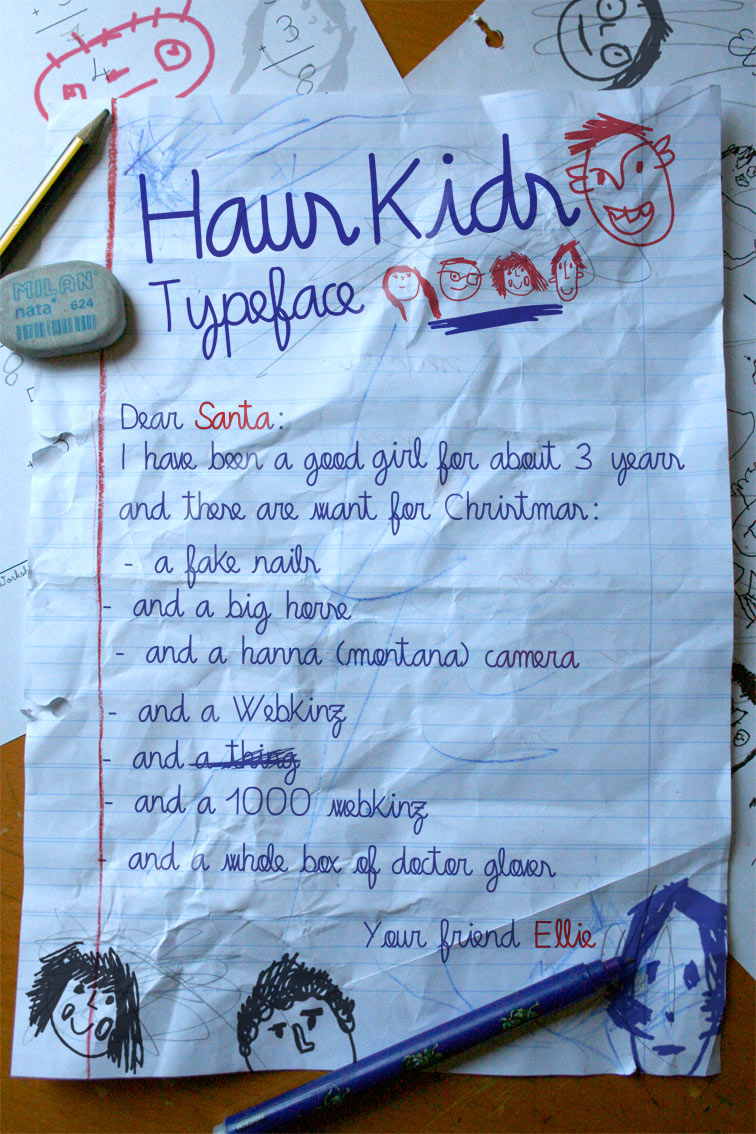
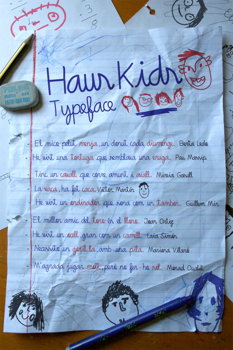
Creation of Haus Kids Typeface.
It imitates the children scripture.
All the drawings that appear in it print, are special characters included in the font.
- joqui0
Magazine layout setups

- loking nicedigdre
- these are awesomestudderine
- dope
ADRENONLINE - sweet!akrokdesign
- Nice work.JerseyRaindog
- i dig the connected spread, nice one...
Huebert
- digdre0
update guys

- I still like itDr_Rand
- I still like itDr_Rand
- sorryDr_Rand
- i need a internship :)digdre
- I will hire you to do one if I find the right job for this styleDr_Rand
- It reminds me a bit of a Coltrane album cover. Can't remember which, but it might be one with Monk. Great work (yours, I mean).dog_opus
- thanks alot guys!digdre
- thats funny, working on something similar
tank02 - needed the cap. cool stuff.Raniator
- not done yet.. :Ddigdre
- jay-z?!
cool.Jaline
- digdre0
but still working on this

- jkmohr0
finishing up an updated portfolio. adding more entries over the next week or two. http://jon-kyle.com

- seems like the screengrab app messed up that first title. oh well.jkmohr
- JerseyRaindog0
A concept for an airport poster just whipped up this afternoon.

- is that meant to be a laptop?skt
- Yup.JerseyRaindog
- where?digdre
- i think people might miss that.skt
- it looks more like a flat without windowsdigdre
- Yeah, my wife said the same thing. This is just a rough and I think it can be improved on.JerseyRaindog
- I like the conceptepigraph
- is there an idea here? since its so simple i expected the line to be killer.
graphicart21 - needs more distinction from the sky and green watered ocean. that's the color scheme yes?jaylarson
- Harm0
http://www.wejane.com - website by me, corporate ID by Martin Pyper - http://www.mestudio.info
- that logo re-drawing on every section is really annoying.skt
- I agree, only need to see that once thanksavolve
- no shit. you gotta animate that logo only once at the start. i cant comment on anything else cause i left after it started over on the next page. sorry.graphicart21
- Concrete0

- Nice is that Ben!uncle_helv
- So Concrete, do you just do posters?Dancer
- Pretty much...Concrete
- green on fuschia, you daring little minx you...neue75_bold
- Tell my client that. She thinks it's boring! :(Concrete
- "can't the image be full-bleed?"neue75_bold
- Exactly! ;)Concrete
- it's this magical concept called "composition"Ampersanderson
- you do the Refune logo too?Ampersanderson
- I comped the image but I didn't design the logo.Concrete
- tank020
work from my girlfriend


- +1 for the photos.
-100 for the attire.2cents - ah yes, that why she selected for several fashion awards.
fuck you 2 centstank02 - love it, tankAmpersanderson
- this wood look esp. in the third pic is unique.invisiblechamber
- +1 for the photos.
- Fouty20
Simple font I'm working on:

- kona0
Concepts for touch screen home thermostat.
Home Screen
Menu
Adjust Temperature
- nice work konaMeeklo
- Thanks Meeklo!kona
- very apple-like and iphone inspiredSamush
- these are dope. i love the fact there is one typeface used to set everything in.madirish
- Nice info graphics indeed.JerseyRaindog
- Thanks guys.kona
- very nice mr!OSFA
- nice stuff K0na, looks like an interesting job you've got nowadayskelpie
- 0000000


- scorchingkona
- I like the 1st 1.ADRENONLINE
- very very nice!OSFA