Show some recent work
- Started
- Last post
- 8,593 Responses
- JG_LB0


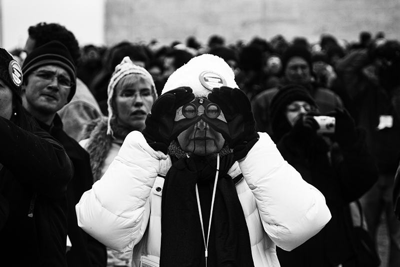
Washington DC Inauguration Week
- http://www.flickr.co…JG_LB
- Nice shots, JG_LButopian
- cööl.
akrokdesign - awesomejuhls
- armed_rob0
- Nice, but maybe you should load the menu instead of makin it drop down on mouseover.. I was waiting for it to load..digdre
- but you standard page is just black..?digdre
- black, how?armed_rob
- all those images are gone..digdre
- http://www.tomhuvene…digdre
- wtf... reload?armed_rob
- yeah that happened to me after fiddling about.. broke it somehow.
really very nice though.max_prophet - must look into that one of these days.armed_rob
- nice!akrokdesign
- beautiful job:)utopian
- very nice!!!!sikma
- amazing all of it. especially the presentation.erikjonsson
- tank020

- love how the letters touch each other ^^ A+ brtCLRBLND
- nice, how about makin it black text? I know white is your thing, but maybe black is better with the BGdigdre
- i think the white fits in more with the picture, will render a black one, to see how it looks...could be nicetank02
- Wow! that is nice. Keep'em white.
Witch app?armed_rob - nice! great shadow/light integration.dyspl
- great! make it hover on the beach with dunes in the background and people walking.stewart
- plus
more contrast or color into the 3D text blockstewart - nice, bart.akrokdesign
- May I ask how you do this?non
- my guess is C4d.
looks fantastic just the way it is. I love itMeeklo - Your gues is right meeklo.
Ye old extrude in C4D.tank02 - I want to learn cd4 just so I can do stuff like this, looks so nice manMeeklo
- I love how the ends of the letters go round and behind the wordMeeklo
- That's one big liggy!Ampersanderson
- jiaf0
New Skate Deck Design for Olive skateboards, based on pacific northwest native american art.

- nice, looks totemdigdre
- Very cool. I can def. see the native american influence.theredmasque
- nice. here's a nice totem deck from bitd http://webzoom.freew…max_prophet
- Thanks guys & sick Max! That one's a little more evil looking than mine.jiaf
- +1Complexfruit
- Love this!Ampersanderson
- very cool.
i'll glady pay for shipping. =)grunttt
- theredmasque0
Flyer for a local concert series

Also recently finished a website for an artist / designer
http://www.matthewclifforddesign…- I would have preferred to have the whole flyer illustrated, tying it in with your illustrationneverblink
- not sure about the flyer, but nice drawing ;)digdre
- ;)theredmasque
- PonyBoy0
finally finished up a couple of sites...
http://www.markpeterman.com
http://www.scottsdalecanaldev.co…- epic!! seriously!!!thelukeandrews
- +1 The photog's work is really strong.UKV
- Scottsdale site is lovely! I don't normally like flash sites, but this was great.D_Dot
- Great work Pony.Complexfruit
- nice work.Jnr_Madison
- didn't know this kind of work from you mr ponydigdre
- mark peterman site is sick. nice attention to detail.johndiggity
- Pony is a flash godjuhls
- max_prophet0
The logo looks much better now.
What I don't like about the ad is that it communicates nothing, I am none the wiser, I've never heard of the product and all I know is that it's something to do with digital publishing. And that generic people in generic stock images might use it in their lab/apartment.
I really think there needs to be some kind of headline probably indicating trhe products USP outlined in a quick and obvious manner, at the moment there is no hook to learn more and it just looks of no interest to me who may be flicking through a magazine.
"Go beyond print" - great, but tell me in a flash not a series of minute bulletpoints and text that all happens to be made quite illegible thanks to complex background graphics.
I think you've done what I would call a 'design job' on this, in that it looks quite pretty and sharp, though in a sterile and somewhat cold manner, but you've forgotten to unpack what it is you are selling, and have ended up delivering very little information, unless someone actually stops to read the small print, which they won't.
- for kelpie, hope that doesn't sound too harsh.max_prophet
- you are, of course, completely correct. Unfortunately my hands were pretty much tied on this one. cheers mate.kelpie
- aah well, what can you do.max_prophet
- oops - sorry for bolting in :-pinvisiblechamber
- that logo would look nice animated btw. it reminds me of one of those film/production companies.. with the paper curling into a C or sthmax_prophet
- curling into a C or sthmax_prophet
- probably communicate your points to the relevant parties next time, I'd reckon. education education education ;)kelpie
- hehe, no problem invisiblechamber...
yeah max, I'm looking forward to animating these (its part of a suite of 3 products)kelpie - ...suite of 3 products)kelpie
- invisiblechamber0
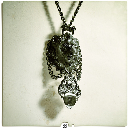
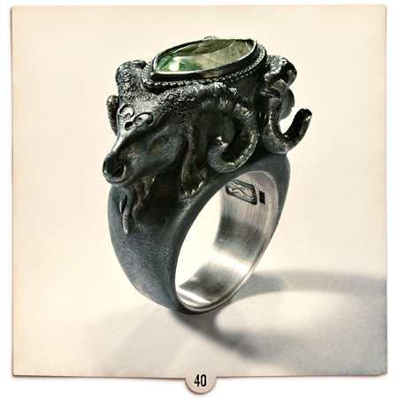
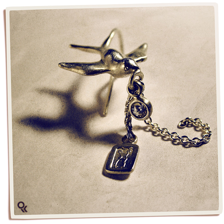
3 out of 80 pages of photography + extensive shopping for a jewellery catalogue i am doing right now.
- nice, I like the jewellery too.max_prophet
- nice pics, the depth of field makes a lovely tone for themkelpie
- I really want the 2nd one to be a bracelet though, instead of a ring. That would be so awesomekelpie
- Very nice. I'd love to see the finished catalogue.NotByHand
- thanks! i think the finished catalogue will be downloadable as pdf. i will post when so.invisiblechamber
- kelpie, there is a lion ring, too, but no ram pendant - at least not yet...invisiblechamber
- Oh I like these! I def. want to see the catalog when you are done. Nice photos too!theredmasque
- sweet.janne76
- love itjuhls
- where can I buy this?juhls
- only in german as yet, but just get in touch via this temporary website: http://www.amala.net…invisiblechamber
- german language on site that is - jewellery purchasable worldwide of course!invisiblechamber
- here is the catalogue:
http://amala.net/AMA…
invisiblechamber
- kelpie0

- scared :-/kelpie
- bits of this i like, bits I hate: too much content, text layout form another version, plonked onto this due to time. bugger.kelpie
- thay gray text does not work on the bluedigdre
- << what he saidslappy
- agreed, though in situ it's not early as badkelpie
- GO BEYOND! lol.
yeah, no grey/gray on blue.
other wise, nice work.akrokdesign - grey blue is awesomedrgss
- tank020
And here is the stuff wich i actually make my money with,
my corporate side.
- Because from my last posts, you might get the idea i'm some arty farty depthcore designer...tank02
- I'm in fact a very commercial son of a bitch ;)tank02
- This is nice man, good colour combo.slappy
- oooh I take your comment for me :) never intended to take as a depthcore teenager.dyspl
- nice one bartdigdre
- Well dyspl, you where right;) and then its been a long time sibce i posted any corporate worktank02
- nice work, bart.akrokdesign
- Very Nice!jiaf
- the logo is a marble, is it?digdre
- marble, highways, earth, a phoenix from a flame..its a leasing company for used cars...tank02
- nice work!utopian
- very niceMeeklo
- slappy0
Just finished a custom blog theme for an orphanage in India. Was a freebee but didn't take long.

- imnotadesigner0
My first shoot in studio and first with a model... Im pretty happy with the results


- 3rd one down, nice shotutopian
- post the nudes pleaseLIoyd
- These are great man, you should be happy.slappy
- last one is lovely....moamoa
- nice. love the 3rd one.akrokdesign
- 1st looks like a manikinflyingnowhere
- skt0

- 10 minute logo, done for free in my lunch break. it shows.skt
- the colours are nice though... just wondering if the tops of the t's could have been the ditto mark somehow?Amicus
- i like!utopian
- Ditto inch?Dancer
- oh, ignore me.Dancer
- how about a free logo for me..
jk/
Nice logodigdre - would prob have merged the t's together or angled them in the same direction but nice colour choice. wats it 4 ?WeLoveNoise
- but then you would lose the OMG HIDDEN SPEACH BUBBLE!!skt
- haha, dig! ain't that bad for a quickie. What's it for?Ampersanderson
- Andrew_D0
Nokia vid we just completed:
- D_Dot0
Is it ok to show stuff you're currently laying out in here?


- Lots of placeholder images and logo :)D_Dot
- nicemagnificent_ruin
- well hello there Rebecca!
:o)VectorMasked - could the grid in the second pic be altered to match the other two?Amicus
- Andrew_D0
A work in progress we're doing for Nokia:
Is it possible to imbed Vimeo files in PV?
- uncle_helv0
Logotype for a 'professional engineering tools' company...

- love it!_salisae_
- looks greatMeeklo
- well done sir!!!!!! beautiful work as always!!!!!moamoa
- like it.Jnr_Madison
- Nice.NotByHand
- nice!dyspl
- Great stuff helv. Solid as usual.non
- Great stuff!5timuli
- Nice workroundabout
- Yum.JerseyRaindog


