Show some recent work
Show some recent work
- Started
- Last post
- 8,592 Responses
- e-pill0
HAPPY V-DAY!!!

:P
- _salisae_0

- il ikedigdre
- love it love it love it. you do american really well ;P if that makes any sense at all!kelpie
- thanks kelpie! :) i hope this doesn't mean you think i am obese!_salisae_
- hell no!kelpie
- like the type. but something looks unbalanced.moamoa
- i'd appreciate any further articulation you can muster, moamoa_salisae_
- I´ll try it. it tillts to the right, probably the position of the star is the reason. the space (brown) between all the type looks messy, its not a nice formmoamoa
- looks messy, its not a nice form.. or not balanced ;)moamoa
- arghhhh my english sucks when I try to crit specific points.moamoa
- my english sucks anywaymoamoa
- ok i think i know what you mean. you're looking at the counter shape primarily._salisae_
- sweeeetliveforever
- I like it, but something seems odd about the text.Jaline
- I think it's the fact that the overall design is so symmetrical, while the Starr Sweets is notukit
- Looks good! Maybe try having the top curve on sweets follow the bottom curve on starr?jiaf
- ahh i see now what you mean .. thanks!_salisae_
- LOKi0
New masthead for my site/blog:

- i likedigdre
- merci!
LOKi - I like it tooMondoMorphic
- you trickster youAmicus
- sexy.Ampersanderson
- tparsons0
Concept in progress...

- how do you pronounce aidw?skt
- very carefully....tparsons
- BRAND AIDW?
doesn't communicatestewart - brand aid nwAkiraprise
- Sorry, man. That doesn't read at all.Ampersanderson
- maybe a different colour for nw? can be subtlehitsuji
- mekanic0
Lexus 2010 RX

Something we just finished up with our friends at Pixelpusher
- FallowDeer0

- Visual for a flash site im gonna be working on,
needs some more work to it, layout wise as well could be better, see what I come up with?FallowDeer - better, see what I come up with?FallowDeer
- i don't like that transparant brown/red 'ishdigdre
- I know what you mean, whould you pick another colour, or make it even more transparent?FallowDeer
- make it black/transparent..
I think..Meeklo - http://www.fallow-de…
tried black didnt look right, grey?FallowDeer - ok black is growing on me haha
http://www.fallow-de…FallowDeer - yeah black is better, maybe a bit darker too, but that is just personal choice really,Meeklo
- guys in the office like it as well, but the bar is all colours but black so it doesnt fit :(FallowDeer
- try reddigdre
- but black is nice!digdre
- try chocolateliveforever
- black looks great! maybe a bit darker & maybe incorporate some colored elements?jiaf
- im having to convince the client now, he isnt keen on black as the building/branding is all brown/redFallowDeer
- might use different colours on different pages, now onto flash!FallowDeer
- Visual for a flash site im gonna be working on,
- digdre0


- Not sure what I should do..
1st one is PS
2nd one is Ecoline
3rd one is just black n white with pendigdre - can i has a print of this?!?e-pill
- i like the 1st one!!e-pill
- Yeah tom, this is cool. I really like the last one, just lines.ian
- i will see what I can do, epilldigdre
- yeah I like the lined version best!
me wantFallowDeer - would you like to have it vectorized, or just pen and paper, or copyeddigdre
- lined B&Wfodcj
- archival print please...
its up to you...
oh and large!!!e-pill - whats an archival print?
it's a4digdre - Love the first oneGrandChamp
- haha vangogh would rotate in his graveerikjonsson
- like em all, nice work tom!magnificent_ruin
- blacknwhite is the best
love you work dudeliveforever - more color please.Hurley
- my teacher likes the first, but I should colour them with markers.. so I will do thatdigdre
- Not sure what I should do..
- JayCee0
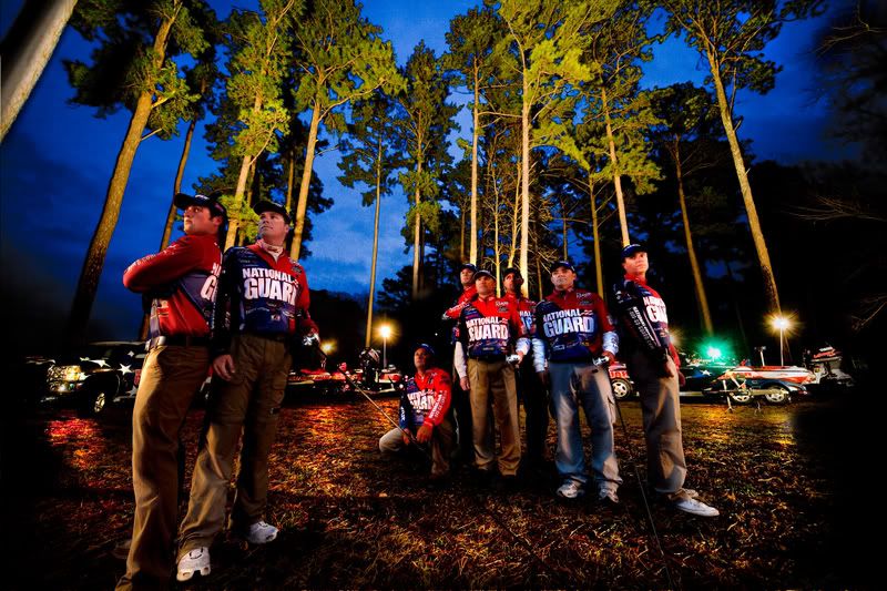
Shot this for the National Guard Wednesday.
- Meeklo0
4 panel cd pack/ photography for hip hop dj


- why do i keep thinking of words like Wonder to describe this?Amicus
- hmm, is that a bad thing?
Meeklo - J'aime beaucoupManchersterUnited
- nice work!ManchersterUnited
- not a personal favourite style but I can appreciate the workmanship on this, good stuff.set
- e-pill0
dEPTHD3

:)
- ‹‹ Advanced Critique Encouragede-pill
- looks good, I think the bee-panel pattern throws me off a bit, is it supposed to be the inside of the case?Meeklo
- yeh i have to fix that background...its still work in progress...e-pill
- this dude might go great on a white background?invisiblechamber
- Looks sort of clunky?Anders
- desmo0

- nicebulletfactory
- lol I've seen the tutorials for this style. You have done a nice job of it though.Amicus
- care to share those tutorials? lolPunchDouble
- invisiblechamber0
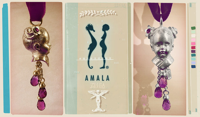
bit more photography + design for jewellery catalogue.
- imnotadesigner0


- 24"x36" canvas wrapped prints
on display at a local resto/lounge in Toronto - shots are of the Bloor Viaductimnotadesigner - i am sure these looks better in real life. meaning, they should be seen close to the canvas. :-) nice.akrokdesign
- really like these.Bluejam
- yes, I would totally hang the last one in my house, love the color palette tooMeeklo
- I meant the 3rd one, the last 2 were still loading :pMeeklo
- melikes.Ampersanderson
- 24"x36" canvas wrapped prints
- JG_LB0
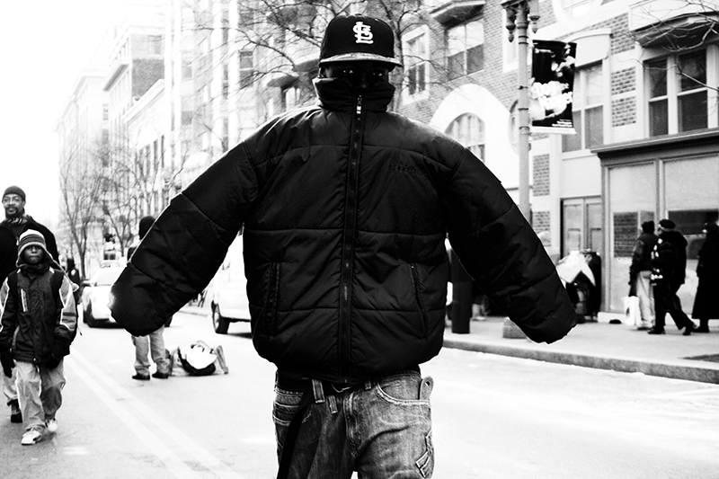

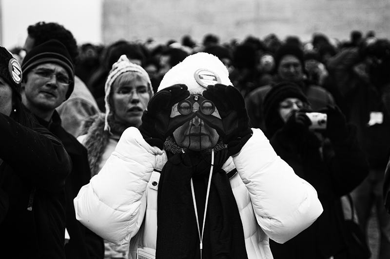
Washington DC Inauguration Week
- http://www.flickr.co…JG_LB
- Nice shots, JG_LButopian
- cööl.
akrokdesign - awesomejuhls


