Show some recent work
- Started
- Last post
- 8,592 Responses
- Ampersanderson0


- ID for music venue in Brooklyn.Ampersanderson
- nice one, but on the banner...you cannot put type like that...tank02
- classic!_salisae_
- Tank, trust me, I know. It's lame, but the client wouldn't give in. Good client, but fast turnaround, so a must. Bums me.Ampersanderson
- I thought, still, the first two...Acetank02
- +1Complexfruit
- that accoutered A is awesome.invisiblechamber
- beautiful!theredmasque
- Great as always.non
- class! Nice work.jiaf
- nice. but there are some huge kerning issues.moamoa
- I think the big dressed-A needs to be moved more to the left to balance the compositionlukusW
- The Big PA combo needs the A flipped to match the A in the work mark. It might be a little more balanced then.Amicus
- that's v truelukusW
- tparsons0
More shots here: http://www.buzzsawstudios.com/pa…

- miesvan0
<a href="http://www.flickr.com/photos/49479788@N00/3291741540/" title="Subsuelo por agdiseo, en Flickr"><img src="http://farm4.static.flickr.com/3578/3291741540_09eef2ce50_b.jpg" width="1024" height="682" alt="Subsuelo" /></a>
- invisiblechamber0
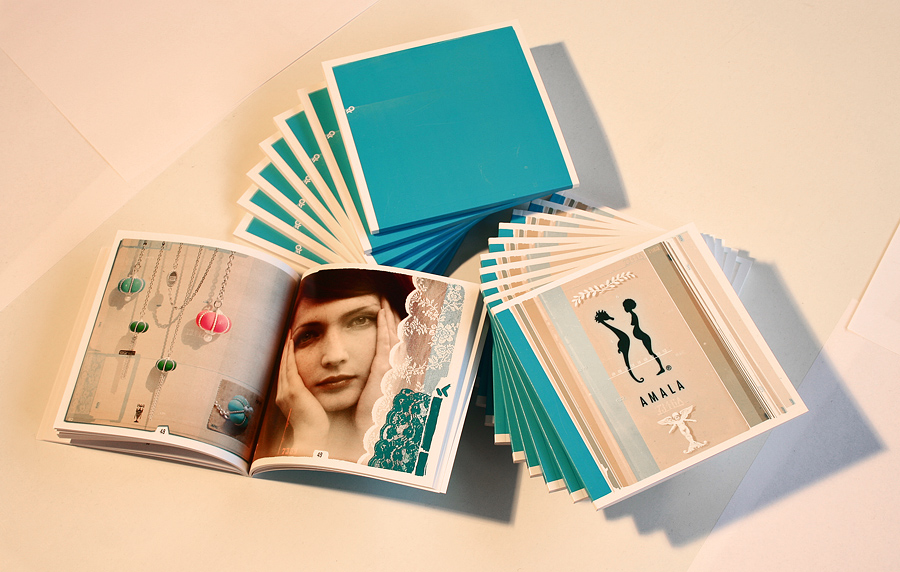
catalogue right out of the printers' shop.
+ the client provides a full download (-:7MB zipped PDF: http://amala.net/AMALA-KATALOG-0…
- nice, i have 2 cards with that name on it aswell :pdigdre
- visualplane_0

- Super smart.slappy
- if i were a vampire i'd drink this.airey
- the green is my favorite! really nice_salisae_
- Beautiful!MondoMorphic
- Yes love them especially the greentparsons
- Love 'em. And the shot.JerseyRaindog
- airey0
a card i just did for a client. we did 2 colours for her as a nice change, we're going to do another 3 colours. nice variance. and it's on a recycled uncoated stock. feels nice.

- Very nice.MrOneHundred
- Nice!jiaf
- good old gotham at work once again_salisae_
- a bit confusing as to which is the brand and which is the personsicarius
- Meeklo0
- This is by far the best piece in whole thread.tparsons
- blows everything awaymagnificent_ruin
- digdre0
- I wanna do the whole serie in b/w
so it actually looks like a 'serie' .. gonna see what my docent saysdigdre - Ah it looks nice like this...tank02
- how come you two got fascinated by van gogh all of a sudden? =)erikjonsson
- sorry edwarderikjonsson
- Like that digdre.JerseyRaindog
- I wanna do the whole serie in b/w
- tank020
For that book again

- nice one.
will you post them all in the same time? would be great.dyspl - 'enemies' no? ;) nice though.digdre
- Well it normally goes enemies, but its about that you can learn more from your critics.tank02
- this is an unbelievably true statement_salisae_
- very now. very liked by me.Ampersanderson
- nice one.
- blaw0
Created for the QBN book:

- Additional detail images in the lightbox here: http://www.brianlaw.…blaw
- I'm seeing a frontal woman's silhouette, with the stump ending strategically. Is that right?arthur
- Nice! I'm getting more excited about the book now.Jaline
- Right on, arthur. Thanks, Jaline; I appreciate the positive feedback.blaw
- airey0
i did a logo, business card and 8 page brochure last night in 3 hours as my mate needed it printed (20 brochures + 40 cards) this morning before he flew to melbourne. actually happy with the result. lucky i sublease from a digital offset printer!
usually i'd take a week to actually finish this and then not be too happy so maybe i'll rush everything from now on. and pay 'homage' to all my design books...

- like it!skis
- this looks greaterikjonsson
- thx! when you're on your own it's hard to judge. usually i just think it all blows and send an invoice.airey
- although this was yet another freebie.airey
- nice!digdre
- really nice worksr_5
- your mate should payyou anyway... people can be too greedy with our precious time and talentAmicus
- looks good, but a custom drop shadow would look better.dontsueme
- tank020
Logo for an music organisation.


(Yes, I recyled some of my own personal work for the bag, images will change ofcourse).
- i like it.skt
- i love it.airey
- have you tried tweaking the p's and a's so they look more illustrated?Amicus
- you mean recycled some of Dieter Rams work =)erikjonsson
- Nicedigdre
- at first I saw Fappant, lolarthur
- same. I saw Fappant.Jaline
- HAHA...its a flemish dialect word,
maybe they are all fappers though ;)tank02 - Awesomeukit
- Rad! I agree with amicus, maybe modify 1 "a" & 1 "p" to give it a more hand lettered feeljiaf
- Love that bag.JerseyRaindog
- theredmasque0
Made a hippocamp....but need to get better photos of it. This is 19" x 25".


- I guess hippocamps aren't supposed to have horns if you are being technical about mythology ;)theredmasque