Show some recent work
- Started
- Last post
- 8,591 Responses
- e-pill0
here is a teaser from what i been working on the last 4 days.
i have developed a new style for my mecha robots. this is my first one in this new 3D style. i have made it full size 1680x1050 desktop size, so click for full beauty!!i await a full on crit... and thanks!!
so after 50 hours of non-stop work and developing a new style i leave you with this teaser...

:)
- ‹‹ the image is created 100% in adobe illustrator, 50 hours.e-pill
- uh since its a teaser...
its smaller than listed price...e-pill - great!! I wondered when you would go 3d :)dyspl
- looks cool with goldish + black. but would probably physically lose any battle against any of your other mechas...invisiblechamber
- very good manMeeklo
- erikjonsson0
hehe sweet
- armin0
sorry! dont know what happened to me...thanx
- monospaced0

- that's for you, arminmonospaced
- <-- armin's workmonospaced
- armin0
<a href="http://imageshack.us"><img src="http://img382.imageshack.us/img382/5217/cocakalendarsn9.jpg" border="0" alt="Image Hosted by ImageShack.us"/></a><br/><a href="http://g.imageshack.us/img382/cocakalendarsn9.jpg/1/"><img src="http://img382.imageshack.us/img382/cocakalendarsn9.jpg/1/w357.png" border="0"></a>
- _salisae_0

- This is fantastic. See you have the layers of meaning thing down. That”s what I’m missing.MrOneHundred
- good shitmagnificent_ruin
- what's it for?magnificent_ruin
- thanks :), you can do it if you just play around._salisae_
- I am REALLY intimidated by the quality here – my problem, not yours. Just great.MrOneHundred
- going to apply it to a book cover design. he's one of my favorites._salisae_
- you're getting to do a kerouac book cover? that's fantasticmagnificent_ruin
- You are kicking arse.MrOneHundred
- Whilst I think the J is a little under-represented, I really like it. Nice work, Sallers.Nairn
- easily fixed, you want a fish, just lop off the legs and armsmagnificent_ruin
- thanks nairn! i think the soft j suits him. who else do you think of when you hear 'kerouac'?_salisae_
- I think the pilcrow makes the J jump out like a madman. It was the first thing I saw.MrOneHundred
- here's how i made it. i air keyboard designed it. http://www.flickr.co…_salisae_
- I don’t question your methodologies – they obviously work – air or no air.MrOneHundred
- wouldja look at that!magnificent_ruin
- apt looks great, toomagnificent_ruin
- i am happy with it. just need to decorate sometime soon. i finished a lot of projects so that's me celebrating :)_salisae_
- I didn’t notice the appt. ;°)MrOneHundred
- nice - like JOhn player specialsmistermik
- I love this, nice work _salisae_!!phatlee
- Like it.
I'm with Nairn though. didn't tell it was a "J' at first. Actually looked like a "P"Jaline - i smell that mr100 has a crush.ephix
- *Runs off and does a Snyder logotype. Again, nice one Ms.jaylarson
- Damn. Favorite design on QBN in months! Kickass!Ampersanderson
- PunchDouble0
just a quick sketch to pitch a symbol for a philosophy festival , the theme of the festival is reconciliation

postcard for booooooom

and just a random one

- erikjonsson0


Birthday present portrait
- beautiful... digital or hand?tparsons
- lovely.Jaline
- fuggin great, looks digital up close.anxiousarms
- aye all photoshoperikjonsson
- love thisfodcj
- much awesomenessthelukeandrews
- MrOneHundred0
These logos were just rejected.

- bummer dude =(univers
- they suckJaline
- the pain is always fresh. I'm sorry, Mr100magnificent_ruin
- Sorry, Jaline, I thought the logos were nice. ;-)MrOneHundred
- they turned out pretty nice, shame.max_prophet
- *that sucksJaline
- Actually, I think I meant "they suck", as in the people who rejected it.Jaline
- nolovelost0

- Interesting G, new this was yours before I saw the username! Lacks focal point a little thoughset
- Very nice.JerseyRaindog
- luv itjanne76
- Yeah it was a little tricky as it was a kinda design vs illo. Made the face for it to.nolovelost
- i dig itmoldero
- moldero0

- hmmset
- my first trace. takes long enough.moldero
- first colored president?colin_s
- o man.. that was funny..
why i dont know
Audria - lolmoldero
- hey illys, got any tips, would be much appreciated (im a flash guy not an illustrator)moldero
- Looks very auto trace, composition isnt great either. Look at Shepard Fairys version.slappy
- it's smurfarificbulletfactory
- doc manhattan?tank02
- stewdio0
Colin, I enjoyed your piece. I felt a bit funny about the ending, but it helped bring a conviction of mine to light that I hadn't been able to articulate previously: Archaic tools have no added virtue. Around the 5 minute mark there's a vague blurring of arguments; an implied meaning but then safe retreat.
The implied argument : something about labor hours being proportional to the virtue imbued in the product. (But that argument is just a distraction.)
The safe retreat : I agree with the lines directly afterwards about personal investment in an idea making all the difference regardless of special effects, etc.
My medium just happens to be digital. And yes, it does enable us to produce garbage *much faster* than traditional physical typesetting. The funny thing is though, it doesn't enable us to produce GREAT things any more quickly than in the past. The real challenge of making good work is never about a tool itself. It's about what tools are right for the job and how well you use them to tie appearance and concept together. That's always been the hard part and it will always be the hard part. And I find that really exciting.
- invisiblechamber0
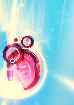
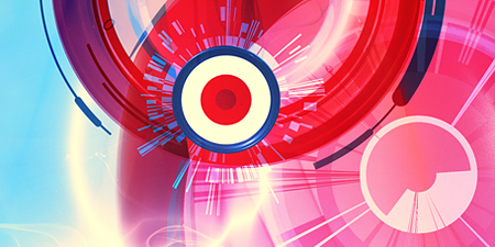

illustration for a university's print campaign (posters, brochure, flyer,...). i'm doing these illustrations for the same client since 2002. they keep asking for this style. that's why it might look a bit - well... 2002ish.
- ooohh, I like thisJaline
- You're calling me out of touch with the times, aren't you?
:PJaline - glad you like it. sometimes a thin line between fad and achievement. trying to stay on the better side. welcome ;)invisiblechamber
- Fancy. Nice.slappy
- Audria0
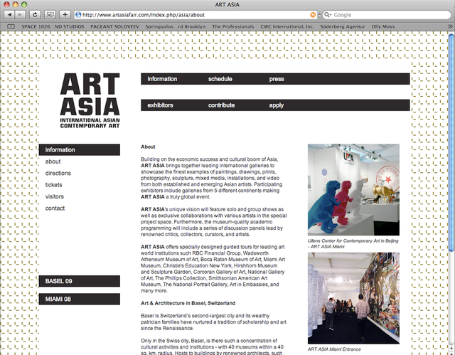
designing websites are not really my thing... It still has a bunch of bugs and issues..
www.artasiafair.com
- magnificent_ruin0
working on this now... have not tuned it up yet

- was this the crumbled up tissue paper?Complexfruit
- I ended up using that for a different eventmagnificent_ruin
- 2008?NotByHand
- woopsmagnificent_ruin
- It's pretty.Jaline
- I love it, except the pink. its to much in the spotmoamoa
- I'll play with it, thanks moamagnificent_ruin
- do you mean, too much in the expected spot, too lined up, too lit up?magnificent_ruin
- I mean the pink fits great as a colour... just the combination of colour&placement is a bit to prominent. for my taste.moamoa
- I wouldn´t mind as an example if Rittenhouse or Row or any other word would be pink...moamoa
- or yellow or a bright blue ;)moamoa
- I just don´t think that the year is that important ;)moamoa
- Hot shit! I even like the pink.slappy
- I was playing with some of the other words pink... looked good but a bit of a legibility problemmagnificent_ruin
- also, since we do this every year I sometimes emphasize it,, sort of like NEW! NOW!magnificent_ruin
- but I know what you mean and will fiddle with it, thank youmagnificent_ruin
- thanks, slappy!magnificent_ruin
- I like this a lot. And I don't mind the pink. Even though I don't generally like the color.theredmasque
- many thanksmagnificent_ruin
- interesting circle/photo work. and i like how you played with the outline in a macro sense._salisae_
- the top and bottom feel lost to me somehow._salisae_
- ahh i just now see that those are flowers._salisae_
- very nice. the rittenhouserow site is great,too.crnatrava
- not bad but I would remove the 'stain' like colour burned circles, they kill the cleanness of itset
- I like the pink.JerseyRaindog
- theredmasque0
Harpy II (I'm digging harpies lately for some reason)

I started up an etsy shop. Made this for it.


