Tokyo 2020 logo
- Started
- Last post
- 62 Responses
- futuremongolian1
Olympic logos are always terrible.
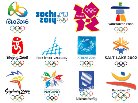
- beijing and sydney are ok.iCanHazQBN
- problem with Tokyo logo is they're playing with the first letter of the word (T). Why? Why is designing around the first letter of a word a "thing"?iCanHazQBN
- There's so much humanity and inspiration to design with in an Olympics logo, and all they can do is design a "T"?? So uncreative and lazy.iCanHazQBN
- There may be a meaning in the "T" (I don't know), but this logo is for the general worldwide public. They don't care about hidden meanings...iCanHazQBN
- ... They just want to be inspired and feel some sort of human spirit in the logo. The Tokyo logo fails in every sense.iCanHazQBN
- still not as bad as Sochi. Which is an URL.futuremongolian
- lol @ Sydney being okay - crock of shit.fadein11
- London by far the best out of all that generic shit.fadein11
- London is still eligible. It became trendy to like that logo. It was fun in applications, but standing alone it's still very confusing.iCanHazQBN
- London Epic Failutopian
- Vancouver speaks of the place, London of the time.. The others are cryptic as shit.zarkonite
- does sochi even count as a logo if can be done in ms word?zarkonite
- Sydney is one of the worst.marychain
- London, Beijing, Vancouver and Salt Lake are all perfectly fine you tossermarychain
- it's the first letter of T-okyo... are you all retarded? though this graphic design exploration sucks, it's as deep and meaningful as any other.doesnotexist
- No shit it's the first letter. So what? it's the ultimate form of laziness just grabbing the first letter of a client and designing around it.iCanHazQBN
- So what if it's starts with a T? Does a T represent Tokyo as a country? Does it represent the human/athletic spirit of the Olympics?iCanHazQBN
- Sydney is shit. It was 10 years out of date at the time. All that painterly generic positive Wolff Ollins shit is and always was shit.MrT
- Ummm. Where is https://en.wikipedia…HAYZ1LLLA
- sublocked0
Tokyo 2020, "not as bad as the London logo"
- BrokenHD0
LA CA '84 or '24. ALL DAY.


- monNom0
I don't think it's that bad. Feels like is has some traditional Japanese themes. The proportional geometry. The red sun. It's kind of 60s modern but it's at least a departure from the current international zeitgeist of saturated colours and cheery mascots.
- ********0
"Doc Poz version 1.1"

- So it will have your name in it?youngdesigner
- it's a watermark, plz ignore********
- couldn't even make the 'O' round eh?lambsy
- haha... no fucks given********
- Nathan_Adams2
I'm a fan. I think it strikes a good balance between referencing the 1964 Olympics and bringing something new. The patterns have good potential to form an interesting system. And it does feel "Tokyo".
I expect the dumb "I could draw that in 5 minutes" arguments from laypeople, but those words should never come out of a designer's mouth.
- i_monk0
I really don't get it at all.
- _niko0
All I see is TL
- dirtydesign0
looks editorial
- desmo0
The TV graphics and transitions reminds me of the CBC logo

- jerk0
i like it better here
- prophetone-1
i like it better here

- Beeswax0
They should have referenced their famous art.
I would put jumping, running, swimming etc. athlete silhouettes inside the wave.
- Kind of a complicated idea you've got there, but I agree they have so much to use, aesthetically, from their culture.iCanHazQBN
- that wave has been referenced to deathd_gitale
- EightyDeuce0
Uh Oh.....
The Rip-Off Controvesy Over the Tokyo Olympics Logo
http://kotaku.com/the-rip-off-co…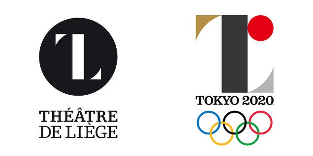
- Haha. Terrible and a rip.********
- I didn't think the "L" made sense for the Olympicsmonospaced
- So tired that a basic shape is a rip. I recently did something similar, and i didn't see any of these...tank02
- Yea I wouldn't call it a rip. Sure it's the same shape but it's as basic as fuck. There are 7 billion cunts on the planet, of course this is going to happen.********
- Haha. Terrible and a rip.
- ********1
Somewhere in Japan a graphic designer is committing seppuku.
- ezkl1
Hmm the logo is growing on me. It is very Japanese to me. But c'mon guys, if this thing was plastered on some Comme des Garcons cdG shit everyone would probably be like, omg want
- ********3
So this Olivier Debie guy that designed the theatre logo that is very similar has officially sent the designer of the Olympic logo a letter demanding a response to his allegations that the Olympic logo is a plagiarism of his.
Does anyone rise think that is incredibly petty, pathetic and narcissistic? It's a basic fucking shape mate, get over yourself. To officially call the guy out like that is a real dick move...
- I sorta agree but these things are very different when they happen to you, chances are you'd feel the same in his shoes.spl33nidoru
- Non Paywall Article from Guardian:
http://www.theguardi…detritus - And no, Olivier shouldn't've raised a peep, silly pompous Belgian that he is.detritus
- Yea sorry I moaned about having to sign up to read that article the other day and then forgot********
- no paywall - just register to view article.fadein11
- Ok, so 'Non-walled' then? Same diff.detritus
- wat?
'Walled-off' evendetritus - Have a to sign up, won't do that for just one articleformed
- I said the same thing, but it kept cropping up on my twitter feed and I wanted to read it, so I gave in. But yes, it's bollocks.********
- Though, formed, detritus did provide a link in note #2, but thanks for your input.********
- Consider it noted, and thanks again. Do pop by again soon.********