Tokyo 2020 logo
Tokyo 2020 logo
Out of context: Reply #21
- Started
- Last post
- 62 Responses
- futuremongolian1
Olympic logos are always terrible.
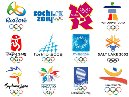
- beijing and sydney are ok.iCanHazQBN
- problem with Tokyo logo is they're playing with the first letter of the word (T). Why? Why is designing around the first letter of a word a "thing"?iCanHazQBN
- There's so much humanity and inspiration to design with in an Olympics logo, and all they can do is design a "T"?? So uncreative and lazy.iCanHazQBN
- There may be a meaning in the "T" (I don't know), but this logo is for the general worldwide public. They don't care about hidden meanings...iCanHazQBN
- ... They just want to be inspired and feel some sort of human spirit in the logo. The Tokyo logo fails in every sense.iCanHazQBN
- still not as bad as Sochi. Which is an URL.futuremongolian
- lol @ Sydney being okay - crock of shit.fadein11
- London by far the best out of all that generic shit.fadein11
- London is still eligible. It became trendy to like that logo. It was fun in applications, but standing alone it's still very confusing.iCanHazQBN
- London Epic Failutopian
- Vancouver speaks of the place, London of the time.. The others are cryptic as shit.zarkonite
- does sochi even count as a logo if can be done in ms word?zarkonite
- Sydney is one of the worst.marychain
- London, Beijing, Vancouver and Salt Lake are all perfectly fine you tossermarychain
- it's the first letter of T-okyo... are you all retarded? though this graphic design exploration sucks, it's as deep and meaningful as any other.doesnotexist
- No shit it's the first letter. So what? it's the ultimate form of laziness just grabbing the first letter of a client and designing around it.iCanHazQBN
- So what if it's starts with a T? Does a T represent Tokyo as a country? Does it represent the human/athletic spirit of the Olympics?iCanHazQBN
- Sydney is shit. It was 10 years out of date at the time. All that painterly generic positive Wolff Ollins shit is and always was shit.MrT
- Ummm. Where is https://en.wikipedia…HAYZ1LLLA