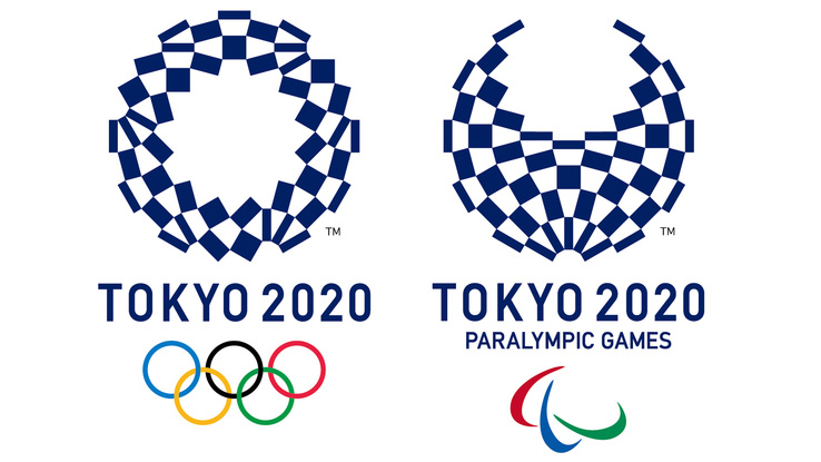
Tokyo 2020 logo
- Started
- Last post
- 62 Responses
- fadein110
The issue is not whether is a RIP or not - doubt any of this debacle was intentional - its more about the fact they didn't dig deep enough to see if there was anything similar out there.
- Why should he have to?
The similarities are banal.
And, more to the point, HOW should he have? Reverse-Google search? Won't work here.detritus - we need a world graphic database.********
- There are companies who will do it for you - across the globe... lol - its the Olympics, they have resources. And it should have a unique identity.fadein11
- Wasn't talking about him - was talking about the bods who signed it off. Jeez.fadein11
- similarities are banal? its a nearly identical mark... are you looking at the same thing? Not blaming the designer as I don't think it was intentional.fadein11
- Why do I even waste my time commenting... both logos are shite and lazy anyway.fadein11
- I said the similarities are banal, not that there aren't similarities.detritus
- The Belgian marque is a derivation of 'that fad for outlined heavy serif fonts' that's been doing the rounds these last 6 years...detritus
- ...(I know, I made a brand using the conceit about 5 years ago) .. whereas the Olympics thing is just plain ol' typograsturbation, typical of Japanese designdetritus
- Why should he have to?
- NeverEver-1
what a load of bollocks this rip shit is
as if no designer hasn't done a letterform like that in their life. I can name about 10 fonts straight up that have that font style, did Tokyo rip them as well.If i'm being honest i like the logo although the bottom right descender doesn't make sense to me.
Maybe it's because i haven't seen the whole rationale, but i feel like if it's called Tokyo 2020, they could have lost the bottom right descender.
- detritus0
Well I never.
http://www.theguardian.com/world…
I suppose the decision's understandable given how protective The Olympic Cartel is of their branding, but I really don't think this should ever have stood accused of being a rip off, it's just far too generic a form.
Oh well, I suppose it gave some otherwise unknown Belgian a few days of fame. Nice one?
- haha no fucking way.
The Belgian should be ashamed of himself really...******** - yep, really sad state of affairs... shame on him indeed.kingsteven
- I'd love someone to find something similar to the Belgian one that pre-dated it then sue him.HAYZ1LLLA
- that'd be gold********
- haha no fucking way.
- ********-4
I hope the next one is better than that garbage they called the first one.
- ********-3
A belgian? A Japanese dude should design it.
- ********-2
OK. I'm done here.
- i_monk1
It was garbage, plagiarized or not.
- BrokenHD0
http://www.tokyo2020.jp/en/emble…
https://twitter.com/Tokyo2020/st…
Amidst plagiarism accusations of the 2020 Tokyo Olympics logo, the organizers have taken to the public for a new design. While designer Kenjiro Sano refuted claims of the art copying the Belgian Théâtre de Liège, the committee has nonetheless decided to replace the controversial logo. Announcing the news via Twitter, the contest depicts democratization in a world that’s all-embracing of the new shared economy. While individuals must be a Japanese national or foreign national with the right of residence in Japan, group submissions require just one person to meet the nationality requirements. The public competition begins November 24 and ends December 7, 2015, with the winner being announced Spring 2016. For full details, visit the official Tokyo 2020 website.
- Mmm, crowdsourcing.BrokenHD
- This will end well. Commence Operation: Cock and Balls Flood in 3... 2... 1...face_melter
- LOL @ an organization concerned with plagiarism turning to crowdsourcing.monNom
- teh0

- At least they had the decency to cover the anus...face_melter
- Why is their porn always so borderline rapey?monospaced
- ^ racist2002
- not in the slightestmonospaced
- formed0
I am torn on the crowdsourcing part...coming from the architecture world, I understand how a competition can catapult someone to fame (indeed, pretty much all of the mega stararchitects got to the top by winning a competition early in their careers).
For something of this magnitude, it is probably going to change someone's life.
- ArchitectofFate1
It's gonna' suck. bigtime. seriously 2 weeks...
Great article on the subject
https://medium.com/@ianlynam/why…
- sephil-2
So what QBNers think about the remaining 4 candidates?
Probably not a victory for crowdsourcing?
details: https://tokyo2020.jp/en/games/em…
- Not again.
http://www.qbn.com/t…******** - Get in touch with darkslateblue. I'm sure he'll have a lot to say about it.********
- http://myfirstbookof…********
- Not loving any of them but I think a is the most unique and has the potential to do great things in an overarching brand system_niko
- oh dear... tho to be fair they're about the usual standard of olympic logos
especial lols at chunky athlete (c)hans_glib - The "C" looks like a man jugglingsephil
- At a severe push, probably D - mainly because it isn't another fucking half-assed brush stroke motif.face_melter
- C looks like a giant baby being tickled.face_melter
- D is quite nice.monospaced
- Not again.
- Dillinger-5
Free Iodine tablets
- jerk2
and the winner is...
- ********-8
i would do this
1 red circle centered above gold circle
below it 3 circles silver gold bronze
text tokyo olympics (not year #)
olympics logo below text
- whatthefunk0

- huh?ArchitectofFate
- Year one after the pandemic?OBBTKN
- Awkwardwebazoot
- 2021********
- 2020 NEChimp
- 202 ONE********
- NBC's Olympics coverage logo but not officially by the Japanese organizing committee me thinks...whatthefunk
- ********5
- better.fixedArchitectofFate
- good luck with fixing it for 2023Krassy