Andy Murray new logo
- Started
- Last post
- 26 Responses
- BaskerviIle
What do we think of this?
It apparently combines his initials a and m with 77 as he's the first brit to win at wimbledon in 77 years.
There's been comments made comparing it to nazi SS iconography etc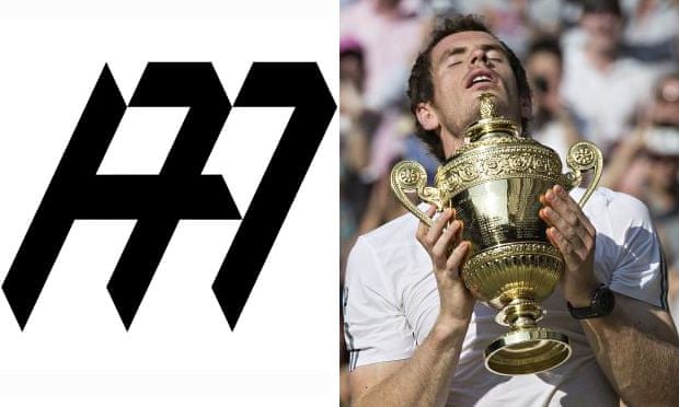
- fadein110
Yep - atrocious - why even risk those associations which are blatantly obvious? Terrible and will be changed v.quick I imagine.
- detritus0
Why does he even need a logo in the first place?
- ********0
This guy is a world class PR disaster haha
- monospaced0
Without knowing anything about this except that it's a mark combining A, M and 77, I'd say it's very successful. It disgusts me that anyone would suggest the designer was influenced by Nazi/SS symbolism.
- noone is saying thatfadein11
- but it happens to resemble Nazi insignia. who has said it was intentional? [facepalm]fadein11
- read the original postmonospaced
- I have and it doesn't say intentional anywhere.fadein11
- Look, the original post said there were comments likening it to Nazi/SS stuff, that's allmonospaced
- And that bothers me because I don't see any resemblance and that kind of accusation is ridiculousmonospaced
- there are similarities - noones saying the designer intended it. How can you not see similarities - weirdfadein11
- similarities aside, I find it distasteful to imply that there is some kind of Nazi tone intended, jeezmonospaced
- To me it looks nothing like a swastika. That seems like a bit of a stretch to me.instrmntl
- agreedmonospaced
- 11pinkfloyd
- with mono on this onePonyBoy
- who said swastika you bunch of fools! Nazi SS insignia - pick up a history book.fadein11
- But it's so incredibly not the same thing you knucklehead. Who's the fool?colab
- Ban calculators! They make numbers looks like SS markingsPeter
- desmo0
Logo is readable and makes sense, but they could have stylized it a lot better.
- stoplying0
It's not terrible and I don't hate it.
- Bluejam0
http://www.creativereview.co.uk/…
i dunno, when you consider the vernacular of sport star logo design it seems to work. if anything, the Andy Murray design made me think of the Deviant Art new logo...
- goldieboy0
As a logo it's ok. But the styling couldn't be any further removed from Mr Murray who is as dull as dishwater
- Fax_Benson0
looks like a first draft.
- Fax_Benson0
I like Murray - the fact that he's awkward, dour, resolutely un-flashy.
In that sense, I guess it's appropriate.
- mekk0
Who is Andy Murray? Could google it but want to point out how unimportant that is.
- ********0
Better than LeBron's logo:

- I like this one toomonospaced
- Dreadfulgoldieboy
- Wow. What the hell is that??formed
- his initials, his number and the crown element, it's a nice compact markmonospaced
- It makes no sense what so ever unless you know himgoldieboy
- it's just a recognizable mark, and it speaks to the audiencemonospaced
- I don't what his number is by looking at this. And it's just ugly.CyBrainX
- there's a 23 in theremonospaced
- Looks like sewer pipespinkfloyd
- looks amateurishorganicgrid
- formed0
Looks like it was horribly inspired by Woods' logo:

- microkorg0
Once you've heard it once ...
- dbloc0
eh, I don't mind it. could be worse.
- Chimp0
I quite like it. Not sure why but it reminds me a bit of a tartan pattern too.
- dbloc0
For Comparison


- I think if you really want to see an SS in there you can but it's a stretchdbloc
- agreed, it says more about the person making the association than anything elsemonospaced
- uan0

- The fuck is this garbage? It'll never last. Trendy fad bullshit.iCanHazQBN
- the first sportsman logo I rememberuan
- wait... he's wearing pants... how did I never see that MJ is wearing pants in his logo?? Weird. :)PonyBoy
- I always knew he was wearing pants.iCanHazQBN
- http://undergroundso…monospaced
- But I had never seen that photo before. It's not even Jordan.iCanHazQBN
- Wait, I think it is actually MJ.iCanHazQBN
- http://undergroundso…iCanHazQBN
- are those laces or straps? and why are they so longhotroddy