ios7
- Started
- Last post
- 546 Responses
- dasmeteor0

- !d0mino
- hahahHombre_Lobo
- genius®utopian
- needs sprinklesBabySnakes
- fate0
Comparing iOS7 to previous versions, you realize just how corny and lame all that skeumorphism in older versions really is.
The design of iOS6 (and under) is like someone design an OS out by literally cutting apart clothing and personal possessions of a 57 year old middle manager. The felt. The notebook. The stupid dark fabric. The leather. All those stupid textures.
iOS7 looks modern.
Breath of fresh air.
- benfal990
I have the feeling iOS7 will look good and effective once we have it in our hands. I think those screenshots online does'nt give it justice. I think most of people will like it after installing it. Personaly, i cant wait to try it and i know i will like i better than iOS6
- Are we all looking at the same clip art icons created by an intern or what?utopian
- fate0
^Agreed.
I'm excited to try it.
I looked at my iPhone today and thought "This interface looks like something from 10 years ago"
- robthelad0
It's mainly the icons getting flack... and rightly so.
- Hombre_Lobo0
i want to know when we are gonna get to the future.
when all interfaces have black backgrounds -
http://visualpunker.tumblr.com/t…
- Hombre_Lobo0
Skeuomorphism has always looked less fresh and cleaner than minimal flat design. minimal design its a lot easier and quicker to interpret visually.
Props to microsoft for being the first to implement it.
So its likely a step in the right direction. But as it stands in some parts it look ugly and some usability is unconsidered.
Like sets examples on the previous page, if they could get it more like that visually, combined with how much usability detail they usually put into their apps, it could be good.
I look forwarded to trying it out though.
- Hombre_Lobo0
- LOLmaquito
- hahafadein11
- stupid - you can see it move sidewayshans_glib
- I did it too... you only do it once though. :)rosem
- dumb fucks are dumbutopian
- I think it's really bad on apples part. Sure you can see how it should move sideways, but hiding that arrow isn't hardHombre_Lobo
- why the fuck that arrow?? Ergonomy FAILbenfal99
- The arrow brings up a menu if your thumb starts on it.mantrakid
- to control shit like volume, brightness, launch camera, calculator, put in airplane mode, etc.mantrakid
- Hombre_Lobo0
i wonder if the game centre icon is shiny and 3d to represent gaming experiences. but even so, it still clashes with the overall ui.
- Nathan_Adams0
After watching the keynote, I'm a little more optimistic. It seems like a lot of thought has been put into the hierarchy of the various layers, and into the interactions. Yes the visuals need to be refined a lot further, but the current state could be a rush by different teams to get ready for WWDC, and not all being on the same page yet. Remember, Ive only took over 7 months ago - which isn't giving a lot of time for such an overhaul.
That said, that doesn't excuse documenting a lot of it already in the HIG.
*Hopefully* the more extreme elements will be dialled back a bit and more consistency is applied over the next 3-5 months.
- animatedgif0
^ Hopefully... It's never happened before though, usually what we see at WWDC is what we get bar a few very minor tweaks
- utopian0
Well at least the new iOS is not using Helvetica!
- Presta0
Not as slick as some of the stuff on Dribbble, but I thought I'd take a shot at making some icons...

- nice dude! i like!!
i hope you have a jailbroken phone to use it on, would be cool!Hombre_Lobo - Can you do this without all the fucking embossing and shit?monospaced
- But overall, really good workmonospaced
- Niceduckseason
- Looks nice! A bit to desaturated for my liking, but nice!!desmo
- Send to tim@apple.com...
; )ideaist - Sorry, tcook@apple.com...ideaist
- I think I might agree with mono, would be cool to see it flat.Hombre_Lobo
- nice dude! i like!!
- _niko0
^ those look great as do a few other designs, but it's all a moot point really since 90% off our app icons are from third parties and will all be visually inconsistant.
- bulletfactory0
Great work.
The 2 suggestions I have (not that you asked):1. Simplify mail icon - lines are too thin compared to the entire collection, maybe even remove the bottom 2 diagonal lines and thicken the top two for more consistency.
2. rework the Stocks icon, feels too sporadic.
But again, this is pretty nice.
- chossy0
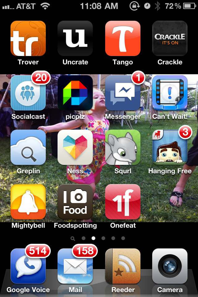
I personally don't really like this kind of thing much, it all just looks like pre school big button toys. I am a very functional and boring kind of person, not really into allot of these logo designs.
It would be cool to see the one presta did with no colour and no square behind it just the image in white...
I know all these things are very popular but for me I have never neen a fan of the look of IOS ever, I do like android but again lots of the icons blow in my opinion.
- formed0
I agree, besides the crazy gradients, just rows and rows of icons looks pretty sloppy to me.
I'll be moving to Windows (c'mon HTC, make a Windows One!) I think.
- moving because of gradients?monospaced
- moving because of overall design - rows and rows of icons - overall, nothing special to keep meformed
- that's a great reasonmonospaced
- Why not he doesn't like the way the phone looks. It's one of the main if not the only reason to chose a smart phonechossy
- over another smart phone as they are all so similar.chossy