Logo crit...
- Started
- Last post
- 51 Responses
- WhiteFace
It's been a while since I had my work ripped apart by you lovely people, what do you think, top or bottom?

(It's for an independent family run garage in the French alps).
- tasty0
#1 feels too American because of the star burst and the curves IMO
#2 for a French Alps Garage
- I like the balance of colors
- The subtle curve of the font is nice too
- iheartfun0
Hmmm top draws my eye more. Both are good though.
- cdub0
it's reading SIL VESTRE to me... kern the L and V a bit.
- cdub0
Also, the second try looks best IMO
- Ambushstudio0
Looove Neutra...
- k_temp0
second is best.
- Fax_Benson0
I prefer the slightly rounded corners of the top one, but I'm not sure there's space (or need) for the starburst thing. I'm not feeling the light brown on the 2nd one. Just personal opinion though. Nice work.
- I'm not sure about the brown either, looking at alternatives nowWhiteFace
- doesnotexist0
more deco!
- d_rek0
2nd has a nice, refined art-deco retro vibe to me. As others pointed out the kerning needs to be addressed.
- ********0
I like the first one, it almost has that old classic Rally look
- WhiteFace0
Thanks guys lots of food for thought
- teh0
I like the 2nd one.
It has a vintage auto look. Is that what you were going for?
Could the gear be larger?
I think it needs something more prominent for the auto industry.
What exactly do they do?
- TOMMYxGUNN0
Here's my two cents.
– Prefer the first one
– Instead of having 1972 in the circle, try just 72
– Simplify the sunburst, it's quite complicated around the top and bottom
– Look at your kerningOther than that, nice work.
- mekk0
Very good!
My thougts on the 2nd one:
- No Shadow/Blur/Shine etc..!
- Kerning, as said ("LV", "VE" "TR")I miss an additional color - maybe a very small red detail?
- albums0
imo it seems the logo design doesn't match established date, nor the time in which it was redesigned. seems like a student redesign exercise that got caught in the wrong decade. I'd run with a 70's theme and go american muscle inspired. there was a lot of attitude and power still being thrown around in the early 70's
- In France?TOMMYxGUNN
- you´re wrong.mekk
- damn, i thought i read that, then i didn't see it again. i knew i was off because of the spellingalbums
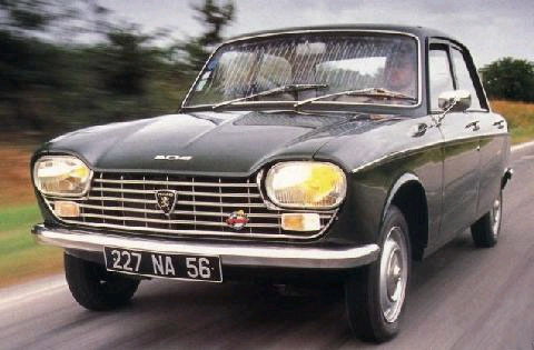
- TOMMYxGUNN0
The Peugeot 204 (1970)
- goldieboy0
Nice. I think the 2nd option seems more French Alps.