Olly Moss Roadshow posters
- Started
- Last post
- 33 Responses
- Honest Inc
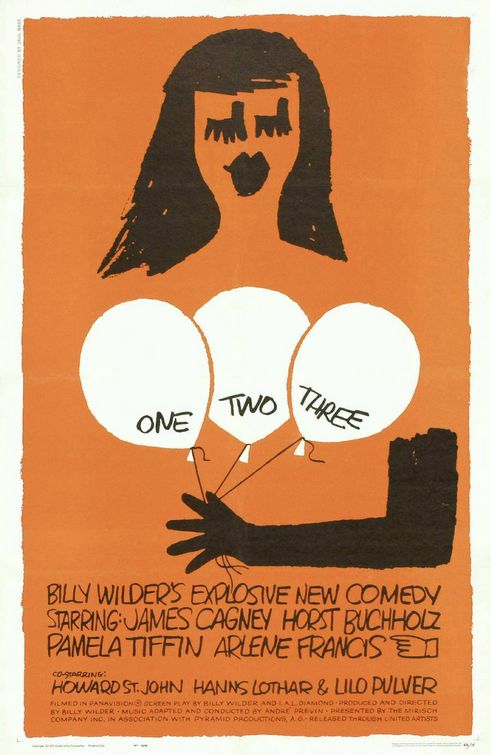
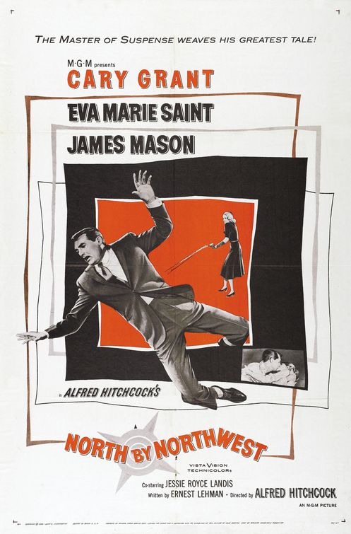
Olly Moss created posters for the 2010 Rolling Roadshow Tour. Free Screenings fo famous movies in famous places. Ollymoss.com
- lvl_130
wow, wow, wow!
- utopian0
This guy really likes orange...
- liamh0
Damn it! Beat me to it! its a great set of posters, full set here:
http://omgposters.com/2010/07/31…
- utopian0
Speaking of posters, where can I buy some really nice design posters?
- havent bought anything from here myself but seen it posted on a few blogs before: http://www.postersan…liamh
- ********0
Very nice.

- ********0
Like the orange and black
- ********0

- NickInfozure0
Want... Rocky.
- ********0
"meh"
- PIZZA0
Well this style has been completely done to fucking death now, well done everyone.
- ********0


- ********0

- ********0

- ********0
How does someone get so much mass appeal and "respect" from the design community while pirating someone else's aesthetic/style? I just don't get what the difference is between this and anything else. If it were someone ripping off websites or logo designs, you people would be flipping out.
- MHDC0
I don't see it as totally original in concept (what is anymore) but you have to admit the well thought out concepts and delivery.
- _niko0
^ anything better than the floating heads movie posters that is the norm is a win.
It's an homage to saul bass, everyone knows that. He does a nice job.
- ********0
^ Those two comments are exactly what I am talking about. Sure, the concept for the final posters are great, but you both just admitted he lampoons someone else's style aesthetic.
I don't get it. I think I'll become a gardener.
- BaskerviIle0
I like his stuff, but there is big gap between true design and these things.
Saul Bass worked in his own style for the reason that he was Saul Bass, that's just how he worked. His posters were communicating information about the films, as that was what he was employed to do.
Over time, he amassed a wonderful portfolio of poster work (not to mention his incredible corporate design work).These Olly Moss posters pastiche Bass's style (the black and orange, the roughly cut edges). But those were originally there for a reason. Now they are used for aesthetic dressing up. And what's with all the distressing?
Sure some of the posters are nice, and some represent the content of the films pretty well, but if you're confident in your design you shouldn't need to dress it up with borrowed aesthetic and distressed effect, as if doing so will buy you some authenticity. It was only authentic the first time around when chosen for good reason.
Imagine all the great poster designers in one gallery. You recognise AM Cassandre, Abram Games with their distinctive airbrush style, Muller-Brockmann and his swiss type, geometric shapes, Saul Bass with his rough hand-made style and recognisable type. but where do you fit? if you copy them you just look like an imitation next to the originals. reason, if ever, to work in your own style.
I get that they are an homage, which is fine, but design is about the ideas, and the way you render them is up to you. if you don't have an original voice for your ideas then you're only exploring half the potential
- nobody is saying he's saul bass. These are re-imagined posters in the style of saul bass. that's all._niko
- Great post, I agree .. a 're-imagining' needs to become part of a new creative trajectory.********
- (i.e. the re-imagining needs to lead somewhere new, to be interesting)********