Typography
Typography
- Started
- Last post
- 132 Responses
- utopian4

- wow!********
- https://moshik.net/
Sexy / futuristic!ideaist - http://youtube.com/w…ideaist
- wow!
- Krassy7
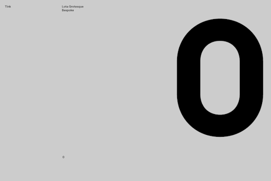
Kurppa Hosk / Tink / Lota Grotesque Bespoke / Numerals / 2018
- BannedKappa0

---
The 's' in this seems like it's too far, I'm trying to match the kerning but don't want them to overlap. I've tried joining them but haven't been able to product a result I'm happy with.
Any examples or suggestions on the fix for this.
- I hear what you are saying, but I don't think there is a fix beside modifying the letter "k".utopian
- BTW - I think that it looks fine, as is.utopian
- thanks for you reply utopian! I've prob been looking at it too closely, much appreciatedBannedKappa
- adjust the tracking of the other letters?_niko
- What _niko says. Loosen it up a little.Ianbolton
- Utopian's "k" modification advice
+
_niko's & Ianbolton's suggestion to loosen up the other lettersKrassy - BTW, what's the use/application of this "links?" context? maybe you should "link" the letters if meaningful to do so?Krassy
- What Krassy said - why not "play" with the word and link the K and Smicrokorg
- yeah, if you're looking at it in totality, the optical relationship between the letters is the issue, not just the k/s. What Niko said.ben_
- Yeah more space between the other letters perhaps. Also you could look at extending the k so that it's more evenly balanced...pedromendez
- At the moment, the top seems very short and the bottom extends a lot, something more even might help? https://imgur.com/a/…pedromendez
- This may be 2 mundane questions but
1. What is it for?
2. Is this a type setting job or a logo job?
This'll help me with what to suggest :)notype - the spacing is so tight, scale it down and the gap will go and it'll like like you crammed the letters into one. Is that what you're aiming for?shapesalad
- *look likeshapesalad
- I mean the gap between the letters on the serif part at the bottom. he heshapesalad
- rechts********
- uan3

- jimzy3
Love this type blog, some great expressive type here:
- renderedred4
https://medium.com/@chrisgaul/to…
Tokyo subway’s humble duct-tape typographer
- utopian1
Some amazing signage and typography in this 60's video.
- Exceptional.CyBrainX
- The following year in Manhattan walking across the Brooklyn Bridge and up Bdwy to Central Park. https://www.youtube.…CyBrainX
- renderedred3
Leon Sans is a geometric sans-serif typeface made with code in 2019 by Jongmin Kim. It allows to change font weight dynamically and to create custom animations, effects or shapes in the Canvas element of HTML5.
- Bluejam0
- via https://kottke.org/Bluejam
- not sure there's quite enough word spacinghans_glib
- Krassy4
- your nice lettering is fucked without itFax_Benson
- lolKrassy
- i_monk2
- Well I think I just came a littleNairn
- jesus that is one fugly unbalanced pile of shitehans_glib
- eat shit and bleed a horror's death upon christ's thorns, you filthy proddy whore. 'tis a great font, you cur.Nairn
- God’s teeth I think you’ve accidentally looked into your lazorz, that shit is terrible.hans_glib
- zounds, sir, 'tis a work of Godly perfection bestohest upon us by God's most mortal kinNairn
- i_monk3
- 85 out of 100********
- 99 / 100PonyBoy
- https://i.imgur.com/…
how is this 100?******** - Degree of tolerance?i_monk
- Yvess one is hard!Krassy
- 86SlashPeckham
- 85 out of 100
- i_monk1
36 Days of Type will run Mar 2—Apr 6.


