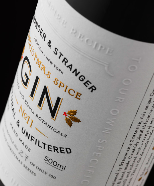
Critique for Gin Label please!
- Started
- Last post
- 70 Responses
- jxh1120
(quick question, im new to this site, how do i scroll back through the mini replys left on comments, it only shows the first one?)
- there's a hidden right arrow to the right of the comment boxbigtrickagain
- aah bloody internet explorer doesnt render it!jxh112
- Josev0
I dont think you have to be literal with the sextants and old world reference but that story about the Island is pretty cool. Maybe you should explore that more.
- ********0
cologne is the first thing i thought of as well
- jxh1120
so it looks like cologne, but would it put you off say buying this for your architect uncle? or globe trotting economist friend :S
- DRIFTMONKEY0
Needs more typography.
- WOW @ Printing...ideaist
- whoaaa shieeetbigtrickagain
- blooody beautiful but looks like wine though!jxh112
- sexy!OSFA
- dirtydesign0
bottle looks too much like cologne for me.
the type and design are starting to look good though.
- jxh1120
hm..still looks like cologne...haha
- i_monk0
^ Now imagine it on a shelf next to all of these colourful bottles and labels. Your gin disappears into the wall :(
- i_monk0
If you're set on the wordmark and copy, you can bring colour into it by replacing the white with something that will stand out. I'm thinking a rusty red/orange for some reason. Or maybe a blue.
- exador10
like what you've done...it does remind me of a cologne bottle though...from bodyshop i think....
i've always liked this label.....not the best i've ever seen, but i did a mock ad for it in college and always feel nostalgic about that when i see it... http://www.bombaysapphire.com/#
- ********0
a big thing with liquor design is the bottle shape. I think if you going to be doing some branding like this you need to think about the bottle shape more, and the packaging it comes in. All these things say something about the brand.
ex:
http://www.thedieline.com/.a/6a0…
- utopian0
UPPER RIGHT SPARKY!
- ismith0
How about just adding some color to the top/cap?
- ********0
I think it works nicely, because it reminds me of cologne—something that this demographic certainly pays good money for and pays keen attention to.
I think it's quite nice, and don't really agree with everyone lashing out against the "non-design" of it.


