Critique for Gin Label please!
- Started
- Last post
- 70 Responses
- jxh112
Hi all,
I'm currently working on a Gin label for a school project,
I've defined the target audience to be wealthy 30-45 year old males with interests in international affairs, culture and design. They MAY work in design, finance, public policy, assorted academic fields and media. These are men for whom style is important but not an obsession.

I realized the sans serif and the serif solution seem to speak to different audiences, what do you guys think?
thanks!
- detritus0
Bit dry.
- non0
Bottom left. Nice, clean, simple.
good job.
- detritus0
I think it needs some kind of mark. Consumers need a visual hook, imho - it's only designers and artists who get a real hard-on for sole typography.
I favour the direction you're going in the bottom left. Top ones feel more like Vodka to me and bottom-right looks like aftershave.
- Josev0
Looks like cologne
- but I like itJosev
- My thoughts too.ETM
- gin tastes like colognefooler2
- that's what I thoughtsection_014
- identity0
top right for me...
I like that the typeface speaks "crisp, dry, minimal, impactful" like a good Gin should be.
- mg330
It'd be great for a cologne bottle.
I like the bottom left one, but think it would be cool with something showing through the bottle. Like, leaves or something on the back of the bottle visible through the front. Something with color.
- georgesIII0
looks like perfume
if I had to chose top right because it has the most impact
- ideaist0
Do some whiskey research...
- bigtrickagain0
the sans solutions seem completely bland and too-trendy - #1 looks "undesigned," #2 looks like the world's most boring identity. the serif ones are better, i think, though the plainness of it suggests a whiskey/scotch instead of a gin, seeing as whiskey trades on the provenance of the name which corresponds to an actual location. from what i've seen of gin labels, since they are basically a base liquor + distilled botanicals, they take more liberties with design and try to give a bit more "character" in the bottle design. witness:


(3 of my favorite gins)
hope that helps...
- http://img.ffffound.…jxh112
- Death's Door White Whiskey is DELICIOUSmg33
- Chanel is classic (: but mixed-case geometric sans is very trendy at the moment - something a liquor shouldn't be.bigtrickagain
- be.bigtrickagain
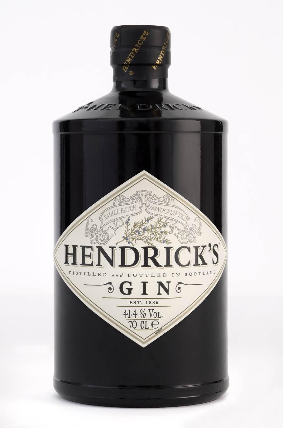
- mmm hendrick's.sputnik2
- identity0
simplicity = standout in an overly-designed market
- iceberg0
looks like fragrance - bottom left anyway
- CALLES0
Gin IS MY cologne comes monday morning
- jxh1120
hi there, wow thanks for the feedback, i didn't expect it to be this fast
yes i was looking at the woodford reserve actually and was sort of trying to evoke the same feeling, but whiskey is a differnet market and has an established look and not to mention great history , the amber color also makes everything god damned sexy...
detritus, you make a great point, i think i will work on a mark, there is a bit of a story to the name so i will use that for sure.
- Josev0
The square bottle and type contained in the white box have strong associations with Chanel perfume for me.
- jxh1120
Well the name Hierro (pronouned hee-eh-rrrrrroh, roll it as hard as you can for more masculinity..) is from El Hierro, a spanish island—in fact the smallest and farthest southwest of the 7 Canary Islands. The western end of El Hierro was actually for a long time considered the end of the known world by the Europeans. It's known as Isla De Meridiano which means "The Meridian Islands" since the general position of El Hierro was marked down as the Prime Meridian in the Old World.
And that links with gin because, gin gets its flavour mainly from the Juniper berries, and on the island of El Hierro, grows Sabinar, a type of juniper berry.
Now I've taken some liberties with the back story here, since 1. the islands are protected and you couldn't touch anything there. 2. I have no idea if decent gin can be made from Sabinar, so you'll have to excuse that but it's only a school brief...
So I think the mark perhaps could reflect that part about El Hierro being once the prime meridian on a map. so sextents and old world instruments like that was what i was thinking. BUT, that seems more appropriate for something you'd do for a drink like whiskey...?
- I'd use either El Hierro or Sabinar as the name if you have the choice. Hierro doesn't have the same ring.Amicus
- OSFA0
From yours... Bottom Right although it looks to me like a tequila bottle (it could still use some more tweaking maybe). I would consider some of the samples posted above...
- jxh1120
hey josev, i did realize this also soon after, but i'm not sure if everyone will see that?
